• Bring Your App to Life with Animation

    Monkey Motion, the new animation feature available in Connect IQ 3.1, allows developers to import animated content into their Connect IQ apps. In this post we will discuss how to import an animation, how to use the new WatchUi.Layer to overlay content onto the animation, and best practices for using this new feature. Our end goal is to make a watch face with a little action when you check the time.

    Getting Started

    To begin with, make sure you have downloaded the Connect IQ 3.1 beta and plug in. We will create a project called DanceDanceGarmin in Eclipse. You can download the example on GitHub.

    Importing an Animation

    The Monkey Motion tool can be launched from the Eclipse plug-in.

    Clicking on Start Monkey Motion will open the tool:

    Monkey Motion accepts input from files in animated GIF or yuv4mpeg format. GIFs, a file format that is a millennial, has been used by users from the Compu-serve era to the messaging revolution. The yuv4mpeg format, which is far less known, is a very simple text-based raw format for video content. The advantage of the yuv4mpeg over GIF is that GIF will pre-palletize your colors, potentially lowering your import quality before it comes to Monkey Motion. If you care about such things, convert your content to YUV before importing, otherwise you can forget this paragraph and move on with your life.

    In our case we will creating a watch face with this GIF:

    In our case we want to download the higher quality MP4 version. As all good command line junkies we will do this with cURL.

    curl https://media.giphy.com/media/1BceylguiTgc94R5pq/giphy.mp4 > Dancers.mp4

    To convert to YUV, we will get the open source tool ffmpeg. ffmpeg is the Swiss Army knife of media file formats.

    ffmpeg -i Dancers.mp4 -f yuv4mpegpipe Dancers.yuv

    Let’s create an asset folder in our eclipse project, and have Monkey Motion put the output file there. We will also use the medium conversion quality, and use dancers as the resource identifier:

    The Monkey Motion tool will generate files for every device selected in the devices list and output a Monkey Motion Manifest (.mmm) file that maps which file maps to which product. It will also output a resource XML file in the output directory.

    When you click Generate Monkey Motion will churn and provide a viewer to watch the sample output:

    The MIP displays used by the Garmin wearables are limited to 64 colors, so color loss is expected.

    Monkey Motion and Monkey C

    Now that the animation has been converted, we want to have our project import it, so we add the asset path to our jungle file.

    project.manifest = manifest.xml
    
    base.resourcePath = $(base.resourcePath);asset

    This makes it a reference-able asset within your code.

    Connect IQ 3.1 introduces the WatchUi.Layer class. Layers are buffered bitmaps that can be stacked on top of each other within a View. During a screen refresh, layers will be combined behind on top of the View to compose the view. In our case, we want to have two layers.

    We will be using this animation logic for both the watch face and the goal view, so let’s put the animation logic in its own class, DanceDanceAnimationController. Creating the Animation from resources is very straightforward.

    // Initialize the Animation
    _animation = new WatchUi.AnimationLayer(
        Rez.Drawables.dancers,
        {
            :locX=>0,
            :locY=>0,
        }
    );
     

    Note that dancers is the resource identifier we provided to Monkey Motion. Now we want to create the overlay layer. Remember that the layer is a buffered bitmap, so the larger it is the higher the cost against your app memory. We’re going to make it large enough for a readable time, but not much larger.

    // Function to initialize the time layer
    private function buildTextLayer() {
        var info = System.getDeviceSettings();
        // Go for 60% width x 30% height. 
        // Word aligning the width and height for better blits
        var width = (info.screenWidth * .60).toNumber() & ~0x3;
        var height = info.screenHeight * .3;
    
        var options = {
            :locX => ( (info.screenWidth - width) / 2 ).toNumber() & ~0x03,
            :locY => (info.screenHeight - height) / 2,
            :width => width,
            :height => height,
            :visibility=>true
        };
    
        // Initialize the Time over the animation
        var textLayer = new WatchUi.Layer(options);
        return textLayer;
    }

    Let’s add the two layers to the view.

    view.addLayer(_animation);
    view.addLayer(_textLayer);

    Now it’s time to draw, um, the time. Rather than setting values in Drawable objects, we will draw the time directly onto the Layer using direct calls to the device context.

    // Update the view
    function onUpdate(dc) {
    	// Clear the screen buffer
        dc.setColor(Graphics.COLOR_WHITE, Graphics.COLOR_WHITE);
        dc.clear();
        // Update the contents of the time layer
        updateTimeLayer();
        return;
    }

    Now, let’s play our animation. We’re going to keep a state variable that keeps track of if we’ve already started playing our animation.

    function play() {
        if(!_playing) {
            _animation.play({
                :delegate => new DanceDanceAnimationDelegate(self)
                });
            _playing = true;
        }
    }
    
    function stop() {
        if(_playing) {
            _animation.stop();
            _playing = false;
        }
    }

    DanceDanceAnimationDelegate is a subclass of WatchUi.AnimationDelegate that calls stop once the animation completes playback.

    class DanceDanceAnimationDelegate extends WatchUi.AnimationDelegate {
        var _controller;
    
        function initialize(controller) {
            AnimationDelegate.initialize();
            _controller = controller;
        }
    
    
        function onAnimationEvent(event, options) {
            switch(event) {
                case WatchUi.ANIMATION_EVENT_COMPLETE:
                case WatchUi.ANIMATION_EVENT_CANCELED:
                    _controller.stop();
                    break;
            }
        }
    }
    

    Finally, lets trigger our playback on onExitSleep of our watch faces. This will start the animation whenever the user gestures to read the time.

    // The user has just looked at their watch. 
    // Timers and animations may be started here.
    function onExitSleep() {
         _animationDelegate.play();
    }
    

    Add Life to Your Apps

    Monkey motion makes it possible to add visual sizzle to your Connect IQ apps. Now you can create animations using your favorite tools, import them into your project, and have them play when you want. 

    • Nov 22, 2019
  • Using Relative Layouts and TextArea

    Let’s say your designer came to you to make an alert dialog like the one above. As a Connect IQ developer you groan  because:

    • Lack of text wrapping makes variable length messages hard to support
    • Different fonts sizes on products makes for difficult testing
    • Connect IQ’s lack of relative positioning means multiple layouts to support all products

    In Connect IQ 3.1, these are no longer issues thanks to WatchUi.TextArea and relative coordinates. The WatchUi.TextArea is a super powered upgrade to WatchUi.Text. TextArea auto-line wraps any string fed into it to fit within its boundaries, and also accepts an array of fonts instead just one. If the first font is too big to allow your text to fit inside, it will try each one until it finds one that works. If the text won’t fit in the area with the given fonts, it will put an ellipse at the cutoff point. TextArea is only available to Connect IQ 3.1 compatible products.

    In Connect IQ 3.1 resource compiler now accepts percentages for X and Y coordinates as well as width and height specifiers. The percent is always a percentage of the available drawing area. Relative coordinates can be used in layouts for all Connect IQ compatible products.

    In our example above, let’s  make an alert drawable list:

    <drawables>
        <bitmap id="LauncherIcon" filename="launcher_icon.png" />
        <drawable-list id="alert" background="Graphics.COLOR_WHITE">
            <shape type="rectangle" x="0" y="0" width="100%" height="20%" color="Graphics.COLOR_RED"/>
        </drawable-list>
    </drawables>
    

    Now let’s create one layout for the alert box:

    <layout id="MainLayout">
        <drawable id="alert" />
        <!-- Exclamation Point -->
        <label id="header" text="!" x="center" y="5%" color="Graphics.COLOR_WHITE" justification="Graphics.TEXT_JUSTIFY_CENTER" />
        <!-- Text Area -->
        <text-area id="bodyText" 
            color="Graphics.COLOR_BLACK" justification="Graphics.TEXT_JUSTIFY_CENTER"
            text="The quick brown fox jumped over the lazy dog" 
            x="10%" y="20%" width="80%" height="60%">
            <!-- The fonts will be tried in order. This allows scaling the font size
                 as the text grows -->        
            <fonts>
                <font>Gfx.FONT_MEDIUM</font>
                <font>Gfx.FONT_SMALL</font>            
                <font>Gfx.FONT_TINY</font>
            </fonts>
        </text-area>   
    </layout>
    

    Note the text-area tag in the layout. The fonts tag allows you to specify the fonts are acceptable for rendering the text block. They are tried in order, so make sure you order them from largest to smallest.

    Here is what the layout looks on the Vivoactive 4 (280x280), Fenix 6s (240x240), and Vivoactive 4s (218x218)

    As you can see, it’s become much easier to display messages to your users. The goal is to allow developers to be able to handle almost all devices with the same layout.

    • Nov 21, 2019
  • Widget Glances - A New Way to Present Your Data

    The following is a guest post from Hermo Terblanche, a Connect IQ developer in South Africa.

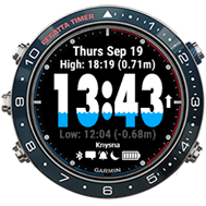
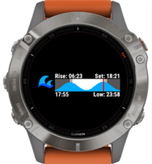
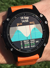
    TidalFace is a watch face that shows the current tide level in comparison to the previous and next tide extremes (high and low). It is always visible and doesn’t require any user interaction.


    Watch faces cannot respond to user interaction, so the presentation of data is limited to just a single view. If you would like to view all the tides of the current day, you would need to open another widget or app that allows for more user interaction and views.

    To bridge this gap, I invented TidalFlow, a companion widget that offers a more detailed view of the current day’s tides with respect to sunrise and sunset.

    To use TidalFace and TidalFlow in tandem, a user only needs to configure both with the same coordinates and ensures that TidalFlow appears first when scrolling through the widget carousel. These apps use the same web service, so the data is consistent and contributes to a convenient single-app experience when used in tandem. With just a single button press (or swipe on a touch screen) from a watch face, the user can immediately access a more detailed view of the same data by means of an adjacent widget that opens automatically in full screen view.

    The arrival of widget glances, launched with the fēnix 6 series, introduced new challenges. The new glances carousel shows three widget glances at a time. This lets the user view more but reduces available screen real estate. When scrolling to glances from the watch face, a user doesn’t see a full-screen widget as before, but instead must press a button to open the widget in full-screen mode. When glance view support was introduced in version 3.1.3 of the Connect IQ SDK, I set out to discover new possibilities in a bid to retain the single-app experience for my apps.

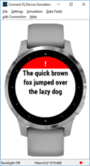
    Without having added any glance support to my widget yet, I first side-loaded it to a fēnix 6 to see what would be displayed in the glance carousel. As seen below, only a launcher icon and name is displayed by default.

    I immediately started adding a custom glance for TidalFlow and was pleasantly surprised with how quick and easy it is to get a simple glance up and running in the sim. Below is a short list of steps to quickly help you get yours up and running quickly:

    1. Add a new *.mc file for the glance view to the widget project

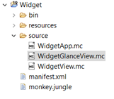
    2. Inherit the glance view from from Toybox.WatchUi.GlanceView
    3. Annotate the glance view class with (:glance)
    4. Add initialize() function with GlanceView.initialize();
    5. In the glance’s onUpdate() function, get the canvas size and draw a border to assist with visualizing the canvas you will be using for drawing.

      Steps 2 - 5 yields the following code:

      using Toybox.WatchUi as Ui;
      using Toybox.Graphics as Gfx;
      
      (:glance)
      class WidgetGlanceView extends Ui.GlanceView {
      	
          function initialize() {
            GlanceView.initialize();
          }
          
          function onUpdate(dc) {
          	 dc.setColor(Gfx.COLOR_WHITE, Gfx.COLOR_BLACK);
          	 dc.drawRectangle(0, 0, dc.getWidth(), dc.getHeight());
          }
      }


      1. Add the getGlanceView() function to the main app class and annotate the function with (:glance) as well.

      Extract from main app class:

      using Toybox.Application;
      
      class WidgetApp extends Application.AppBase {
          ...
          function getGlanceView() {
              return [ new WidgetGlanceView() ];
          }
      }
      

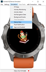
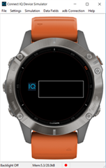
    6. Run the widget in the simulator and enable Glance View simulation. You should now see the rectangle you implemented in step 5.

    The canvas (dc) dimensions for the different fēnix 6 models are:

    Fenix 6S  151 x 63
    Fenix 6  171 x 63
    Fenix 6X 191 x 63

    Since TidalFlow’s main purpose is to show a graph of the present day’s tides, I wanted the same graph to fit in the smaller glance canvas. I assumed that it would work well if a user could still assess the time of day (red vertical line) with respect to the tides and sunrise and sunset times from a glance, instead of having to manually open the full-screen view.

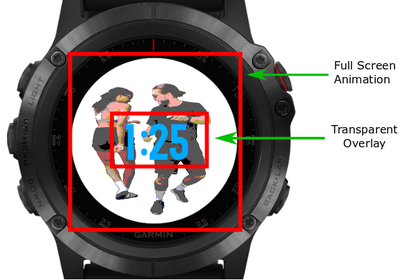
    I knew that fitting all the original full-screen widget’s data into the glance wouldn’t be feasible, because it would unnecessarily reduce the limited real estate even more. The adage “a picture is worth a thousand words” came to mind, and I happily accepted that only showing the graph would suffice, as it would still fulfill most of the full-screen widget’s purpose. I had renewed hope in achieving the goal of retaining a single-app experience.

    Below is an illustration to show the challenge I faced to make the full screen graph work in a glance:

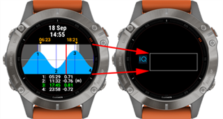
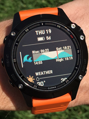
    After fiddling with the scaling algorithm for a short while, I managed to display the graph in the glance. Ultimately the graph is rendered to an even smaller area within the glance canvas’s boundaries. I needed some real estate to display a few meaningful text elements, as well. Below is the result as seen in the simulator:

    The top row displays the sunrise and sunset times, and at the bottom is the current time and the time of the next tide extreme (high / low).

    Very pleased and excited with the result, I side-loaded the widget onto a fēnix 6, but as soon as I started scrolling through the glances, I immediately observed a very slow scrolling performance, the culprit was my glance’s intensive drawing operations. Asking around about how to improve performance, someone suggested rendering the graph once on a BufferedBitmap instead of re-drawing the graph on every update. Sure enough, the scrolling speed returned to normal.

    In short, the idea behind the BufferedBitmap is explained as follows:

    1. Declare a class variable of type BufferedBitmap
    2. In onUpdate(), if the variable is null, instantiate a new BufferedBitmap and render to it.
    3. Otherwise skip the drawing operations.
    4. Draw the buffered bitmap to the main canvas.

    Here is a second code example illustrating the BufferedBitmap approach that draws the same rectangle as in the first example:

    (:glance)
    class WidgetGlanceView extends Ui.GlanceView {
    	
    	var bufferedBitmap;
    	
    	function initialize() {
            GlanceView.initialize();
        }
        
        function onUpdate(dc) {
        	
        	if(bufferedBitmap == null) {
        	
        		var width = dc.getWidth();
        		var height = dc.getHeight();
        	    	
        		bufferedBitmap = new Gfx.BufferedBitmap(
    {:width=>width,:height=>height});
        		var bufferedDc = bufferedBitmap.getDc();
    	    	
        		bufferedDc.setColor(Gfx.COLOR_WHITE, Gfx.COLOR_BLACK);
        		bufferedDc.drawRectangle(0, 0, width, height);
        	}
        	
        	dc.drawBitmap(0,0, bufferedBitmap);
        }
    }
    

    After solving the slow-scrolling performance using a BufferedBitmap and having tested it to satisfaction on a fēnix 6, I released an update that included the glance support for the fēnix 6 series. I kept a close eye on ERA reports so that I could immediately act if any problems were reported. It wasn’t long before the first error report showed up: an OutOfMemory error on a fēnix 6X. Then a couple more reports for the same error and device showed up. It was clear that I had another challenge on my hands: There was a definite issue with my glance on the fēnix 6X. Immediately, I compared the peak memory of the fēnix 6X to that of the fēnix 6 using the simulator’s View Memory function.

    The screenshots below show how to access the View Memory screen and where to look for the Peak Memory value. The closer the peak memory is to the allowed limit of a glance view (32kB), the higher the risk for an OutOfMemory error to occur.

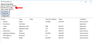
    The memory report for the fēnix 6 showed a peak memory of 27.4kB, whereas the fēnix 6X had a higher value of 29.8kB. The goal then was to reduce the 6X’s peak memory usage to as close as possible to that of the fēnix 6. Knowing that the glance worked on the fēnix 6, it was evident that 27.4kB was a safe target to aim for. Since the code was the same between the fēnix 6 and 6X, it was concluded that the fēnix 6X ‘s bigger canvas contributed to the higher memory usage.

    Further optimizations were performed, but I could only manage to scale the peak memory usage down to 28.6kB. I found a user who was willing to test a side-load on a fēnix 6X, but unfortunately the new optimized version still didn’t cut it. It still crashed with an out of memory error according to the CIQ_LOG.yml. At this point I knew that the safe zone was somewhere under 28kB. Finally, another developer, @peterdedecker, came to the rescue by suggesting that I should try to limit the palette of the buffered bitmap. I identified six colors that were being used in the glance view and set the buffered bitmap’s palette accordingly:

    bufferedBitmap = new Gfx.BufferedBitmap({:width=>width,:height=>height,
         :palette=>[Gfx.COLOR_DK_GRAY,
        Gfx.COLOR_LT_GRAY,
        Gfx.COLOR_BLUE,
        Gfx.COLOR_RED,
        Gfx.COLOR_BLACK,
        Gfx.COLOR_WHITE]});
    

    After this change and running it once more, I observed a much lower peak memory of 22.4kB. I released another update, and after a couple of good reviews and positive feedback, I knew that the biggest challenges were finally overcome.

    With the addition of a glance view, not only did I manage to retain the single-app experience between TidalFace and TidalFlow, but I also managed to present data in an easy-to-understand, glanceable view. This resulted in a total of 3 different tiers of detail:

    1. The original watch face (TidalFace) shows the clock and level of the current tide with respect to the next and previous tides.
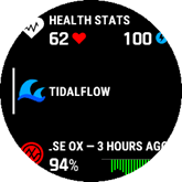
    2. The widget glance view of TidalFlow shows all the tides for the day in a graph with respect to the sunrise and sunset times.
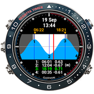
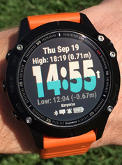
    3. The original full-screen widget of TidalFlow shows a larger graph for the tides and the exact times and heights for each of the four tide extremes of the day.


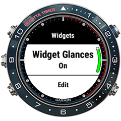
    If a user still would prefer to follow the original single-app approach as described in the beginning of the post (two-tier presentation) without the interruption of glances, then fortunately there is a setting available on the watch to disable glances. This can be achieved as follows:

    1. Long press the up button to open the settings menu.
    2. Scroll down to Widgets and select it by pressing the Start button.
    3. The first option is a toggle for switching Widget Glances On or Off.
    4. Click the Start button to toggle it.

    About the Author: Hermo Terblanche is a Connect IQ developer in South Africa. You can find Hermo on Twitter, Facebook, Instagram, and the Connect IQ Developer Forum. See Hermo’s Connect IQ apps in the Connect IQ Store.

    • Oct 30, 2019
  • Connect IQ at ANT+ Symposium 2019

    Garmin presented at 2019 ANT+ Symposium in Canmore, Alberta. If you weren't able to make it, here are some of of the highlights:

    • Oct 29, 2019
  • SDK Release 3.1.6

    We've released SDK 3.1.6 which includes device support and version changes, as well as some minor updates. Here is a list of some of the changes and updates:

    General Changes

    • Add support for the Garmin SwimTm 2.
    • Update minimum firmware and supported CIQ versions for the vívoactive® 4 / 4s, VenuTm, and Edge® 130 / 520+ / 820 to support CIQ 3.1.
    • Add support for GPSMap 66 / 66i APAC.
    • Add support for Legacy Saga series devices.
    • Fix a bug that caused properly urlencoded strings to be cut short at the first triplet in the string.
    • Fix an issue that caused onLayout to be called for a view when the view on top of it in the view stack was popped.
    • Fix a bug where onPartialUpdate would continue to be invoked after a watch face had crashed.
    • Fix potential random app crashes when invoking onHide/onUpdate.
    • Update ERA viewer to show all known crash reports for each app across all app versions.

    Simulator Changes

    • Enable widget glance support for MARQTm series devices.
    • Update data field layouts for the vívoactive® 4 series and VenuTm to better match the device.
    • Fix an issue that prevented the simulator from launching apps when TMPDIR was on a case-sensitive file system on MacOS.
    • Fix a bug where app crashes can cause the simulator to shut down.
    • Fix a bug where calls to requestApplicationWake() would crash the simulator.
    • Fix a bug where the map controls were in the wrong location on the edge 530.
    • Update Menu2 title draw area for fenix6 devices to be correct.
    • Fix a bug where progress bars would not update.

    Compiler Changes

    • No Changes
    • Oct 25, 2019
  • Make Music with Connect IQ and the LIDAR-Lite v4

    The Garmin LIDAR-Lite v4 LED is a LED based LIDAR solution. The LIDAR-Lite v4 is powered by a Nordic nRF52840 application processor, which means your can program it communicate distance measurements over ANT, ANT BLAZE, and BLE. By default, it communicates distance readings over ANT.

    This sample uses the LIDAR-Lite v4 to create a Connect IQ Theremin. The Theremin was an early electronic musical instrument, using two antennae to sense the position of the player’s hands allowing them to control oscillation and frequency. As the artist waives their hands around the antennae it amplifies the signals to make its trademark sound.

    Our demonstration uses ANT and the updated Attention.playTone API. The playTone now allows developers to pass in an array of Attention.ToneProfile objects. Strung together, your Connect IQ apps can now play some music.

    You can find the source to the LiDAR Theremin on GitHub.

    • Oct 22, 2019
  • Bluetooth Mesh Networking with Connect IQ

    This guest post was written by Gus Workman, a Garmin intern and Ohio State University student.

    Bluetooth mesh is a protocol that was released in 2017 by the Bluetooth SIG. Since that time, it has slowly started to gain traction for its many-to-many connection capabilities, enhanced range, and security features. The protocol is getting more attention with the big silicon manufacturers, and every week sees the release of new Bluetooth mesh IoT devices. Because this protocol is quickly rising in popularity, the team here at Garmin thought that it would be an interesting challenge to see if the Bluetooth mesh protocol could be supported on Connect IQ devices using the brand new BluetoothLowEnergy APIs. Out of this concept came two projects - a Bluetooth mesh library and an example application using the library.

    The following is a guide to the Bluetooth mesh library created as a 2019 summer intern project. This library can be used by Connect IQ devices that support the 3.1 Bluetooth Low Energy APIs. It can be used to create a Bluetooth mesh network, provision devices to add them to the network, and control devices on the network. It does not turn a Connect IQ device into a node in the mesh network, since it only supports interacting with the network via a proxy node. The library has been designed to make it easy to either build off a implementation of a BluetoothLowEnergy delegate or to create a custom implementation in order to have more control or support other Bluetooth functionality outside of Bluetooth mesh.

    The following guide primarily is geared toward introducing users to the sample barrel and sample application available on GitHub.

    Usage

    Bluetooth mesh is by no means a simple protocol - there are many great features (such as the excellent security Bluetooth mesh provides), but the multitude of features and small details can make it seem very difficult. Fortunately, this Monkey Barrel makes Bluetooth mesh much easier while also giving the developer access to the lower-level layers of the protocol.

    Getting Started

    To get started building Bluetooth mesh applications on Connect IQ, you will first need to download the barrel and import it. To import it into your project, follow the steps outlined in the Programmer's Guide. After importing the barrel into your project, you only need to add the following pieces of code to get started with Bluetooth mesh:

    1. Create a class that extends MeshDelegate and implement the following methods:
      1. onScanFinished()
      2. onConnected()
      3. onDisconnected()
      4. onNetworkPduReceived(networkPdu)
    2. If you plan on supporting provisioning new devices, you also implement the following methods:
      1. onProvisioningParamsRequested(capabilities)
      2. onAuthValueRequired()
      3. onProvisioningFailed(reason)
      4. onProvisioningComplete(device)
    3. Initialize a NetworkManager object and pass it into a new instance of your custom MeshDelegate class.
    4. (Optional) Call the networkManager.load() method to load the saved state, and put a call to networkManager.save() in the application's onStop() method to save the state on close.
    5. Import the BluetoothLowEnergy module with using BluetoothLowEnergy as Ble;
    6. In your app's onStart() method, call Ble.setDelegate() with the instance of your custom MeshDelegate class.

    That's pretty much it! Integrating the Bluetooth mesh Monkey Barrel is fairly easy.

    Connecting to Devices

    To communicate with the mesh network, your device needs to connect to a proxy node. Simply call your custom MeshDelegate.startScanning() method with an argument of MODE_PROXY to begin the process. Over the next five seconds, the device will scan for devices and collect the results into the scanResults array. The scan results are automatically filtered to only include unique results where the device is broadcasting a Bluetooth Mesh Proxy (or Provisioning if you used MODE_PROVISION as the argument to startScanning()) Service UUID. Because your custom delegate class extends the base MeshDelegate, you have access to the scanResults instance variable right within your onScanFinished() method. In this method, you should choose one of the devices to connect to, then call the connectToDevice(index) function with the index of the result from the scanResults array. The recommend way to choose one is to iterate through the scanResults array and find the device with highest RSSI value. For some cases, such as during provisioning, you might want to present a list of the scan results to the user.

    Sending and Receiving Data

    What about using the application to send and receive data? Most of your application logic concerning receiving data back from the network will reside in the onNetworkPduReceived(networkPdu) method - this is where you will want to act on the payload opcode for the PDU. To send data, however, you will need to do the following:

    1. Instantiate a AccessPayload class with the opcode and parameters you wish to send (if no parameters, pass in an empty byte array).
    2. Create a new TransportAccessPDU, passing in the application key flag (true if you want to encrypt the packet with an application key, false to use the device key), MIC size (for almost all access messages, use MIC_SIZE_4), and the AccessPayload object you created in 1.
    3. Initialize a new NetworkPDU using the static method newInstance(networkManager, ctl, dst, transportPdu). 
    4. Get the segmented and encrypted PDUs by calling the static method ProxyPDU.sesgment(PROXY_TYPE_NETWORK_PDU, networkPdu).
    5. Finally, now that you have your segmented data you can send it to the device with networkManager.send(segmentedData).

    This is all most applications will require, but this library makes it easy to use more complex features like defining your own packet types and encryption schemes.

    Provisioning

    Provisioning new devices into the network is a little more involved since user input is required at some stages. The implementation is largely left up to the developer to figure out the best way to present the data to the user, and then to use callbacks to continue the provisioning process. For the example application created with this library, I chose to primarily use Menu2 and GenericPicker to present the information. Provisioning with the library requires the following steps:

    1. Scan and connect to the device with MODE_PROVISION as the argument to startScanning(mode). The InvitePDU is automatically sent to the device that was connected to.
    2. The first packet that is received in response is the CapabilitiesPDU. After this is received, the system will call the onProvisioningParamsRequested(capabilities) callback function in your custom MeshDelegate class. In this function you must call the ProvisioningManager.onProvisioningModeSelected(startPdu) method (use self.networkManager.provisioningManager from your custom MeshDelegate class). You can display a list of authentication options to the user, but note that not all modes have been implemented in the library yet. Check the docs for more information.
    3. If output OOB authentication mode was selected, you will need to get the output value from the user when the onAuthValueRequired() callback method is called. You should have some form of input from the user, then send that value back to the library by calling the ProvisioningManager.onAuthValueInput(authValue) method. This will continue the provisioning process.
    4. Finally, the provisioning will either fail and the onProvisioningFailed(reason) callback will be invoked, or provisioning will succeed with your application being notified through the onProvisioningComplete() callback. Either way, provisioning is over. You should probably call the self.disconnect() instance function of the base MeshDelegate class from here, because the device will no longer accept data from the Provisioning Data In characteristic. Reconnect to the network using startScanning(MODE_PROXY).
    5. Finally, while the device is provisioned, you likely still need to configure the device before it is useful. See the below instructions for doing so.

    Configuration

    The configuration process involves adding app keys to the device, as well as binding those keys to specific models. Optionally, you can configure subscription and publication addresses for those elements. Because configuration is largely dependent on each use case, the library only provides the necessary tools to craft your own configuration scheme. There is no special ConfigurationManager class to handle this because all of the configuration PDUs are regular TransportAccessPDUs - the only difference is that the packets must be encrypted with the device key, and not an application key. So, make sure to set the akf field to false when initializing new TransportAccessPDU variables!

    The library does provide some helper classes to piece together configuration data:

    • Get the AccessPayload for retrieving the composition data of the device using CompositionData.getCompositionData(). Use this AccessPayload object as described above in the Sending and Receiving Data section above.
    • When you receive the composition data back from the device, you can parse it using the CompositionData.decode static function.
    • To add an app key to the device, use the AccessPayload from AppKeyConfig.getAddAppKeyConfig().
    • For setting an element's publication or subscription status, use AppKeyConfig.getPublishAddConfig() or AppKeyConfig.getSubscribeAddConfig() to get the necessary AccessPayload objects.
    • The AppKeyConfig class contains some additional opcode constants that are useful when receiving and parsing the acknowledgements and status PDUs back from the device that is being configured.

    To send other configuration messages, you need to figure out the correct opcode and parameters from the Bluetooth Mesh Specification documents

    Conclusion

    Bluetooth mesh is a powerful new way of interfacing with IoT devices. With the Bluetooth mesh barrel you can integrate Bluetooth mesh features into your own Connect IQ applications. As this technology becomes more prevalent, we can't wait to see what amazing apps the community creates!

    • Oct 15, 2019
  • App Store Database Update Complete!

    The app store database update has been completed successfully. You should now be able to upload new apps and update existing apps without issue. Thank you for your patience while the maintenance was completed.

    • Oct 9, 2019
  • App Store Database Maintenance Update

    Due to issues discovered after the update we will be extending the app store maintenance. During this time, there will be no impact on Connect IQ end users, but developer app uploads and updates have been temporarily disabled. We will provide updates via this post on the progress. We are working to resolve this as quickly as possible so you can share your creations. Thank you for your patience as we work to get this resolved. 

    • Oct 8, 2019
  • App Store Database Maintenance

    We're in the process of doing some app store database maintenance, for which we've needed to temporarily disable app uploads and app updates:

    We expect to have things back to normal later today, and there should be no impact on typical Connect IQ users. Apologies for the inconvenience! 

    • Oct 8, 2019