The following is a guest post from Hermo Terblanche, a Connect IQ developer in South Africa.
TidalFace is a watch face that shows the current tide level in comparison to the previous and next tide extremes (high and low). It is always visible and doesn’t require any user interaction.
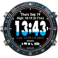
Watch faces cannot respond to user interaction, so the presentation of data is limited to just a single view. If you would like to view all the tides of the current day, you would need to open another widget or app that allows for more user interaction and views.
To bridge this gap, I invented TidalFlow, a companion widget that offers a more detailed view of the current day’s tides with respect to sunrise and sunset.
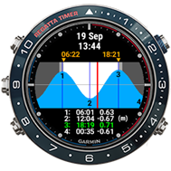
To use TidalFace and TidalFlow in tandem, a user only needs to configure both with the same coordinates and ensures that TidalFlow appears first when scrolling through the widget carousel. These apps use the same web service, so the data is consistent and contributes to a convenient single-app experience when used in tandem. With just a single button press (or swipe on a touch screen) from a watch face, the user can immediately access a more detailed view of the same data by means of an adjacent widget that opens automatically in full screen view.
The arrival of widget glances, launched with the fēnix 6 series, introduced new challenges. The new glances carousel shows three widget glances at a time. This lets the user view more but reduces available screen real estate. When scrolling to glances from the watch face, a user doesn’t see a full-screen widget as before, but instead must press a button to open the widget in full-screen mode. When glance view support was introduced in version 3.1.3 of the Connect IQ SDK, I set out to discover new possibilities in a bid to retain the single-app experience for my apps.
Without having added any glance support to my widget yet, I first side-loaded it to a fēnix 6 to see what would be displayed in the glance carousel. As seen below, only a launcher icon and name is displayed by default.
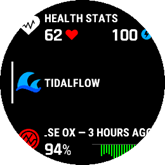
I immediately started adding a custom glance for TidalFlow and was pleasantly surprised with how quick and easy it is to get a simple glance up and running in the sim. Below is a short list of steps to quickly help you get yours up and running quickly:
- Add a new *.mc file for the glance view to the widget project
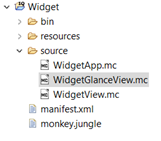
- Inherit the glance view from from Toybox.WatchUi.GlanceView
- Annotate the glance view class with (:glance)
- Add initialize() function with GlanceView.initialize();
- In the glance’s onUpdate() function, get the canvas size and draw a border to assist with visualizing the canvas you will be using for drawing.
Steps 2 - 5 yields the following code:
using Toybox.WatchUi as Ui; using Toybox.Graphics as Gfx; (:glance) class WidgetGlanceView extends Ui.GlanceView { function initialize() { GlanceView.initialize(); } function onUpdate(dc) { dc.setColor(Gfx.COLOR_WHITE, Gfx.COLOR_BLACK); dc.drawRectangle(0, 0, dc.getWidth(), dc.getHeight()); } } -
- Add the getGlanceView() function to the main app class and annotate the function with (:glance) as well.
Extract from main app class:
using Toybox.Application; class WidgetApp extends Application.AppBase { ... function getGlanceView() { return [ new WidgetGlanceView() ]; } } - Run the widget in the simulator and enable Glance View simulation. You should now see the rectangle you implemented in step 5.
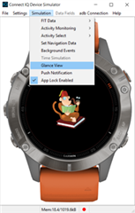
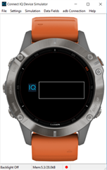
The canvas (dc) dimensions for the different fēnix 6 models are:
| Fenix 6S | 151 x 63 |
| Fenix 6 | 171 x 63 |
| Fenix 6X | 191 x 63 |
Since TidalFlow’s main purpose is to show a graph of the present day’s tides, I wanted the same graph to fit in the smaller glance canvas. I assumed that it would work well if a user could still assess the time of day (red vertical line) with respect to the tides and sunrise and sunset times from a glance, instead of having to manually open the full-screen view.
I knew that fitting all the original full-screen widget’s data into the glance wouldn’t be feasible, because it would unnecessarily reduce the limited real estate even more. The adage “a picture is worth a thousand words” came to mind, and I happily accepted that only showing the graph would suffice, as it would still fulfill most of the full-screen widget’s purpose. I had renewed hope in achieving the goal of retaining a single-app experience.
Below is an illustration to show the challenge I faced to make the full screen graph work in a glance:
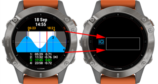
After fiddling with the scaling algorithm for a short while, I managed to display the graph in the glance. Ultimately the graph is rendered to an even smaller area within the glance canvas’s boundaries. I needed some real estate to display a few meaningful text elements, as well. Below is the result as seen in the simulator:
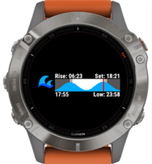
The top row displays the sunrise and sunset times, and at the bottom is the current time and the time of the next tide extreme (high / low).
Very pleased and excited with the result, I side-loaded the widget onto a fēnix 6, but as soon as I started scrolling through the glances, I immediately observed a very slow scrolling performance, the culprit was my glance’s intensive drawing operations. Asking around about how to improve performance, someone suggested rendering the graph once on a BufferedBitmap instead of re-drawing the graph on every update. Sure enough, the scrolling speed returned to normal.
In short, the idea behind the BufferedBitmap is explained as follows:
- Declare a class variable of type BufferedBitmap
- In onUpdate(), if the variable is null, instantiate a new BufferedBitmap and render to it.
- Otherwise skip the drawing operations.
- Draw the buffered bitmap to the main canvas.
Here is a second code example illustrating the BufferedBitmap approach that draws the same rectangle as in the first example:
(:glance)
class WidgetGlanceView extends Ui.GlanceView {

	var bufferedBitmap;

	function initialize() {
        GlanceView.initialize();
    }

    function onUpdate(dc) {

    	if(bufferedBitmap == null) {

    		var width = dc.getWidth();
    		var height = dc.getHeight();

    		bufferedBitmap = new Gfx.BufferedBitmap(
{:width=>width,:height=>height});
    		var bufferedDc = bufferedBitmap.getDc();

    		bufferedDc.setColor(Gfx.COLOR_WHITE, Gfx.COLOR_BLACK);
    		bufferedDc.drawRectangle(0, 0, width, height);
    	}

    	dc.drawBitmap(0,0, bufferedBitmap);
    }
}
After solving the slow-scrolling performance using a BufferedBitmap and having tested it to satisfaction on a fēnix 6, I released an update that included the glance support for the fēnix 6 series. I kept a close eye on ERA reports so that I could immediately act if any problems were reported. It wasn’t long before the first error report showed up: an OutOfMemory error on a fēnix 6X. Then a couple more reports for the same error and device showed up. It was clear that I had another challenge on my hands: There was a definite issue with my glance on the fēnix 6X. Immediately, I compared the peak memory of the fēnix 6X to that of the fēnix 6 using the simulator’s View Memory function.
The screenshots below show how to access the View Memory screen and where to look for the Peak Memory value. The closer the peak memory is to the allowed limit of a glance view (32kB), the higher the risk for an OutOfMemory error to occur.
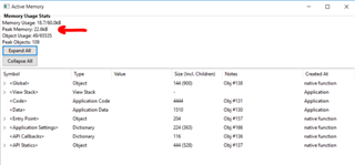
The memory report for the fēnix 6 showed a peak memory of 27.4kB, whereas the fēnix 6X had a higher value of 29.8kB. The goal then was to reduce the 6X’s peak memory usage to as close as possible to that of the fēnix 6. Knowing that the glance worked on the fēnix 6, it was evident that 27.4kB was a safe target to aim for. Since the code was the same between the fēnix 6 and 6X, it was concluded that the fēnix 6X ‘s bigger canvas contributed to the higher memory usage.
Further optimizations were performed, but I could only manage to scale the peak memory usage down to 28.6kB. I found a user who was willing to test a side-load on a fēnix 6X, but unfortunately the new optimized version still didn’t cut it. It still crashed with an out of memory error according to the CIQ_LOG.yml. At this point I knew that the safe zone was somewhere under 28kB. Finally, another developer, @peterdedecker, came to the rescue by suggesting that I should try to limit the palette of the buffered bitmap. I identified six colors that were being used in the glance view and set the buffered bitmap’s palette accordingly:
bufferedBitmap = new Gfx.BufferedBitmap({:width=>width,:height=>height,
     :palette=>[Gfx.COLOR_DK_GRAY,
    Gfx.COLOR_LT_GRAY,
    Gfx.COLOR_BLUE,
    Gfx.COLOR_RED,
    Gfx.COLOR_BLACK,
    Gfx.COLOR_WHITE]});
After this change and running it once more, I observed a much lower peak memory of 22.4kB. I released another update, and after a couple of good reviews and positive feedback, I knew that the biggest challenges were finally overcome.
With the addition of a glance view, not only did I manage to retain the single-app experience between TidalFace and TidalFlow, but I also managed to present data in an easy-to-understand, glanceable view. This resulted in a total of 3 different tiers of detail:
- The original watch face (TidalFace) shows the clock and level of the current tide with respect to the next and previous tides.
- The widget glance view of TidalFlow shows all the tides for the day in a graph with respect to the sunrise and sunset times.
- The original full-screen widget of TidalFlow shows a larger graph for the tides and the exact times and heights for each of the four tide extremes of the day.
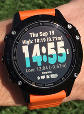
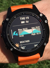
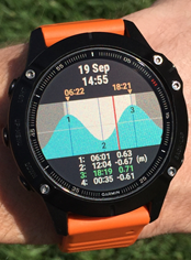
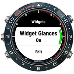
If a user still would prefer to follow the original single-app approach as described in the beginning of the post (two-tier presentation) without the interruption of glances, then fortunately there is a setting available on the watch to disable glances. This can be achieved as follows:
- Long press the up button to open the settings menu.
- Scroll down to Widgets and select it by pressing the Start button.
- The first option is a toggle for switching Widget Glances On or Off.
- Click the Start button to toggle it.
About the Author: Hermo Terblanche is a Connect IQ developer in South Africa. You can find Hermo on Twitter, Facebook, Instagram, and the Connect IQ Developer Forum. See Hermo’s Connect IQ apps in the Connect IQ Store.
