

Let’s say your designer came to you to make an alert dialog like the one above. As a Connect IQ developer you groan because:
- Lack of text wrapping makes variable length messages hard to support
- Different fonts sizes on products makes for difficult testing
- Connect IQ’s lack of relative positioning means multiple layouts to support all products
In Connect IQ 3.1, these are no longer issues thanks to WatchUi.TextArea and relative coordinates. The WatchUi.TextArea is a super powered upgrade to WatchUi.Text. TextArea auto-line wraps any string fed into it to fit within its boundaries, and also accepts an array of fonts instead just one. If the first font is too big to allow your text to fit inside, it will try each one until it finds one that works. If the text won’t fit in the area with the given fonts, it will put an ellipse at the cutoff point. TextArea is only available to Connect IQ 3.1 compatible products.
In Connect IQ 3.1 resource compiler now accepts percentages for X and Y coordinates as well as width and height specifiers. The percent is always a percentage of the available drawing area. Relative coordinates can be used in layouts for all Connect IQ compatible products.
In our example above, let’s make an alert drawable list:
<drawables>
<bitmap id="LauncherIcon" filename="launcher_icon.png" />
<drawable-list id="alert" background="Graphics.COLOR_WHITE">
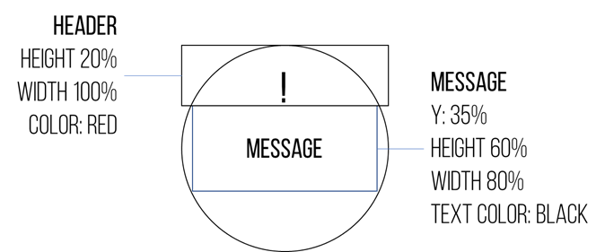
<shape type="rectangle" x="0" y="0" width="100%" height="20%" color="Graphics.COLOR_RED"/>
</drawable-list>
</drawables>
Now let’s create one layout for the alert box:
<layout id="MainLayout">
    <drawable id="alert" />
    <!-- Exclamation Point -->
    <label id="header" text="!" x="center" y="5%" color="Graphics.COLOR_WHITE" justification="Graphics.TEXT_JUSTIFY_CENTER" />
    <!-- Text Area -->
    <text-area id="bodyText"
        color="Graphics.COLOR_BLACK" justification="Graphics.TEXT_JUSTIFY_CENTER"
        text="The quick brown fox jumped over the lazy dog"
        x="10%" y="20%" width="80%" height="60%">
        <!-- The fonts will be tried in order. This allows scaling the font size
             as the text grows -->
        <fonts>
            <font>Gfx.FONT_MEDIUM</font>
            <font>Gfx.FONT_SMALL</font>
            <font>Gfx.FONT_TINY</font>
        </fonts>
    </text-area>
</layout>
Note the text-area tag in the layout. The fonts tag allows you to specify the fonts are acceptable for rendering the text block. They are tried in order, so make sure you order them from largest to smallest.
Here is what the layout looks on the Vivoactive 4 (280x280), Fenix 6s (240x240), and Vivoactive 4s (218x218)
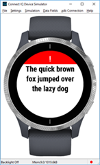
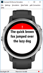
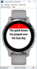
As you can see, it’s become much easier to display messages to your users. The goal is to allow developers to be able to handle almost all devices with the same layout.