Watchface: Glance

NEWS UPDATE:

HANDY IQ:

https://apps.garmin.com/apps/3d167441-94f1-4b67-953f-e3ff6c272406

BIG EASY IQ:

https://apps.garmin.com/en-US/apps/1c8d4883-b4b2-49f3-b30c-954698cef794

EASY+: 

https://apps.garmin.com/apps/7c993e2b-70b3-459a-bbe0-db48a89af5a8?tid=0

With introduction of Garmin Pay, I am starting to add a new payment option for some of my apps. The system is not flexible enough to just add Garmin Pay to existing apps, so I'll publish a copy of an app, with the same functionality but Garmin Pay as the payment provider.

The first one out is Glance Ultra (a copy of Glance Dual Screen):

https://apps.garmin.com/apps/1bed8f69-2e34-46e4-9786-3166fa3c6ab2?tid=0

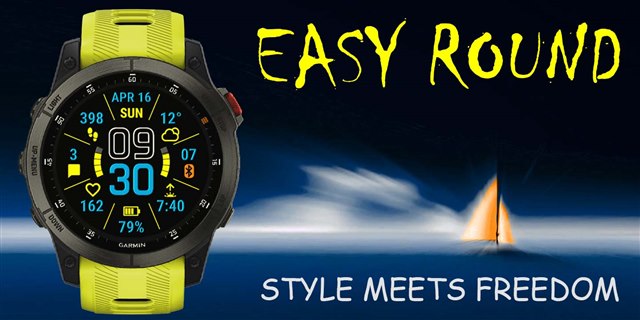
EASY Round - 2023 #1 watch face of the year (by Garmin):

apps.garmin.com/.../9a619d99-3e5b-4eec-81e7-006655d797cc

EASY Round

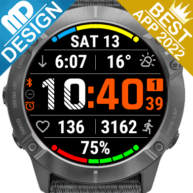
GLANCE WATCH FACE app won THE BEST NEW WATCH FACE APP OF 2022 ! At the Developers conference Garmin announced nominees and winners for the best apps in different categories. Glance Watch Face was nominated and won in the best new watch face category Slight smile! Garmin didn't post the video from the conference yet, but it was already reported by other websites: https://the5krunner.com/2022/10/12/garmin-app-watchface-of-the-year-2022-ciq-winners-and-nominees-announced/

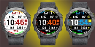
The idea for this app is simple:
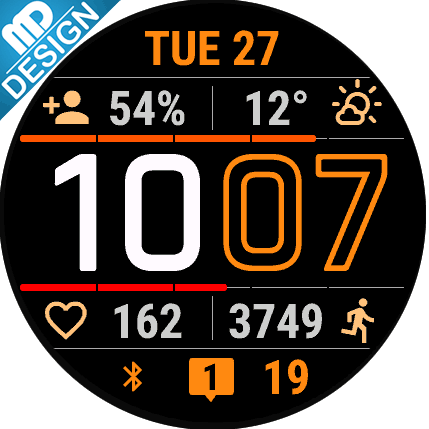
- Use only large fonts, so that all data are visible at a glance (hence the name of the app: Glance   )
- Put as much data on the screen as possible, without sacrificing font size above
- Make all data fields customizeable to your needs
- Make colors customizeable as much as possible, so users can create their own design

The "Glance Watch Face" app is 100% FREE - no hidden restrictions, nagging, or expiration:
https://apps.garmin.com/en-US/apps/07ae ... 07e8035fae

There is also a mostly free app - BIG EASY: apps.garmin.com/.../86ec352b-da01-4806-8972-770c6d32a5e8

There are also two paid versions of this app - "Glance Pro":

https://apps.garmin.com/en-US/apps/ac4be3ce-f0f3-4c49-be01-5fa52614ab2b

and "Glance Dual Screen":

https://apps.garmin.com/en-US/apps/5c0fe72b-f045-4366-a878-d3e67c600868

Paid versions are identical to the free version (so no worries, FREE doesn't mean bad!), but have a lot of extra features features:

  • Open Weather Map support
  • Setting for TIME font weight
  • New way to use shared color themes
  • Support for many new metrics (like Body Battery, Stress Level, and lots more)
  • Extra progress bars and Graphs (in Dual Screen only)
  • Two separate data screens (in Dual Screen only) 
  • A lot more - see apps description for the full list
  • You have an opportunity (and a small incentive) to support the development Slight smile

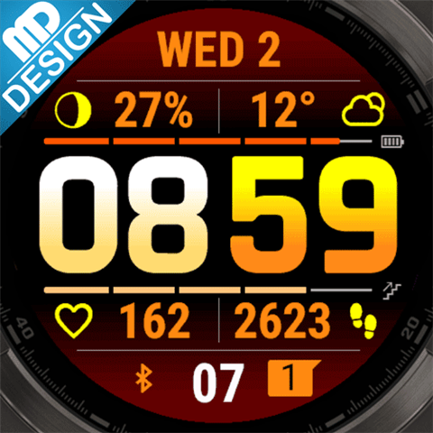
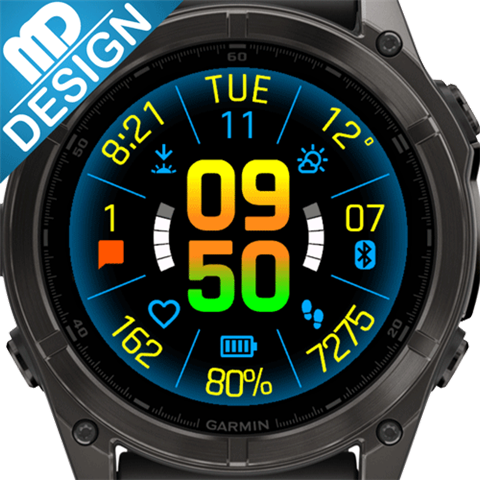
Unique feature of the Glance apps - you can save your own Color Themes and quicly switch between them righ on the watch.

NEW: Now you can SHARE your Color Theme! You can also quickly apply Color Themes shared with you. Here is a full description of how it all works: https://www.mobiledriveway.com/glance.html#color

Here is the current Color Themes Gallery: https://www.mobiledriveway.com/glance_gallery.html

Color themes are compatible between "Glance" and "Glance Pro" (except for "inactive status icons color", which became obsolete in "Pro").

I'd love to see all color combinations you came up with. Please post your themes in the Reviews and I'll add them to the gallery!

Questions and suggestions are welcome!

  • Does exist Glance Pro for Instinct 2 Series?

    No, not really possible to add any extra features to Instinct 2 due to a low memory. I have a few spots reserved for System 5 metrics (like body battery) when the watch will be updated, but that's it.

  • Possible, but these are a single sport dedicated metrics that would be better in a widget. If you use my Universal Widget Pro, I can add it there. Let me know.

    I do not think so. You have added all new ciq 5 metrics except for the two vo2max. I think there are some users here who run or cycle and would be happy about it. Furthermore, that would also be a unique selling point ;)

  • Congratulations on a great job! - this is my favorite watch face.

    I have a suggestion on how to present the time to sunrise / sunset - in tactical watches it can be displayed as the time remaining until sunrise / sunset instead of the time of this event.
    Maybe in your shield you would enable such a possibility.

  • Thanks! I'll keep your suggestion in mind.

    Maybe it is the time I give everyone an overview of how I decide which features to implement in the app.

    Right now the list of settings is already overwhelming - even as a developer I have a hard time finding what I need Disappointed. However, I want to make sure the app is still easy to use for an average user. That is a difficult ballance. There is also a problem with memory - the app is close to the limit on many older devices, that is why I had to actually remove some of the features. Now I do have a little bit of space left, but I reserve it for the most important requests only.

    So, it comes to the following:

    • Please continue sending me your feedback, suggestions, and requests. They are all great and I appreciate you share them with me.
    • Do not get discougared or upset if your request is not implemented right away. I receive lots of requests of all kind (20-30 different ones at the moment), and I can only implement a few of them (based on the reasons above).
    • Some of the most popular requests do get implemented eventually. It just takes more people asking for it - so your voice always counts, even if it doesn't feel like it.

    Cheers

  • Thank you very much for your message.

    Today I installed the PRO version to test its capabilities and my biggest surprise was the lack of this beautiful system font (hours and minutes) and instead its enlarged font used to display smaller subtitles in the system.
    The one that is in the "Glance Watch Face" version is much prettier in large numbers. I come back to this shield :)

    regards

    Jack

  • biggest surprise was the lack of this beautiful system font (hours and minutes) and instead its enlarged font used to display smaller subtitles in the system.

    I'm not sure what you mean by "smaller subtitles in the system". All metrics fonts are exactly the same, only Time font has changed. Try different font weights settings - bold font is pretty close to the stock.

    Thanks

  • Yes, you are right - the smaller data is OK, it's just this TIME font - the system font is much prettier for time display. I am a graphic artist and the typography of the dial is extremely important to me ... It is not important for everyone :)

  • Best watchface by far for the Instinct 2. I will absolutely donate. I did have one request. Is it possible to add an alternative date option for the round window to have the data stacked like the stock faces? In otherwards showing WED with 4 below it rather than side by side. It's obviously subjective but I like how it looks better and allows the date number to be a little larger. Thank you so much for this one. Super nice job 

  • Best watchface by far for the Instinct 2.

    Thanks!

    Is it possible to add an alternative date option for the round window to have the data stacked like the stock faces? In otherwards showing WED with 4 below it rather than side by side.

    The way all metrics are implemented now, they are displayed kind of the same everywhere. Making a special format for a date in sub-windowisn't easy.