Data Field: Peter's (Hi Vis) Pacer

Description
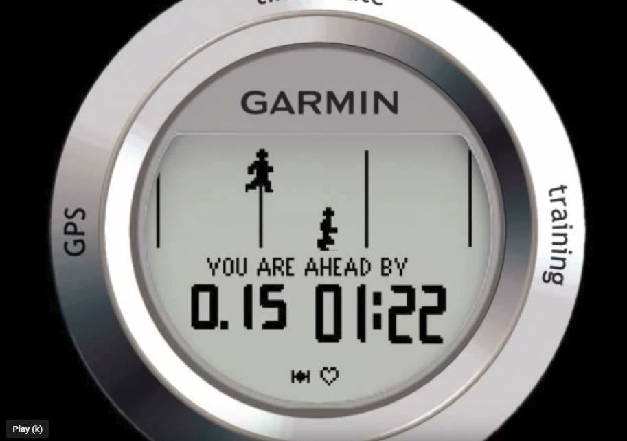
Peter's (Hi Vis) Pacer helps you to ride/run the perfect race.
This is a spinoff project from Peter's (Race) Pacer, while it has many similarities it took me a while to create as it's a completely seperate code base.
It's different in the following ways:
  • high visibility less data is shown on the screen, which means that it is easier to read - eg for people with bad eye sight.
  • it can be used in non-single field mode, this means you can put it on the same page with other datafields of your choice!
  • It's also optimized to run on Edge devices, this means you can just as well use this field to pace your bike races just as your running races....
Adjusting the race distance
In a race when you are next to the race marker press the LAP button, the distance will now be corrected to the nearest lap position - eg 5.08 will correct to 5, 8.8 will correct to 9. After pressing the lap button the distance will be adjusted and all averages will be recalculated against this new distance figure.
When you miss a lap marker do not worry: do not press LAP and go for the next lap marker.
When you press the LAP marker by mistake you can undo the (last) correction by pressing the LAP button again - within a 30 second window

Donations
The data field is fully functional as is, yet donations are encouraged on the watch by an encouragement text.

Download
Download link: https://apps.garmin.com/en-US/apps/5...4-e3afdd10eddf
  • something like this (from the old Garmin Forerunner 405) would be perfect community.garmin.com/.../1440024.jpg
  • That's what the hi-vis pacer does. Shows you where you are relative to your goal pace, ahead or behind, minus the running man graphic.
  • Hi Peter,

    I'd like try the Hi-Vis pacer with 4 fields showing at all times (ETA, current pace, distance, and timer), and not use carousel. Can I set this up using Hi-Vis in multi-field mode? If so, how should that be set up?

    I took a stab and tried choosing 4 field layout in the watch (FR235), and then choosing Hi-Vis for all fields, but that doesn't seem to be the right way since it only allows me to include up to 2 Connect IQ items. Which layout is needed, what should be entered in each, and do the app settings on my phone then need to be done any differently?

    Thanks, Trang
  • That's not possible.

    the closest you'll get is to choose a 1-field layout to show the single field layout which shows 2 or 3 data points simultanously
  • Hi Peter...

    I set the 1 field to show ahead/behind time and the second field to show ETA (i set the 3 field to blank)

    The ETA is not showing the projected time but the AVG PACE to achieve that ETA that I set on CIQ, even after start the timer... Maybe this is simple to fix, but it's important for you to know...

    I have < 10% of vision accuracy and for me it would be wonderfull if I could set only 1 field (put the 2 field blank too)... Or add Perfect Pace in the second field so I could see the red/green to know if im on target time and the perfect pace in the second field to know if i can adjust my pace...

    Wonderfull App

    Cheers!
  • The ETA is not showing the projected time but the AVG PACE to achieve that ETA that I set on CIQ, even after start the timer... Maybe this is simple to fix, but it's important for you to know...


    As soon as you start running/moving the ETA will be displayed.
    Not sure why I display the average pace initially, it looks like a bug, I'll add it to my list to check this

    if I could set only 1 field (put the 2 field blank too)... Or add Perfect Pace in the second field so I could see the red/green to know if im on target time and the perfect pace in the second field to know if i can adjust my pace...

    Investigating whether I have sufficient memory for Perfect Pace was already on my to do, I've add the request for the big single field. I'm already using the biggest native font so the font wouldn't be any bigger in this case, but maybe I can center it more.
  • My idea for ahead/behind time on a single field is like the attached photo (sorry for the iPhone edit lol)

    ">https://ibb.co/b5CZ4vV" />
  • Wouldn't it be better to color it completely?
  • Well i saw some comments here that sometime people say its hard to read with the red color as background (and im on this group lol) so thats the reason i think in this solution because Garmins default screen is white with black and bold color and you just put the colors indicators on the screen as i show to you... thats just my opinion to help you improve this wonderfull app
  • Hi, Peter, registered user here. I've already successfully used this or the original (Race) Pacer in multiple races. Thanks for a great pair of data fields.

    First, I'll mention that the link to this topic from the app site was broken by Garmin's recent forum changes.

    Second, I'd like to second the request for Perfect Pace in this (Hi Vis) Pacer, at least for CIQ 2/3 devices. My sight is just fine, but the smaller number of fields and larger fonts are easier to read at a glance when I'm focused on a very hard effort. Sometimes it's nice to leave a little in the tank instead of going all out, and PP helps with that. Perfect Pace for the Perfect Race!Tm