ANT+ HRM Heart Rate Monitor 
 ️
️
Displays the heart rate from an external ANT+ heart rate monitor (chest strap or arm band or another watch).
I'm proud to be one of the Runner up's in the Best New App category of 2022 Connect IQ Developer Award Winners: https://www.garmin.com/en-US/blog/general/2022-connect-iq-developer-award-winners/
This data field connects to an ANT+ external (auxiliary) heart rate monitor in addition to the built-in OHR (optical heart rate sensor) or the sensor paired in the system settings, displays the HR and records it to a FIT file for comparison and analysis of the measured HR.
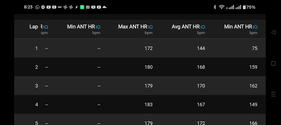
Fields saved to the FIT file: HR, min/avg/max lap/session HR, AntID, alias, HR zone.
Support Forum: https://t.ly/K3kL
Send me a beer: https://paypal.me/GavrielF or write a review.
Note: you shouldn't pair the ANT HRM with the watch!
(You can disable it: Menu - Sensors & Accessories - [Your HRM] - Status - Remove or Off)
### Terms
- "internal", "watch", "WHR", "OHR" sensor is used for either the built-in wrist heart rate sensor or an external (ANT or Bluetooth) sensor that is paired and connected to the watch (Menu - Sensors & Accessories - [Your HRM] - Status - Connected)
- "external" or "HRM" or "auxiliary" is used for any ANT sensor that is not connected to the watch but is broadcasting and the watch is receiving it's signal. It can be a chest EKG sensor or optical armband or even the training partner's watch that is set to broadcast HR on ANT (Menu - Sensors & Accessories - Wrist Heart Rate - Broadcast During Activity - On)
Initially, the strongest external sensor's signal is picked up and remembered throughout the activity.
To avoid tracking the wrong sensor (for example during a race where many people run with ANT HR sensors), the ANT ID can be fixed in the data field settings.
### Use cases
- Comparing an auxiliary heart rate sensor (i.e: chest strap or armband) to the internal optical HR sensor of the watch
- Compare two ANT+ sensors (one connected to the watch vs one not connected to the watch) to see the difference and analyse them
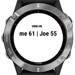
- Monitor and record a training partner's HR for pacing during an activity. My device natively connects to my HR sensor and this data field connects to my partner's, so during the activity I can see how hard they are going while pacing in the front, and still - in parallel - see and record my own HR
- Monitor a horse's HR during a horseback ride
- Comparing an auxiliary heart rate sensor (i.e: chest strap or armband) to the internal optical HR sensor of the watch
- Compare two ANT+ sensors (one connected to the watch vs one not connected to the watch) to see the difference and analyse them
- Monitor and record a training partner's HR for pacing during an activity. My device natively connects to my HR sensor and this data field connects to my partner's, so during the activity I can see how hard they are going while pacing in the front, and still - in parallel - see and record my own HR
- Monitor a horse's HR during a horseback ride
### Settings
- Only connect to ANT ID - If set, then it will only connect to that device. Set to 0 to search and connect to the closest device.
- Set name for connected ANT HRM - Enter an alias for the currently connected sensor. This alias will be saved & displayed in Garmin Connect in any activity recorded using this sensor.
You can save multiple users.
- Name
- ANT ID
- HR Zones - "u" - use user's HR zones | "m:{maxHR}" | "z:{minZ1},{maxZ1},{maxZ2},{maxZ3},{maxZ4},{maxZ5}"
- Low/High HR Alert - alert when below/above given zone/HR - (0 - off | 1..5 - when below/above zone | 30..255 - when below/above HR)
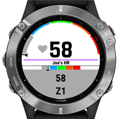
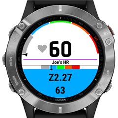
The display format can be set using 2 format strings. The watch will automatically adjust the font size and place the two parts in one or two lines depending on the available space. Format for both parts: AntHR:{H}, AntZone:integer(i.e: 2):{Z},fraction(i.e: 2.34):{z}, AntName:{N}, OHR:{o}
- Display format part 1 - i.e: "{H}"
- Display format part 2 - i.e: "z{z}"
- Display format part 2 - i.e: "z{z}"
- Delay Low HR Alert - don't alert on low HR for X seconds at the beginning of the activity
- Show HR zone gauge
- Show HR zone color - color background according to zone
- Show HR zone gauge
- Show HR zone color - color background according to zone
### Supported devices
Any ANT+ HR monitor, see: https://www.thisisant.com/directory/smart-hrm/ , i.e:
4iiii Viiiiva
Accuro LYNK2
BKOOL, Bontrager
Bowflex
Bryton
Cardiosport
CATEYE
CooSpo
Dayton
Decathlon
DREAM SPORT
Echelon Beat
Echowell
Fitcare
FITCENT
Garmin HRM/SS/Dual/Swim/Run/Tri/Pro
Geoid
Hammerhead
iBike
iGPSPORT
Kinetic inRide H1
Kyto
LIVLOV
Magene
MIO
Mobii
Peloton
Polar H9/H10/OH1/Verity Sense
PowerTap
POWR LABS
Scosche Rhythm
Senda JetBlack
Shanren
Sigma R1
Tacx
Timex
TopAction
Topeak
VDO
Vortec
Wahoo Fitness: TICKR/FIT/Run/X
Walio PULSE
XOSS
Xplova
## Languages
English
Hebrew
Hungarian
## Changelog
2.5.3.2 (2024-10-10)
- added edge1050
2.5.3.1 (2024-10-01)
- added enduro3, fenix8*
2.5.2 (2024-07-26)
- added User #3 (for newer devices)
- fixed low/high HR alert crash on older devices
2.5.0 (2024-07-16)
- added alert screen. To enable: Activity Settings ≫ Alerts ≫ Add New ≫ Connect IQ Data Fields ≫ ANT+ HRM ≫ Edit data field settings? ≫ No
- added battery icon
- added setting to record invalid HR
- added settings whether to record each FIT field to prevent crashes in case other data field records many fields
- improve contrast between background color and text
- fix for HRM-s that don't send heart beat time (i.e: MyZone)
- display ANT ID in label in case there's no name set in the settings
- added setting to hide label
- added fr165
- bug fixes
2.3.2 (2024-01-28)
- bug fixes
2.3.1 (2023-11-12)
- added new devices
- bug fixes
2.3.0 (2023-03-19)
- use bigger fonts when possible
- fixed label font size
- fixed position on edge devices
- different low HR and high HR alert tone
- changed OHR in the display format from {h} to {o}.
- bug fixes
2.2.0 (2023-01-17)
- added Low / High HR Alert (newer devices only)
- removed sensors from settings
- added new devices
- bug fixes
2.1.0 (2022-10-24)
- IMPORTANT: NEED TO SET THE DISPLAY FORMAT AGAIN WHEN UPGRADING FROM EARIER VERSION!
- changed format to use {.} instead of $.$ to prevent crashes because of bad settings
- allow extended 20-bit ANT ID-s
- fixed HR zone color, display '--' when disconnected during activity
- only connect to the same sensor when resuming activity
2.0.0 (2022-10-03)
- show name in the field label
- added HR zones
- added graphical HR zone gauge
1.0.2 (2022-06-05)
- fixed a bug in some watches
1.0.1 (2022-06-03)
- added fr255, fr955, code optimizations
1.0.0 (2022-05-31)
- IMPORTANT: Please delete and install again!
- complete rewrite. Settings have changed.
- can save alias for 3 external sensors
- added all older devices with only 16Kb memory
0.3.1 (2022-05-09)
- optimized fit file
- added settings for internal(watch) HR display
- fixed ANT certification problems
0.1 - Based on versions of IMGrant, flyingflo