This discussion has been locked.
You can no longer post new replies to this discussion. If you have a question you can start a new discussion

Why does the distance to the next turn not update?

Garmin.... oh Garmin....

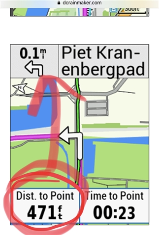
PLEASE change the "next turn" screen such that the distance at the top left actually shows the current distance to the next turn. For some reason it shows an old value at the top left and the current value at the bottom left. See image. (thanks dcrainmaker)

It would be nice to configure the lower data fields individually. Currently it's quite confusing if at the top it says 0.1 mile to the next turn ... even though I'm standing just next to the turn.
It would also be nice to have more options regarding the changing screens, i.e. configure screen 1 to show for 10s, screen 2 for 5s, screen 3 only manually.

edit: if map screen is set to high contrast, the turn screen still shows the normal map. This should use the same setting. 

  • I would second that.  I wouldn't mind if only the bottom value was shown and something else put in place of the initial one at the top.  Having the two is not optimal.

  • I'm pretty sure  you can change the bottom two items to display anything you want.

    On devices with touch screens, a long press on the item and a menu of data items is displayed.

    I'm not sure how that's done on devices with buttons,

    You might need to go through the settings menu and select "data screens" in the profile.

  • Unfortunately no, I don't think so:

    It is possible to change the data fields on the map screen (or to choose to show just the map without data fields) (can be done in the data screens menu), but this question is about the "turn by turn" screen, i.e. the one which is not one of the normal data screens but one which shows up whenever you're approaching a turn and the Edge tells you where to go. I cannot find any menu to change the appearance of that screen.

    In my opinion this screen

    -should use the same settings as the normal map screen, i.e. for example use the "high contrast" setting if it has been selected

    -should be configurable like the other data screens, i.e. it should be possible to choose which data fields to show

    -most importantly: should show the current distance to the next turn at the top or no distance at all. It doesn't make sense to show "left turn in 200m" if in fact the left turn is now only 10m away. At least I myself notice data fields at the top more than those at the bottom. Hence I rather notice the 'useless' distance value at the top instead of the "correct" one at the bottom (see screenshot above). Additionally notifications show up at the bottom and hide the "correct" distance data field. So if e.g. I get a message or a heart rate warning, I can only see the "useless" distance value at the top.

  • In the example you show, the distances are the same, albeit in different units. 471 feet is 0.09miles. Or am I missing something here? 

  • Yes - there is a huge BUG. 

    the same with my 530. The top left turn notification distances would remain static from when it first appeared and would stay permanently like that until the turn is completed. The Dist. To Point would count down the distances to the turn, as it properly should......so the Dist to Point field is working as expected. But the next Turn Distance at the top left is a big fail. IT's thrown me off a few times until i realised it can't be depended on.

    FIX THIS ASAP - Mr Garmin.

    Make this priority number 1.

  • Former Member
    0 Former Member over 5 years ago in reply to KevinJames

    YES - this is a big bug.

    The top left turn notification distance remaining number remain static and does not reduce as u come closer to the turn. It permanently displays the same distances as when it first appeared. Extremely misleading and caused me to miss my turn. It then disappears when the turn is complete.

    For now I can only rely on the Dist. to Point. It counts down the distances to the turn correctly.

    Garmin - Fix this ASAP - it's a priority 1.

  • I don't think the top left turn notification distance is intended to be the remaining number.  It's the initial value for the distance to the turn.  And as such is more or less useless and often misleading.  Having the remaining distance and letting it clock down makes more sense.  And putting this at the top would prevent, as someone pointed out, having the value overwritten by alerts.  

  • Former Member
    0 Former Member over 5 years ago in reply to DuaneHebert

    I think it has improved for me - i've read in one of the threads/messages that one has to disable World DEM....so i've done that and just have AU DEM map enabled.....and the white arrow seems to be counting down correctly....except for this one spot where it never changes...i changed screens and returned to it and it started to count down the distances to the turn.

    So my suggestion would be to make sure WORLD DEM is disabled.....that's the current theory anyway......

  • I've noticed that the countdown works when you're viewing the permanent map. However, it's the pop-up one where it's static.

  • It hasn’t changed with the pop up.