Lap+ data field

Lap+ is a single run datafield with a difference — it's made for runners who need all their lap data in a single app.


If you ever wanted...

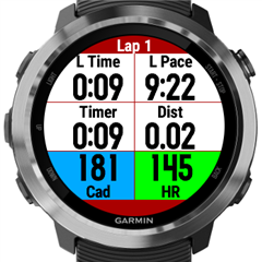
  • 6 customizable fields with any combo of lap/activity metrics you could imagine (over 100 combos)
  • (Optional) Auto splits (by time or distance) separate from your manual laps, with alerts and metrics for your splits
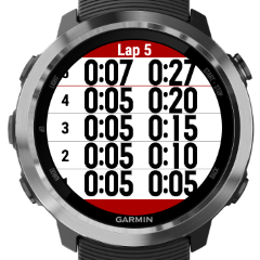
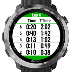
  • † To review *all* your laps during a workout

...Lap+ has you covered.

If you ever wondered why you can't see your Last Lap Max HR, or wished that your VA3 had custom lap alert data, Lap+ is for you. Want to see all your laps in a list, with any metrics you can think of, such as lap time, total time, lap pace or average activity pace? Lap+ can do that.

As someone who's run more intervals than I can count, I wanted a datafield I would actually look at while I'm resting between hard laps, so I made one. Hopefully you'll find this somewhat useful as well.

Download Lap+ from the Connect IQ store:
https://apps.garmin.com/en-US/apps/77c83bb1-925e-4323-a2ab-e97269c3cdb9

3 additional clones are available here, so you can use 2 Lap+ pages at once, or have 4 different configurations:

https://apps.garmin.com/en-US/apps/db7a382e-fdf4-4fe7-b6db-0e5591be418e

https://apps.garmin.com/en-US/apps/b3c4d41a-bc6c-44d8-8b22-c81f162204b5

apps.garmin.com/.../3a8c2ebc-2c1b-445c-8465-b543a54f3a3d


† = Not available for older devices: D2 Bravo [Titanium], Fenix 3, FR230, 235, 630, 920XT, Vivoactive

---

If you need the lap viewer for an older device or just without the 6 fields, Lap Viewer is available as a standalone datafield:

https://apps.garmin.com/en-US/apps/14e5c6b5-c9e8-44f9-a1ff-28a44148c170

  • Update 1.4

    Fix average pace and lap (average) pace.

    Average pace is now the same as Garmin's built-in average pace.
    Lap average pace is now:
    - For the first 10 (moving) seconds of the lap: current pace
    - Afterwards: calculated properly (lap distance / lap time).

  • The Lap Viewer is available as a standalone data field now, if you have an older watch or you just don't need the 6 data fields, alerts, and auto splits:
    https://apps.garmin.com/en-US/apps/14e5c6b5-c9e8-44f9-a1ff-28a44148c170
  • Update - LapViewer and Lap+:

    - For large text size, use bigger fonts and more width on round watches
    Text will still shrink to fit with 3 columns/big numbers.
    - Fix problem where lap time/total time was often 1 second short

    Medium text - 6 rows:


    Large text - 5 rows:
  • Latest Update

    Lap Viewer
    - Add setting for Auto-scroll Type: Paused/Slow or Always
    -- Now you can have autoscroll whenever you want
    - For old touchscreen watches (VA, VAHR, 630), change "hotkey" threshold to 5 seconds (from 2), to make it easier to trigger

    Lap+
    - Add optional HR/cadence coloring for all watches (colors are the same as HR gauge / Garmin Connect) [IMG2=JSON]{"data-align":"none","data-size":"full","src":"https:\/\/services.garmin.com\/appsLibraryBusinessServices_v0\/rest\/apps\/77c83bb1-925e-4323-a2ab-e97269c3cdb9\/screenshots\/7004ce58-9b20-4055-9f95-6ecb210795d6"}[/IMG2]
  • Great looking data field. I can actually see using this as a customisable "6 field runner" style data field, as well as the Lap+ functionality. A few observations and requests / suggestions:

    - Could you add another version to the store so we can have two instances installed, e.g. Lap+A and Lap+B? I'd use A as a 6 field runner, and B for LL stuff.
    - Can you explain how the lap and split interact with Garmin's built in lap and auto lap functions? I assume you need to turn off Garmin's auto lap if you want auto split functionality? Also if I use Garmin's auto 1.0km laps, does both the Garmin lap summary, and the Lap+ summary both get displayed?
    - There's quite a lot of wasted space, esp on the middle row. It would be great if the number font could be bigger. Would it be possible to have an option to hide (or abbreviate) the titles, and increase font size for the numbers? You could even have two letter abbreviations e.g. Di = Distance, Ti=Timer, Ca=Cadence etc). Might bet a bit confusing for the last lap data.
    - Could you centre the numbers horizontally within their boxes? Two numbers on the same row are very close to the centre line and at a quick glance, almost appear as one long number, i.e. it's a bit difficult to quickly identify the start of the second number.

    Thanks!
  • There is a bug in that after about 10 minutes, all time fonts shrink.
  • PatFelstead Thanks for the feedback. Yes I use it as a 6 field runner field myself. I don’t even use the auto-split functionality, but I do use the lap viewer. Lap+ also has far more lap metrics than Garmin (e.g. Last Lap Max HR). I just wish there was more general interest in this kind of field, but I understand. It’s too complex and there’s too many options, especially with how they are presented in GC.

    All that visual stuff you mentioned is a consequence of a tradeoff I made to allow for longer labels at the expense of losing space for metrics. The time fonts thing is not a bug, it’s a consequence of less space for the metrics to allow for more space for the labels, unless you put time in the middle row. Since obviously nobody likes it that way, I’ll have to change it, but I’m not sure when I’ll get a chance.

    As a reminder, if you found Lap+ useful, please leave a review on the store if you have a chance. It’s one way for me to evaluate who is actually using my free apps and finding them useful.

    EDIT: I’ve now changed most round watches to have a centred layout with very short labels. The top and bottom row fields are centred in their own boxes. The middle row fields are aligned with the top and bottom fields, until the values get large enough that more space is required, at which point they revert to being left/right justified. That way the additional horizontal space in the middle fields is used to its fullest.

    I know that’s not exactly what you suggested, but it works better than centring each number within its own box, because then the numbers would be misaligned with each other and it would look funny.

    Re: auto splits

    Yes, if you would like to use auto splits, it’s best to turn off Garmin auto laps. That way you can have Garmin manual laps that are completely separate from your any auto laps/splits, which is the point of the feature. If you leave Garmin auto laps on, auto splits still work, but now your manual laps are mixed with your auto laps as usual, negating the reason the auto splits was added in the first place. I.e. Users wanted auto laps/splits separate from manual laps.

    Notes:
    - Auto splits don’t get added to the activity FIT file, because it isn’t possible. You have to use a third party site like runalyze to see your custom splits.
    - If you have a lap or split alert in Lap+ that coincides with a Garmin autolap, then the Lap+ alert screen is displayed after the Garmin alert screen goes away.
  • PatFelstead Also I can't increase any font size with shrinking some of the fields or hiding labels. In another app I have the option of multiple field layouts which does exactly that. I will have to evaluate whether this is feasible for Lap+ due to very tight memory constraints.

    See 6 Field C, 4 Field and 5 Field layouts:
    https://github.com/flowstatedev/ciq-...-Field-Layouts

    EDIT: multiple layouts are not feasible in Lap+ due to memory constraints, except for newer watches such as 645M, Fenix 5X or Fenix 5 Plus.
  • Update 2.2
    - Use nicer centred layouts for most round / semiround (e.g. 235) watches, at the expense of much shorter labels.

    Now all of the fields can handle a four digit time/pace (e.g. "59:59") without shrinking the font. The middle row can handle 5 digits ("9:59:59") without shrinking the font.
    [IMG2=JSON]{"data-align":"none","data-size":"full","src":"https:\/\/services.garmin.com\/appsLibraryBusinessServices_v0\/rest\/apps\/77c83bb1-925e-4323-a2ab-e97269c3cdb9\/screenshots\/aacafbba-90f8-4256-b9cb-954ba7a7b949"}[/IMG2]