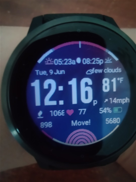
- a readable time font
- sun events
- active statistics (heart rate / steps / stairs)
- YAHOO! weather & forecasts.
- ....
I have Venu 2, and am wondering if anyone else can see HR Line chart, if you set it for the bottom chart? It just shows a blank chart for me. If I choose e.g. Pressure line chart, it shows.
hi Joerg, it's an issue on ios.
See https://forums.garmin.com/developer/connect-iq/i/bug-reports/broken-settings-in-connect-4-22-for-ios (and while you're there also upvote the bug report)
this is not handled by the watch face, the alarm is native to the watch so you'll have to contact garmin support if you have an issue with this
that looks indeed not ok, I'll have a look.
Thanks for the nice watch face. On my Vivoactive 4s, the weather sign is really close to the text. Is it possible to fix it.
I've adjusted the layout (fixed the icon location) and also decreased the font size a bit as it seems too large in your screenshot.
I've uploaded the changes to the beta version of Data Lover. Can you install this version on your watch and verify that it is indeed fixed?
The beta version download is available via this link: https://apps.garmin.com/en-US/apps/5cd7f160-804e-4ed6-aae2-186d86294a39
It is much better now. Thank you very much.
currently all the texts are 15 pixels high in the public beta (it's 18 pixels in the regular version for the data elements and sun line). I decreased the font because it was overlapping other items in your screenshot. Is the text too small now in the public beta?
Thanks for you response. For me, 15 pixel in the public beta seems a bit small. If you can only change text in weather condition (field top right) to 15 pixel, and keep other texts as 18 pixel like the regular version, it would be perfect. Thank you again.