Layer not rendering when added to a View

Hi,

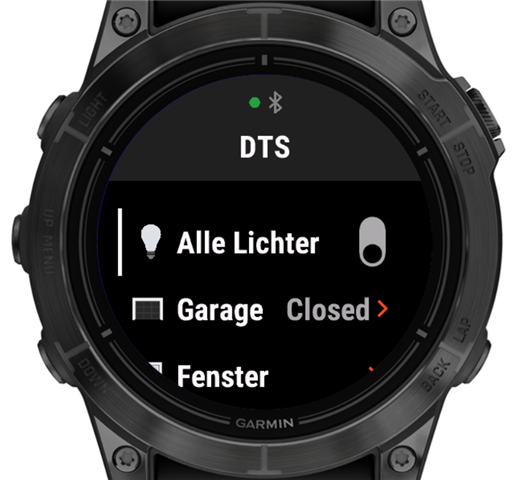
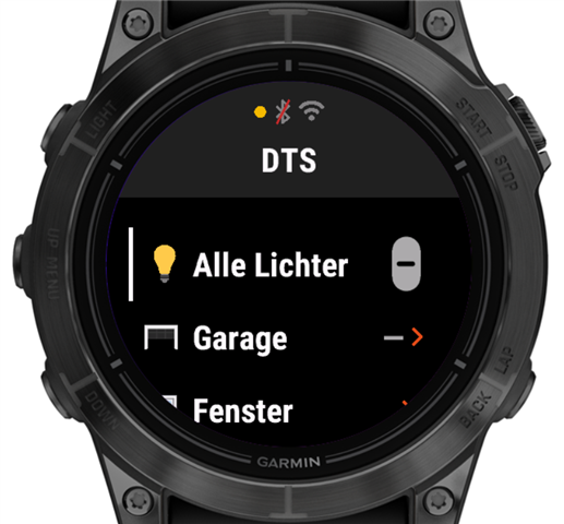
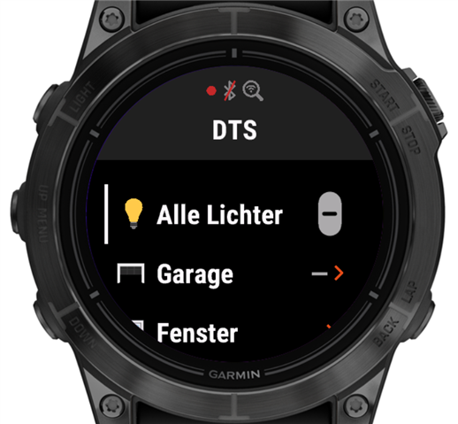
I’d like to use a layer to display a visual indicator in my app. The indicator should be a circle along the edge of the screen in a specific color, or a rectangle, depending on the screen shape. I want this indicator to appear not only on my own View implementations, but also on top of CustomMenu implementations, which is why I’m trying to use a layer.

I tried following the example in the documentation (https://developer.garmin.com/connect-iq/core-topics/user-interface/), but my layer never shows up.

Since posting code here often fails, I’m linking directly to the relevant files.

Layer implementation:
https://github.com/openhab/openhab-garmin/blob/main/source/connectivity/WifiIndicatorLayer.mc

I’ve confirmed the constructor code runs. A Dc is returned and drawing calls execute.

For testing, I added the layer to one of my views in the view constructor:
https://github.com/openhab/openhab-garmin/blob/main/source/user-interface/loading-views/WifiCheckView.mc

Is there anything else I need to do to get the layer to display?

Also, is my understanding correct that the layer is drawn on top of the view’s base Dc?

  • I guess this means that Garmin shows a full-screen wi-fi sync status page, like what you see with Spotify.

    Exactly. In fact, there are two screens. The first one shows a progress bar. Your code can report the sync progress as a percentage, and this is reflected there. At the end, a second screen is shown that indicates success or any error reported by your sync code.

    In the simulator, this final view has to be confirmed using the back button. On my Epix Pro Gen 2, the back button can also be used, but the view disappears automatically after a few seconds as well. In any case, this is not something that runs in the background while the user continues using the app.

    From the perspective of my use case, a permanent Wi-Fi connection would of course be an advantage. I am not entirely sure whether I fully understand the distinction, but there seems to be a difference between an app started as a full app, similar to an activity, and one started in widget mode, which nowadays means from the glance carousel. In the latter case, the app is automatically terminated after a certain time without user interaction. In that scenario, a permanent Wi-Fi connection may be considered acceptable, but i guess the use case is to rare for Garmin to do anything about it. 

  • I guess it's all there in the use of the word "sync", right? Garmin only wants CIQ apps to use Wi-Fi for long-running, but relatively infrequent, content sync activities. 

    I think that, originally, wi-fi sync was only available for music providers (CIQ 3.0.0), and the relevant class was Media.SyncDelegate, which is now deprecated.

    In CIQ 3.1.0, the generic Communications.SyncDelegate class was added (I assume this is because Garmin wanted to allow non-music apps to use wi-fi sync), but it doesn't change the fact that Garmin probably just wants us to use this stuff for infrequent syncs of possibly large amounts of content.

    (The docs for Media.SyncDelegate refer to syncing "audio", while the docs for the newer Communications.SyncDelegate refer to syncing "content".)

    I don't think it was ever intended to be used in the same way as makeWebRequest over BLE (general purpose communication).

    I also seem to recall talk in the forums that a regular makeWebRequest would automatically use Wi-Fi assuming the device was already in "wi-fi mode" (e.g. say it recently performed a native sync over wi-fi), but there was no way for CIQ apps to force wi-fi to be turned on in this case. CIQ apps could only implicitly use an existing wi-fi connection. This was before the wifi sync delegate class even existed, I think. So this behaviour is probably still around, but it still doesn't help you because it will only apply in the rare times that wi-fi had already been activated by some other means.

  • I also seem to recall talk in the forums that a regular makeWebRequest would automatically use Wi-Fi assuming the device was already in "wi-fi mode" (e.g. say it recently performed a native sync over wi-fi)

    Yes, I observed that as well. If my polling timer triggers immediately after a sync, it may still succeed, even though the sync has already ended. Therefore, when determining whether BLE is available, I also needed to take connectionInfo into account.

    However, the time during which the connection remains open is only one or two seconds.

  • WiFi also has a much larger impact on the battery than BLE, and establishing a wifi connection takes more time than just using BLE.

    With some devices, using wifi to download music required that the Garmin be connected to a charger so the battery didn't die while the sync was in progress.

    On at least some edge devices, when you first turn them on and before you start an activity, it starts up wifi for things like downloading FW, syncing with connect, etc.  Those are the only devices I've seen that start up wifi all on their own.

  • It seems like this would be confusing to users - if they didn't read the manual, they might think the presence of a wi-fi icon is a good thing and its absence is a bad thing.

    Just to follow up, I have now implemented a permanent connection indicator. A green Bluetooth icon indicates a phone connection, while a red Bluetooth icon combined with a blue Wi-Fi icon indicates Wi-Fi mode.

    When starting without a phone connection, the app now displays a full-screen view while searching for Wi-Fi, featuring more detailed iconography:

    If no connectivity is available, the app switches to the following view.

  • I have no formal UI/UX education, just as a user (and as a developer who knows how hard it is to do it right) I think the first 2 icons are confusing a bit. If I didn't know the meaning from the thread, just by looking at the 2 familiar icons I would think that having both icons displayed is better than only having the Bluetooth icon alone. And also maybe it's better to have a non-color differentiator (i.e the BT icon vs a BT icon with an X or a / over it) so color-blind people don't have issues understanding it.

  • Yes, I was not entirely happy with the icons either. I therefore tried a monochrome approach, using only a red slash over the Bluetooth icon to indicate that it is not available.

    The reason for showing only the Bluetooth icon is that, while connected via Bluetooth, the app does not know whether Wi-Fi is available. Checking for Wi-Fi is relatively costly, so I wanted to avoid doing that unnecessarily.

    In general, my users are quite tech-savvy. They are the kind of people who set up their own open-source home automation servers. I doubt there is any icon that can fully convey the limitations of Wi-Fi mode and the reasons behind them. However, I believe that when actually using the app, the unavailable states and the full-screen sync views make the situation sufficiently clear.

  • I doubt there is any icon that can fully convey the limitations of Wi-Fi mode and the reasons behind them

    Just my 2 cents but maybe I'd go with:

    - Bluetooth available: [network status icons] + green checkmark

    - Wi-Fi available (but not bluetooth): [network status icons] + yellow warning triangle

    - No network: [network status icons] + red X

    What would be kinda cool (but unobtrusive) would be if the status icons were repeated in the top menu item, and selecting that item would give you a page or two of explanation. The explanation could also be shown if the user taps on the header (if possible). Maybe it could be shown if you scroll towards the header (by pressing the UP button when the first item is displayed, or DOWN when the last item is displayed).

    Kinda like the sensor info page which explains the meaning of "open connection", etc. Maybe that's a bad example tho haha.