How to properly use Picker?

I started using the Picker today - or at least tried to.

So far, I’ve run into two issues I haven’t been able to solve. I’ve tested both in the simulator and on a real device, and the problems occur in both environments.

  1. Scrolling behaves oddly
    I'm testing with three items. The Picker initially requests item 0 from the factory, but then the up/down behavior seems reversed.
  • Pressing up cycles through index 1, then 2, then wraps back to 0.
  • Pressing down jumps from 0 directly to 2, then to 1, and back to 0.
    It feels like the direction handling is flipped.
  1. Screen isn't fully cleared
    I created a custom class derived from Picker, implemented onUpdate, and cleared the Dc there — following the SDK example. I also override the Drawable of the picker elements and clear the Dc in that context too, since otherwise new elements just render on top of the old ones.

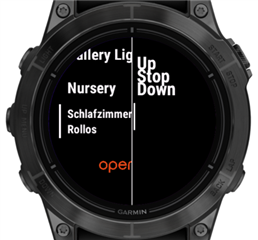
Despite this, parts of the underlying view still remain visible. Below is a screenshot showing the view before launching the Picker, followed by how it looks once the Picker is shown.
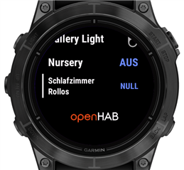
Any ideas or recommendations on how to resolve these issues?
Thanks in advance!

Top Replies

  • Not sure. The SDK sample seems pretty straightforward and doesn't seem to suffer from the same issue that you're seeing.

    I was just able to fix the issue.

    It appears to be related…

All Replies

    1. Scrolling behaves oddly
      I'm testing with three items. The Picker initially requests item 0 from the factory, but then the up/down behavior seems reversed.
    • Pressing up cycles through index 1, then 2, then wraps back to 0.
    • Pressing down jumps from 0 directly to 2, then to 1, and back to 0.
      It feels like the direction handling is flipped.

    I wouldn't say this is flipped.

    You're thinking of this as analogous to scrolling through a menu of items (ordered top to bottom) or perhaps choosing from a drop-down (e.g. HTML select element), but I think of this as analogous to using a number picker.

    An HTML number picker increases the number when you click the up arrow (or press the up key) and decreases the number when you press the down arrow:

    https://www.w3schools.com/tags/tryit.asp?filename=tryhtml5_input_type_number

    On Windows and Mac, native number pickers also work this way.

    Yes I realize it's kind of the opposite on an iOS device for number pickers such as setting an alarm: in this case you swipe up to increase the number (which is usually the same as "scrolling down"). But even on an iPhone or iPad with a connected keyboard, giving a native number picker keyboard focus and pressing the up key increases the number (in violation of the usual rule of thumb that swiping in one direction is the same as scrolling in the opposite direction.) Maybe it's a hint that UI designers don't really think of this as scrolling per se. When you press the up key, you're not scrolling up through the list - indeed the iOS device visually shows you moving *down* through the list as the number increases - you're *increasing* the value.

    Perhaps more importantly, this is how native number pickers work in Garmin devices - e.g. when selecting reps or weight for a set in a Strength activity.

    In your case, when you press up, you're not scrolling through a list of items that are ordered top to bottom, you are "increasing" the currently selected item (from index n to index n+1). Or pressing UP gives you the next item while pressing DOWN gives you the previous item.

    [Then again, Garmin number pickers work the opposite as iOS as far as swiping goes. Here, swiping up decreases the number and swiping down increases the number, as the numbers are ordered as increasing from bottom to top. Garmin does present this as normal scrolling, where the touch swipe direction is the opposite of the button scroll direction.]

  • You're thinking of this as analogous to scrolling through a menu of items or perhaps choosing from a drop-down (e.g. HTML select element), but I think of this an analogous to using a number picker.

    Yes, that makes sense - I see where you're coming from.

    That said, I’ll probably need to look for a different solution. I need to select from a list of longer strings, and the space the Picker provides is quite limited for that use case.

    What I’m trying to do is use a CustomMenu with CustomMenuItems to represent home automation devices. The idea was to use the Picker to let the user choose from a list of commands that can be sent to a selected device.

    I’ll take a look at ActionMenu next. And if that doesn’t work out, I’ll likely fall back to another CustomMenu as a last resort.

  • I think an action menu would be a nice solution for a context sensitive menu that doesn't take the user out of what they're currently doing. (That's probably the reason Garmin introduced them.)

    As far as pickers go, idk if there's any right or wrong answers, just conventions. (Look at how Garmin number pickers are subtly different from ios number pickers. iOS number pickers use both swipe up and the up key to increase the number, but Garmin uses swipe down and the up key to increase the number.)

  • As far as pickers go, idk if there's any right or wrong answers, just conventions. (Look at how Garmin number pickers are subtly different from ios number pickers. iOS number pickers use both swipe up and the up key to increase the number, but Garmin uses swipe down and the up key to increase the number.)

    I also have a use case for a number picker - for example, to select the dimming level of a device.

    Do you have any suggestions on how to properly clear the screen when using a Picker? I tried replicating the approach shown in the SDK example, but I may have missed something.

    Any tips would be appreciated!

  • Not sure. The SDK sample seems pretty straightforward and doesn't seem to suffer from the same issue that you're seeing.

    I guess I'd have to see your code and try it out.

  • Not sure. The SDK sample seems pretty straightforward and doesn't seem to suffer from the same issue that you're seeing.

    I was just able to fix the issue.

    It appears to be related to the problem described in the link below. I am calling setClip on the Dc inside CustomMenu.drawTitle, and that somehow carries over to subsequent views in an unexpected way. It’s not just the clip region - the entire area of the menu title gets clipped in the next view that’s pushed onto the stack or switched to.

    Simply clearing my own clipped region didn’t help. What actually resolved it was explicitly calling clearClip() in the next view that’s being shown.

    This also resolved the issue I was having with the Picker.

    forums.garmin.com/.../setting-clip-in-custommenuitem-drawtitle-affects-subs

  • It's the bug that keeps on giving!

  • Speaking of bugs - have you worked with the ActionMenu before?

    In my initial attempt, I’m seeing some strange behavior: the menu opens with the three items I added, but they appear above the focus indicator and with no spacing. It’s as if the items are rendered in the wrong place. I can still scroll through the (invisible) list as expected, but the labels are drawn where they shouldn’t be.

    I’m not sure what I could be doing wrong here - with the ActionMenu, all I’m doing is adding labels and IDs. The SDK handles the rendering entirely, so it’s unclear where things might be going off.

    I’ll need to test on a real device to see if the issue persists there.

  • Looks like this is just a simulator issue - everything appears fine on the actual device.

    Functionality-wise, the ActionMenu isn’t quite what I’m looking for either. Ideally, I’d like to be able to define which item is initially focused, and handle a selection without automatically exiting the menu.

    A CustomMenu might be the better approach after all...

  • How has your experience with the Picker been on real devices?

    I now used it in a place where it fits quite well. On my Epix 2 Pro, it looks good, but I noticed there are no indicators for “accept” or “cancel.” Shouldn’t there be a default for the "accept“ at least?

    I’m curious to hear how it looks and behaves on other devices, especially touch-oriented ones like the Venu or Vivoactive.