Instinct glance icon requirements

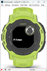
Hi, I updated my app to work with Instinct watches but I have trouble related to glance icon. It is not shown. In glances list there is white circle instead of icon on real watch.

My launcher icon is SVG. I tried both white icon on transparent background and black icon on transparent background but result it the same. 

In simulator everything is fine. 

Any advices? 

  • I use png files on the I2/s with no problem.

    Maybe try b+w with no transparency?

  • How the PNG should look? White icon on black background or black icon on white opaque background?

    It is confusing that in simulator icon is white on black but in my device icon is black on white. 

    I wish Garmin specify what format it should be (PNG or SVG?) and whether it should be white on black or black on white.

  • Here's one of mine with a png with a few things other than B+w (red for the raspberry for example). and it looks the same in the sim and on an I2.

    The only time I use svg images is for the icon used when publishing a complication.

  • The dithered colour image doesn't look good in my case. I wanted a custom simple image created with a 1-bit color scale in mind.

    In the end, I found that black on a transparent PNG background looks good on the device. But on the simulator it looks completely wrong :-/ Black colour on a white background looks better in the simulator, but has artifacts on the edges.

    I wish got the spec from Garmin instead of guessing. The documentation for the whole development is weaker than the documentation I'm used to read on other platforms (Android, iOS).

  • Understand CIQ isn't like Andriod or iOS.  If you go to Help>About in the sim and then you click on developers, that's really about the size of the Garmin engineering staff for CIQ.  A few of the names have changed, and maybe a few were added, but it's really not a large group at Garmin.

  • I'm in the same shoes. I have a 1 color (+transparent background) svg that I'd like to be the launcher icon for a datafield and a watch-app.
    Do we know in which device should I do:

    	<bitmap id="launcher" filename="launcher.svg" dithering="none">
    		<palette disableTransparency="false">
    			<color>FFFFFF</color>
    		</palette>
    	</bitmap>

    and which devices:

    	<bitmap id="launcher" filename="launcher.svg" dithering="none">
    		<palette disableTransparency="false">
    			<color>000000</color>
    		</palette>
    	</bitmap>

  • I always use png files for the launcher icon.  Not sure how well the resizing and the extra stuff you include works based on the device's icon size..

    I just use

    <drawables>
        <bitmap id="LauncherIcon" filename="my_icon.png" />
    </drawables>
    what happens if you try a png?
  • Jim the question is not about the file format. It doesn't really matter in terms of png or svg, I could convert it to png, and then the automatic resizing by the compiler would maybe be slightly worse.

    The question is whether a 1 color icon should be black-on-white or white-on-black. For example on fr965 the background of the activity list is black, so a white-on-black (or white-on-transparent) would fit fr965. But would such a launcher icon fit all devices?

  • Don't use transparent,,  Just use black and white.  It will look the same if the background is white or black.  That might not be consistent even on the same device based on settings or where the icon is being shown,

  • I don't want to be consistent with my app's logo on other device that the user probably doesn't have, thus never saw. I'd like to be "consistent" with the device they own.

    On fr965v all the app / activity icons are either transparent or black background with the icon. So for fr965 I'd prefer such a logo: black background with white color logo on it.

    But if another device has white background I'd rather not have a black square with my white logo on it, but the inverse: white background with black logo on it.