How can I improve my Bitmap's quality?

I would like to improve my bitmap graphics in my watch face. Here is an example of the problem I'm facing:

As you can see in the picture above, the man to the left is what I actually get. The man to the right is what is actually in the .png file. It is actually only a 25 x 25 pixel file.

Thanks.

Top Replies

All Replies

  • You definitely made my day!!! Thank you so much! 
    Now I have to try and see if automaticPalette="false" works in darkMode as well...

  • For .svg (since it's not a raster but a vector image) I was expecting something different... 

    I think the resource compiler converts vector images to bitmap, after scaling / modifying the palette / etc., so the device and simulator only see the resulting bitmap.

    (Not to state the obvious haha)

  • Now I have to try and see if automaticPalette="false" works in darkMode as well...

    Again not to state the obvious, but since automaticPalette is applied by the resource compiler, the resulting bitmap will be same regardless of whether you have a white or black background at runtime.

    The problem here is that your icon will probably be nearly invisible if the background is black.

    Here's some possible solutions:

    - I need to dig up the example I'm thinking of, but some devs get around this by designing icons that look good either on a white or black background.

    For example, you could draw a white outline around all the black lines in your icon (not just on the outside, but also on the inside.) When the background is white, the outline will be invisible, but when the background is black, it will be crucial.

    EDIT: here's the example I was thinking of:

    https://forums.garmin.com/developer/connect-iq/f/discussion/330684/instinct-glance-icon-requirements/1884641#1884641

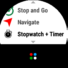
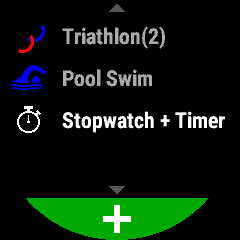
    The stopwatch + timer launcher icon looks good (well, ok) on either a black or white background, due to the black outline around the white lines.

    - Another way to approach this would be to have two sets of icons: one for light mode and one for dark mode.

    - You could use a font for your icons, so that it could be drawn in the solid colour of your choice (white or black), and any anti-aliasing would be performed on the device

    - You could use a single set of single colour bitmaps, and swap the palette from white to black or vice versa. Of course the whole point of this thread is to avoid using a single colour for your bitmaps.... (This would only work if you could handcraft bitmaps which look perfect at the resolution of your choice without any anti-aliasing.)

  • I tried with font but with no luck. Also I do have a Mac and I haven't found an easy way to build .fnt from .svg images. 

    I'll try with the 2 icons approach: one for light mode and one for dark mode. 

    Thanks again!

  • Also I do have a Mac and I haven't found an easy way to build .fnt from .svg images. 

    As mentioned in the other recent thread where this was discussed, you should be able to use this procedure, which I've updated to include instructions for Mac:

    [https://forums.garmin.com/developer/connect-iq/f/discussion/165912/custom-font-icon/902230#902230]

    TL;DR:

    - Use FontForge to convert SVG to TTF

    - Use fontbm to convert TTF to FNT/PNG

    (The difference between Windows and Mac is that Windows uses the original bmfont program, while Mac uses the fontbm command line tool which is compatible with bmfont)

  • Yes and that's exactly what I tried. But the result on both the sim and real device was not as great as expected and that's why I reverted to bitmap. 

    But I don't want to talk about font here (someone already warn me to do not post on different threads about the same topic); here's how to render an image (both svg and png)on the device screen properly.

    Thanks again for the support!

  • Yes and that's exactly what I tried. But the result on both the sim and real device was not as great as expected and that's why I reverted to bitmap. 

    I see - sorry, I should've checked in on the other thread to follow up.