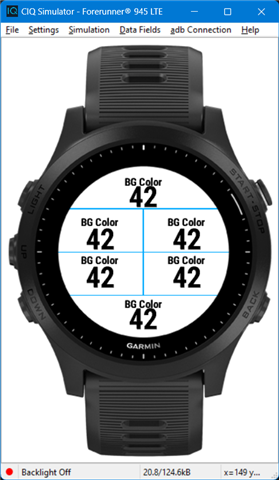
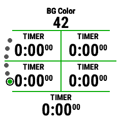
What is the best practice for font and position of datafield label? I'm sure I'm not the 1st developer that tries to create a custom field and want it to look like the native. (Using SimpleDataField is not a solution, there are graphics also, just not shown on the above images) Which font should I use? Where should I position it? Or should I have a different font and position for each device? (maybe for each datafield-layout?) If the answer is to do it per device then is there a way to see a default datafield in the simulator? I'd like to be able to run my DF and see it next to some simple field, like Timer (or doesn't matter which)
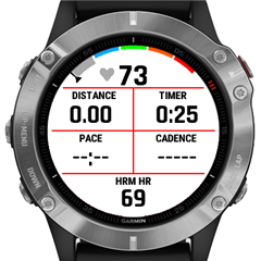
I used Graphics.FONT_XTINY for the label "HRM HR" and positioned at the top of the field. This looks exactly like the native datafields in fenix 6:

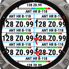
Today I saw how it looks in Edge Explore 2 compared to the native fields ("HRM B-118"):

The font is too small and the label is "glued" to the top of the field (or maybe that just looks like that because of the small font)


