I'm posting this here instead of in the Showcase since I believe it will get more traction in this forum.
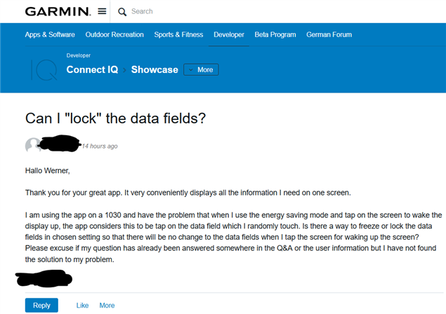
Misplaced CIQ app support request posts like this (for the SPHGRAWH data field) are a regular occurrence, even with people who use the forums somewhat regularly. These posts contain a support request for a CIQ app, with no reference to the name of the app, and usually no reference to author. What inevitably happens is the post is either ignored, or someone eventually replies with a comment asking the poster to clarify their request.

If the poster didn't mention the name of the author, I never would've been able to guess which CIQ app they were talking about.
Since this happens all the time, I'm pretty sure it's a usability issue with the forums. Multiple random people, including semi-regular forum users, can't all be making the same mistake of not knowing how to use an internet forum (the likes of which have been around for 20+ years). What's obviously happening is that people *think* they're replying to an existing support thread, but they're actually creating a new thread. Some of these posters have said as much.
I decided to try to recreate this problem myself, by putting myself in the user's shoes.
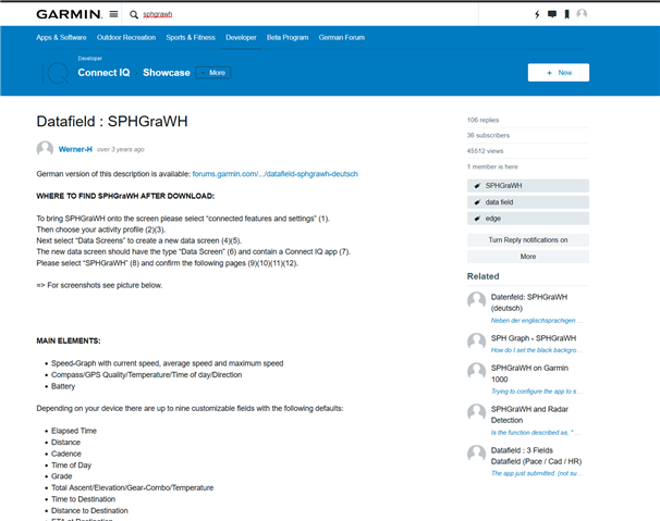
For example, if I search for "SPHGRAWH" or just click on a direct link, I'm greeted with this page:

I think it's very obvious what's happening here. People search for an app thread or click on a link provided by the app author in the store, and they're greeted with a big "New" button.
Obviously people are clicking on the New button in the belief that it will add a new reply, but in fact it adds a totally unrelated new thread.
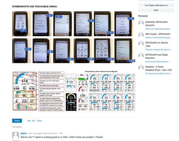
To properly reply to the above thread, a user has to scroll down quite a bit, as it's a very long post, and click on the Reply button which isn't nearly as prominent as the New button.

Suggested fix for when you are viewing an existing thread:
- Remove the New button and replace it with large Reply button (so it's prominent and at the top of the page -- no scrolling required.)
- Another helpful tweak could be to have another Reply button at the very bottom of the page (not just below the OP), so that's it's always in a predictable and prominent place when you scroll to the bottom. (Although it may not work well in practice.)


