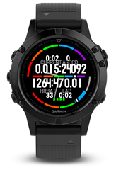
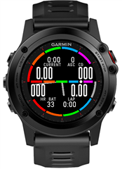
I have built a data field long time ago for my Fenix 3, now I want to adopt it to other circular devices and publish it. How to solve the problem where layout is inconsistent on different devices?
https://github.com/radulle/gevanimarun
On Fenix 3 all looks fine but on Fenix 5 you can see that text fonts are too big and big numbers too wide. Is there a way to address this?


