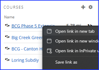
TLDR: With the list of courses on the left hand side, you cannot CTRL-Click to open into a new browser tab (or Right Click and select 'Open in New Tab'). This makes it SUPER ANNOYING when planning out what Ride/Run course I want to follow. #GarminPleaseFixThis
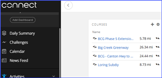
So I've got almost 600 courses saved in my Garmin Connect Courses.
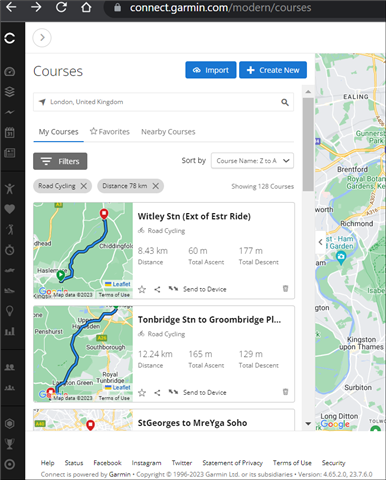
My usual workflow is to: Open MyCourses list, then filter by Type e.g. 'Road Cycling', then add a distance filter e.g '50-80 Km'
(* Props admittedly due to the Devs for the very useful new 'Course Name' filter and actually functional distance filters!)
I would then scroll through the list and open the Courses I was thinking about riding into New Tabs (so that I could look at the routes in more detail)
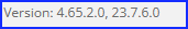
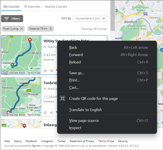
With the new UI (v4.65.2.0, 23.7.6.0) it does look better, but it has BROKEN the ability to open the separate courses into new tabs (NO Ctrl-Click or Right-Click)
If you click on a Course it loads the full Course Details page (which you could duplicate the tab), but then when you go back it has lost the Filters and you have to apply them again.
This makes looking at or comparing multiple courses almost impossible, thus making the new UI absolutely useless!
[Tested on Windows 11, Firefox v112.0 + Chrome v112.0.5615.86]
GARMIN DEVS... can this please be fixed ASAP (and if anyone knows a way of temporarily going back to the old UI, that would be really helpful!
Cheers, Derek