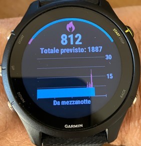
Hi, yes the red peaks are active calories and I suppose the scale on the right side of the graph from 0 to 30 should be representing the red calories values.
I just wonder how we interpretate the resting calories (blue portion): if there is no scale for it what's the sense of the graph?
I replied on this before in your other post, take your resting calories / 240 and see if it works. Mine does. Indicating that each reading is for 1/10 of an hour , on the same scale