This discussion has been locked.
You can no longer post new replies to this discussion. If you have a question you can start a new discussion

Widget calories on FR255

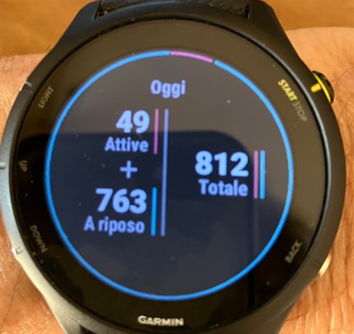
Hi all, in the image "Calories 1" I see today's at 10am calories: active 49, resting 763, total 812, the forecasted total for today is 1887.

Now, in the image "Calories 2" I do not understand the graph: the first line from the bottom should value 750, but I see the blue box just below 750 and not upper as it should be, as it's 763. 

and, what represent the red peaks?

If I have well understood the scale should be x100 calories.

thanks for any feedbacks

  • I think the graph has time on the horizontal axis, and calories per time on the vertical axis. The resting calories per time are constant, so the blue part is flat. At the end of the time period you also had some active calories on top. I don't think the scale is x100.

  • The red peaks can effectively represent 49 calories, but I can't understand the metrics of the blue part that should represent 763? We are here at 10 hours time, so 76,3cal/hour? But the scale is from 0 to 30, tricky point! 

    What do you think? 

  • I don't know. For the scale to work, it should be calories per 5 minutes or something like that....

  • You see a scale for only active calories on the right side. For an BMR, it is on the left (you don't need it, is empty).

  • Thanks, so why the red peaks start from the upper side of the blue part? Should not start from the base (time axis)?

    And could you explain a little deeper why we do not need the scale for BMR? 

  • Because this value changes at best by 1-2 cals per week, if you measure your body composition even daily. It makes no sense to make a scale for a value that will definitely not change by a visible amount in the last 12 hours. And if you will a same scale for active/BMR then you can't see your active cals at all. Compare 1600 to 100-400 you daily gains - it's simply difficult to see.

  • Understood, but in my opinion it should be a math explanation about the width of the blue part! It there's no scale for it, what's the sense to show in a graph?   

  • I mean the height 

  • I think the graph makes very little sense unless the passive and active calories are at the same scale. The purpose should be to visualize how much of the calories you burn with your activities compared to resting. Same with the curved line on top of the screen.

  • as regards the base, if each thin bar represents 1/10 of an hour , then mine is about sensible looking at the base bar on my 965 which has many little bars in each hour period.

    my base would be about 7.5 calories per 6 mins or about 1800 per day

    Of course this is my supposition based on my graph and data

    Take your last days total rest calories and divide by 240 and see if that numbers reflects where the blue line is standing, min is at about 7,5 yours looks around 6 - 6.5 so around 1560 base calories for 24 hours