This discussion has been locked.
You can no longer post new replies to this discussion. If you have a question you can start a new discussion

HOW TO: Make course line easier to see

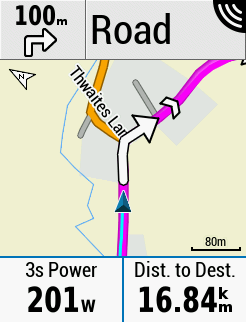
For some reason Garmin use a thin dark purple line for guidance if you're following a course. This annoys me (not least because if you navigate to a waypoint you get a nice chunky magenta line), so I've tweaked the map theme file to fix it. This is how it looks on my Edge 530 when navigating a route:

If I get around to it I'll make a tool that lets you pick your own colours and generates a theme file for you.

You need to edit one of the MapTheme files (/Garmin/MapThemes/Classic.kmtf) and add the following lines to the <stylelist> XML category:

<style field="MPM_ACTV_CRS_CLR">
			<color>
				<primary day="#ffff00ff" night="#ffff00ff"/>
				<secondary day="#ffff00ff" night="#ffff00ff"/>
			</color>
		</style>
 

  • Yes, it can be tricky to debug as if the XML isn't right the Garmin just uses the defaults built into the software &/or Map. The High Contrast & Mountain Themes have the most entries in their Themes as they make the most changes to the defaults, Classic the least changes so mostly "standard" If the color hex codes are not right format, (there might be a limited pallet of valid colors, I don't know), then they just get ignored and the default applies.

  • I uses TextEdit on the Mac and this worked perfectly.

    This is epic, for 7 years I've wanted a clear course route to follow and at long last I have a nice bright lime green course to follow. Garmin give this man a job!

  • Eureka ! finally got it to work - as advised i edited highcontrast and renamed it...... but lime green is not a good choice. It's even worse than the magenta.

  • I've created a couple of extra kmtf files, one pink and one lime green so I can switch between the two next time I'm out.

  • I've had another go at customizing the Classic theme and this time it is working, so why it didn't work making the same changes as yesterday will remain a mystery.

  • so i've changed the colors to some kind of green - i can't say it's made any improvement in legibility. I thought the line looked kinda 'slim' and weak looking - quite underwhelming -  looks like it can get easily lost still among the details in a real ride. Bummer me if Garmin was right all along with it's magenta line ???

  • The "hated" chevrons make much of the "obsession" about the visibility of the track/route line moot.

    I think it's fine people can change this to what they think is better but it's not going to be much better. 

    There's enough going on to figure it out. Nothing is going to be perfect (if you fix one thing, something else will be worse).

  • hated ?? by who?? only if you ride to and back on the same route - but which pro would do thing like that ? The chevrons are life savers man. There is no other way to distinguish the direction of the route - when u see the chevrons pointing right u know u meant to be heading right. and if it points left - go left man. So many times i had to rely on the chevrons - the colored route is more suitable for 18 year old eyes. Old timers eyes can't distinguish the finer details properly. Sure if you ride in a loop to and back the now multi direction chevrons will confuse -  but you learn not to do that -do what the pros do - Load the route for each way only.You can't please everyone all the time but the chevrons is definitely a life saver and a step in improving legibility. 

    And you're right - changing the color does not improve the route's legibility by any significant bit. 

  • “Hated” was quotes, man. 

    Otherwise, yes.