
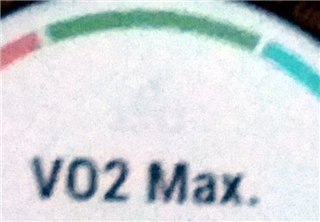
The picture isn't the clearest, but it illustrates quite well that the 'cycling' icon is very low contrast. For running it's the same. Is it supposed to look like this? I had not looked at this widget before, so I don't know if this is new since 19.10 or not.


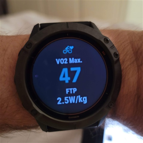
 The whole issue arose because I didn't understand the widget at first. I never paid all that much attention to VO2Max, but thought the Fenix 6 was maybe overestimating (compared to previous watch) so I had a look at the widget and there was the same number on different days. It took a while to realize they were for running and cycling. On the widget glance the icon is purple on black so that's not too well visible either.
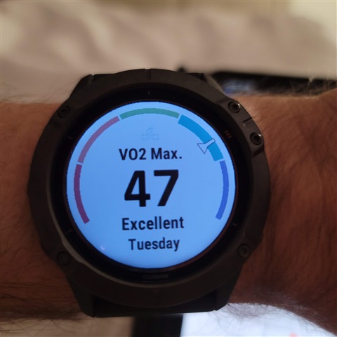