Timer : hour in tiny size after in case of activity of more than an hour

Hello,

I'm french, sorry for my english...

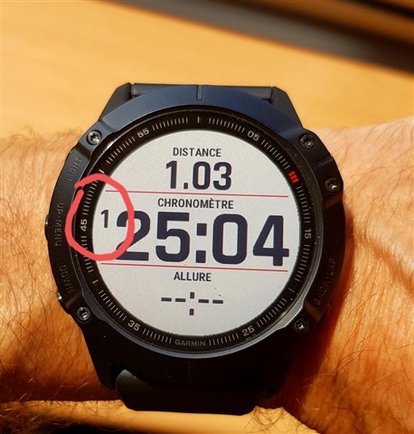
on a fenix 6X Pro, whatever data screen I choose, the timer behaves amazingly. After an hour of activity, the hours figure is displayed in tiny size, compared to the minutes and seconds figures (see picture below after 1 hour and 25 minutes...). I run long runs, trail and ultra, it's just unusable,

Who is the engineer who designed this display? He never made a race of more than an hour to conceive such behavior ...

Am I the only one that bothers? Have you found a workaround?

Thank you

  • I have just reconfigured one of my data screens to have 4 stacked data fields and have put timer in one of the middle fields. I don't really like this screen layout because numbers are fairly small and a lot of space is wasted, but it will have to do.

    And as to why I particularly dislike hours displayed in a tiny font, there are several reasons. First, I am 51 years old and my eyesight has declined. I am still not wearing glasses and OK running without glasses because I am farsighted, but I increasingly struggle to see small numbers on my 6X, especially in dim lighting conditions. The sapphire screen makes that even harder.

    Second, glancing at a screen when running faster is hard, because the picture seems blurry. I find that I often have to stop or to walk slowly to see the screen.

    Third, it is even worse at night. When using a light I find that my eyes have especially hard time focusing on the screen.

    Fourth, yes, brain isn't working well after running for entire day and into a night. Brain becomes sleep deprived and some people start hallucinating. Something that may seem trivial, like remembering whether you were running for 16 or 17 hours, becomes increasingly hard.

    Finally, I should mention that I've just tested recently introduced Ultra activity on my Fenix 6X. And yes, sadly, even in Ultra activity, Garmin gives preference to seconds over hours and renders Timer field the same way. 

  • Thanks, I can do that on my own. I'll probably go ahead and make a simple data field that just renders the timer field. I think, in fact, there may already be data fields like that.

    But the point is that Garmin could easily solve this by providing two alternative timer fields - one with small hours and one with small seconds. This would give users a choice. I'd argue that the one with small seconds would be a more reasonable choice for many activity types like Hiking, Ultra, etc. 

  • Brain becomes sleep deprived and some people start hallucinating

    Hallucinating?  What difference does it make what size the numbers are then?  You may see a 10 foot neon sign displaying 17 hrs and 10 mins, but it wouldn't matter if it were a hallucination.

    Something that may seem trivial, like remembering whether you were running for 16 or 17 hours, becomes increasingly hard

    Again, if memory is an issue, how does the display size matter?  You said, "I decided to enable auto-laps back.Thay way, at least, I'll see my time normally every mile."  I fail to see how this prevents anyone from having hallucinations or memory loss.  Font size plays absolutely no roll in hallucinations or memory loss.  I agree with your first three examples, but your fourth is a bunch of nonsense when it comes to how it's displayed.

  • Ok, here is a partial solution that I had a chance to verify this past weekend doing a 30 hour race.

    If Timer field is placed on a middle field on data screen layout with 4 vertically stacked fields, it always displays hours in the same font size as the rest of the field. That still works if the time exceeds 9:59:59.

    If Timer field is placed on either top or bottom field in the stacked layout, this workaround applies only up to 9:59:59.

    So basically, the layout algorithm works the following way - first the font size is selected based on the field height. Then, if the horizontal space is insufficient for the font size, it makes hours digits tiny; otherwise it displays hours normally.

    Thanks for experimenting and finding a solution.

  • Thanks - moved my timer field and left it running whilst I worked, can confirm that I get hours in a large font even after 10:00:00

    When it was in the bottom field (where I now have distance) it would switch to the small font at 10:00:00

  • The solutions prescribed here didn't work on my FR255 so I decided to make my own datafield. If anybody is looking at this thread looking for a solution, here it is: Big Hours Timer Datafield. And you can find it on the ConnectIQ store app by searching for "Big Hours Timer Datafield". All these people saying that it's dumb to want the hours to be a large sized font are crazy.