Cadence all over the place

Hi all

I am after some advice hopefully, I have had several injuries over the last year (ITD Syndrome (both legs) & peroneal tendonitis (left foot)), a friend of mine suggested it could be because of my running form. Because of this comment I have spent some time researching form, cadence etc.

I am now more confused than I was before.

I initially started counting my steps in my head and then when I finished a test run I realised Garmin does it for you.... Doh!

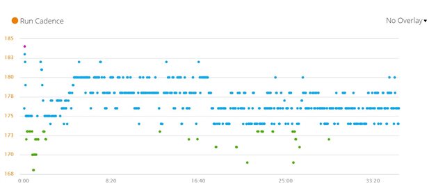
I completed a run a few weeks ago with another runner and we had a cyclist behind us for moral support, the cyclist commented on how well I run and how smooth and comfy I look while running so by this does not appear I am over striding (never thought of this until recently). However, Garmin tracked my cadence and it is all over the place.

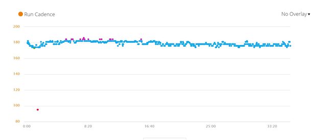
I have attached 2 images of that run, 1 is mine (all over) the other is his and we ran side by side the whole time.

I looked back into my runs and my last "solo" run was the same, in a nice straight line but all other runs this year when I ran with my dog or daughter have scattered cadence.

I guess what I am after is some advice into the injuries and what can be causing them and what my cadence could be scattered.

  • Did you notice different scales on the left on the two graphs? The top one is 8x stretched vertically compared to the bottom one. 

  • Garmin calculates the cadence from the watch sensors on the wrist, if you want to be sure of your steps you have to add RDP or a foot pod, just so you are sure of how you are running. Of course, as said by his friend, the scale is considerably wider and the points more distant from each other

  • Thanks for that both, I see what you mean about the scale, not sure how to change that, I have tried sliding the mouse etc it just wont change.

    Absolutely correct though! On the app, cadence is measured the same visually as my friends in 1 straight line, so some how on the web browser I have zoomed in, even zoom reset is not doing anything...

    Never mind, thank you again.

  • Your scale is different than your friend's scale in Garmin Connect web because the website is determining the y-axis scale based on your min and max cadence (probably excluding zeros). Based on the two graphs, none of your cadence values were below 168, whereas your friend had the one outlier around 100 (maybe a sensor dropout/bad data/very brief stop).

    In the app, when I look at my cadence the graph's y-axis always starts at 0 (and goes up to roughly my max activity cadence), probably because it picks up zeroes here and there.

    So I'm guessing the difference is that the website ignores zeroes and the app doesn't. (I'm guessing you both have a handful of zeroes in the activity, like maybe at the very beginning, or at any point the watch was paused, or when you were standing still for any period of time.)

  • When you look at your cadence in the app, do you see any red values near 0?

  • In the second image, you've got a moment where the cadence was only ~95, which caused the chart scale to get stretched to 80-200 (a range of 120). So the rest of the run's cadence looks really "tight" because of that scaling.

    In the first run, you didn't have any outlier data, the lowest was 169 and the highest was 184, so the chart scale wasn't stretched out nearly as much - it's scaled to 168-185 (a range of only 17), which is a pretty small range, which is why the cadence looks like it's all over the place.

    In fact, both charts are correct, and are showing the correct cadence (aside from that one weird reading at 95 in the second chart). The outlier at 95 probably happened when you checked your watch or something, causing it to fail to get an accurate cadence reading for a moment. If you hypothetically didn't have that one outlier at 95, the chart scaling would be different and the two charts would look very similar. If you look closely at the second chart, you'll see that (aside from the blip at 95) it similarly shows your cadence is mostly ranging from 168-185 just like the first run.

    TLDR; the charts only look different because one is showing a wide range of 120 because of the weird outlier at 95, the other is showing only a narrow range of 17 (because it had no weird outliers). But the actual data in the two charts is 99% the same.