Pace graph does not correspond with average lap pace graph

So I did a 5K time trial and ran a steady pace of just below 4:00.
My Fenix 6X gave 3:47 for the first km.
When I look at the pace graph I see the following:

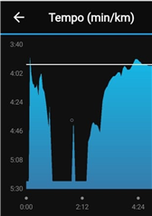
This is clearly wrong.
I never went below 4:30/km and this also doesn't add up to an average of 3:47 for that first km.
When I select the average pace/lap graph I see this:

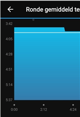
Now this is correct.
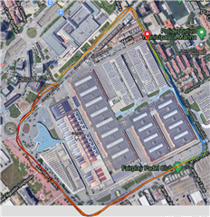
I looked on the map as to where this dip happened.
There were no strange spikes to be seen, I also didn't make any sharp turns, it was just a straight part.
This must be a bug right? I have no other explanation for it.

I'm running:
Fenix 6X
Software: 13.10
GPS: 4.80
Sensor Hub: 8.00

  • I've noticed similar issues with instant pace often being slower compared to lap splits. I've done a bit more analysis of activity data using some custom python script which confirm that Fenix 6 instant pace is consistently biased toward slower than actual pace.

    See the following thread:
    forums.garmin.com/.../instant-pace-is-neither-precise-nor-accurate-and-has-bias-towards-slower-than-actual-pace

  • Thanks silentvoyager. Interesting thread.

    I don't understand why there should be a complicated algorithm behind the actual pace. Well, at least not behind the graph of that pace. While running I understand you want it to smooth out a bit or else it would be jumping all over the place all the time. But, if the average pace for that km is calculated correctly, the data that adds up to that average must also show the correct paces on the graph. Maybe use a spline to smooth it out a bit, but what Garmin shows in the graph makes no sense at all.

    I'm a software engineer so I'm quite interested in the raw data behind this.

  • I don't think that the lap pace is derived directly from the instant pace, for the most part - it's just the total time over the total distance. If you have lap pace displayed as a field, at the start of a lap it clearly is averaged instant pace, but shifts towards time/distance.

    I'll expand on "for the most part":

    At one point I had my Stryd pod set to provide speed but not distance, and it flipped out and started showing double the speed I was actually going (hardware fault and I've had it replaced) - for the first .1 of each mile this was really obvious, but by the .1 it was clearly moving towards the true pace, which must therefore have been derived from GPS distance. At the end, the overall lap paces were all sensible, but the instance pace graph was bananas from the point the pod went wrong.

    It's clearly complicated. You'd expect a lot to just come out in the wash over a km or mile - errors in each point along the line you're travelling will average out, errors perpendicular need to be pretty big between adjacent points before Pythagoras shows them to matter, and the Kalman filtering cuts those down anyway for the most part  - so it is not surprising that they might be doing a lot of work to generate instant pace, but it is surprising that that work seems to generate numbers that don't make sense or don't add up over the lap.

  • Thanks McBadger, also interesting.

    I'm just trying to understand how this works.
    For the average pace over a kilometer I would say it is:

    sum(time) for a lot of GPS samples that add up to a km.

    So I think if you would just build up a graph from all the GPS samples and calculate the distance travelled between 2 samples and the time difference (then smooth that out a bit), you would have a much better graph than the fancy "intelligent" thing they're trying to produce now. But, I might be completely wrong...

    Anyway, they should fix it. As is, it is completely useless.

  • There's more than GPS position data going into it; there is almost certainly a velocity value coming directly from the GPS chip too, and the accelerometer in the watch provides a speed estimate as well, which takes over if GPS is lost entirely.

    Are you running under trees? The estimate gets noticeably slower under tree cover, and is usually, mmm, better than you're seeing at least with a clearer sky view.


  • The slowdown happened in the blue part which actually is a part with more trees. It happened on both laps.

  • Street view, it looks as though the sky view is not great along there, between the buildings, the trees and the overpass, and that's exactly the sort of environment that really drags the pace down, even though the actual distance accumulation is OK.

    I suspect this is coming straight from the GPS chip being really conservative about how large a distance you've moved when the satellite view is poorer, but can't prove that of course. I once ran a race with two watches, one using a Mediatek chip and one using a SirfSTAR chip, and it was interesting how the Mediatek one cut every corner and the SirfSTAR went wide of every corner, so they were clearly handling filtering quite differently. The Sony ones seem more in line with the Mediatek ones.

  • Get a Stryd footpod if you want accurate pace

  • I see this recommendation often on this forum. While I agree that a pace from a foodpod would be more accurate, especially when running on roads, I don't see why Garmin's on-watch instant pace has to be so terrible and obviously not accurate (i.e biased on one side). Other brands have managed much more accurate algorithms for instant pace, for example Suunto's Fused Speed (https://www.suunto.com/en-us/Support/Product-support/suunto_spartan_ultra/suunto_spartan_ultra/features/fusedspeed/). I used several Suunto watches myself and can tell you that the Fused Speed feature worked quite satisfactory even on difficult terrain. By the way, footpod based speed won't work well on steep terrain, when trail running, where the terrain is highly variable.

  • Agree completely. If the GPS track showed strange spikes I could buy the wrong pace. But the track is more or less ok.