Your epix watchface recommendations

Hi Epix-enthusiasts! 

Because I've already seen some nice watchfaces out there I thought it would be nice to share some watchface recommendations that go well with our beautiful watches.

Ideally, the watchfaces have a good AOD mode, too.

For a start, here is my recommendation:

SHN EDO (here with PRO functions enabled) 

https://apps.garmin.com/de-DE/apps/dcaedb61-a7b6-4bf1-a336-5a39dab18b2c
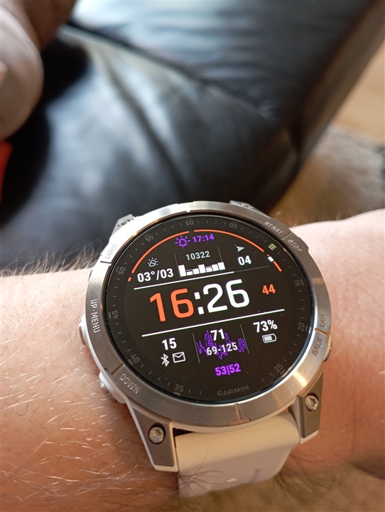
And AOD looks like this:
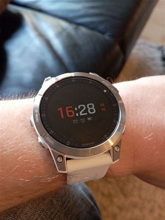
So what watchface do you like and enjoy on the epix? 

  • Hi Jaamgans,

    more types / backgrounds definitely to come. 

    This is how the always-on-mode (low power screen) looks:

    Regarding battery life: I don't know exactly. I charge my Epix2 about every 5 days. Stock watchface or CIQ, I don't see a difference. Suppose we talk AMOLED displays: Biggest impact (besides GPS settings and activity duration / frequency) is brightness setting and time to stay in high-power mode, with choices of 4, 8 or 15s (on my Epix). The Garmin firmware makes all CIQ watchfaces behave the same way: In high-power mode update the screen content every second. In low-power mode dim the display down considerably and update once a minute. Probably, there will be in impact on battery life depending on the overall brightness of the watchface (background, hands). Therefore it is good to have a black background when using always-on-mode.

    You are welcome to try on your own - free for 48h

  • the black one with just the hands - its the ambient watch face to his other watch faces i.e. what you see when you are using AOD on (always on display on) and the screen times out - the watch faces you see with the data complications and like american flag as background will disappear to be replaced with this plain watch face as it uses less battery as more pixels are switched off.

  • I really like what you have done with the ambient watch face - it looks really really good. 

    And chance of an option to turn on/off date in the ambient watch face (and maybe even shift it around the screen based on hands position).

    Assume you are using burn in protection on all the watch faces.

    Please do let me know when you have more options avialable especially with plainer backgrounds.

  • Hi Jaamgans,

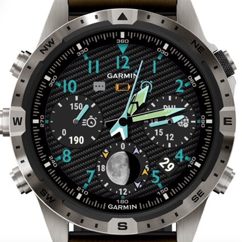
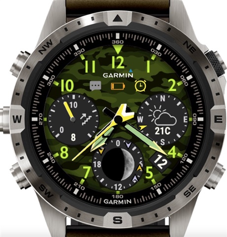
    we just had two new watchfaces approved and released to the store. Both feature a pilot style with different backgrounds / themes. I think the moon phase complication, which includes rise and set of sun and moon, is a special highlight.

    CarbonPilothttps://apps.garmin.com/apps/0e9abcd6-5619-4f79-a66d-3dd1220a24d6

    CamoPilothttps://apps.garmin.com/apps/fd0549b3-f599-4c06-af36-46840b55cda9

    Best,

    RoboleoApps-Team / Holger

  • Do they have icons that show DND mode on watch? That's quite a crucial one for me personally :-)

    They look pretty nice otherwise

  • Purtroppo sono circa due giorni che connect iq non funziona più..non mi fa vedere le app installate  si è bloccato

  • Based on Carbon:

    I like how you have positioned the date between the appropriate month - works really nicely - but I love being able to press on my date to go straight into the agenda - nice easy way to see what I have on the calendar. Any chance of being able to do this - if not then would like it as a complication option (wether the date field goes away or not wouldn't worry me).

    Any option so the top notification bar can be long pressed to go straight into notifications?

    Complications -- the carbon background is too heavy, by this I mean the complications don't pop as much (they lose an aspect of their 3d nature). What can really make a watch face for garmin stand out is more 3d effect i.e. looking more like a mechanical watch face which often have depth to their complications.

    Seconds hand - any option to turn on/off?

    Themes - mmmm none of them really work for me in terms of style I like - how about the ability to provide more flexibility here. The hands colour don't always fit in iwth the the theme and no way to change them; and would be nice to maybe have the option to pop the date with different colour and to maybe do the same with te data points - donsn't have to be all colour but maybe an option to have a bit of colour i.e. weather one could look really nice that way. Maybe when steps reachs goal etc etc. Really like the roman numerals you have on some of your other watches - maybe theme should be more around layout and colours dealt with seperately (sorry not sure what is and what isn't possible).

    PS - love the hands movement when you are accessing data - how they clear out the way... nice touch and pretty nice fluid movement.

    Woiuld say you are getting pretty close to some really nice looking watch faces that really do the garmin platform justice.

  • Hi,

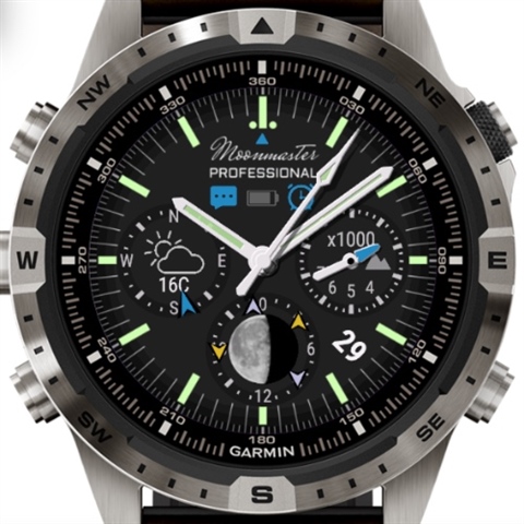
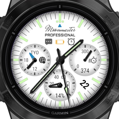
    maybe this thread is of interest to some users? I'd like to share one of our latest additions to the Garmin IQ Store:

    Moonmasterhttps://apps.garmin.com/de-DE/apps/b3c8f789-5743-497f-bd1c-88e5ebbd6d06


    This watch face has a 2-day trial period with all features enabled, check it out for yourself.

    Best regards,

    RoboleoApps-Team / aceholgi