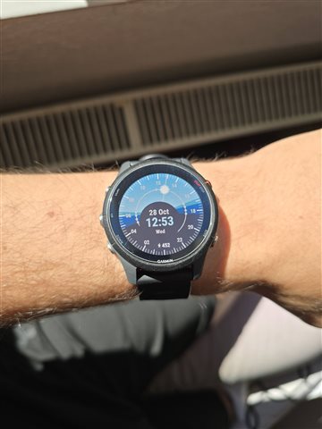
Hello to the entire community here on Garmin!
I'd like to share a small project that I've done, that was inspired by a watchface available for WatchOS devices.
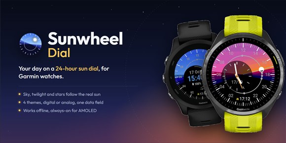
The watchface is called "Sunwheel Dial" and it features the entire day phases portrayed on your wrist!
What you see:
- The sun on its path, with a beam from the centre. It shows half lit when it sits on the horizon.
- Twilight bands for astronomical, nautical and civil twilight, worked out for your location and today's date.
- A dot on the path for every sunrise, sunset and twilight event, plus solar noon and midnight.
- A sky that changes colour with the sun, a warm glow around sunrise and sunset, and stars that come out after dark.
Customization:
- Digital or analog clock, on a dark, frosted or clear tinted dial.
- 6 colour themes: Atmospheric Blue, Deep Ocean, Sunset, Graphite, Aurora, Violet.
- 6 presets (Classic, Frosted, Clear sky, Midnight, Analog, Analog frost), or your own mix.
- Two independent data fields, at the bottom and inside the digital clock: steps, heart rate, battery, next sun event, countdown to the next event, sun position, moon phase, day length, solar noon, calories, distance or temperature (or none).
- The clock field shows an icon and a short value, or the weekday, or nothing.
The watchface has only been checked on a Forerunner 255 because I own the hardware, everyhing else was tested in the simulator thoroughly.
If anything looks wrong or does not behave as it should, please contact me directly so it can be worked out!
The watchface has a 7-day trial which is unlockable by buying a code. After the trial, the face keeps working with the first theme and the digital clock; the unlock brings back all themes, the analog clock and the data field.
Feedback is very welcome!
The watchface can be found on the store page here, or by searching "Sunwheel Dial"