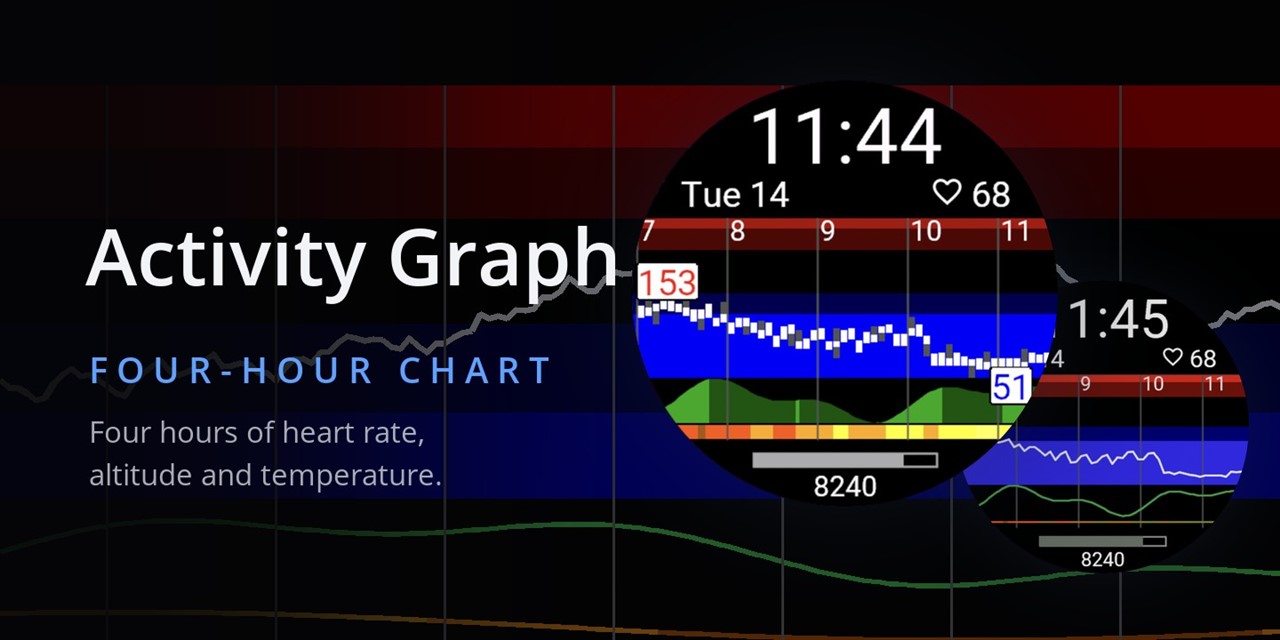
Activity Graph has been here since 2018: the last four hours of your body, drawn as a live chart under the time. Heart rate as bars over your own zones, altitude as an elevation profile, temperature as a color strip.
This is the performance face of my set: it exists to monitor your body during intense days.
- On mountain bike enduro races it shows the elevation profile of the stages, the heart rate during the climbs, and the recovery HR between stages.
- On a full-day hike in New Zealand, hot and dry, I watched my HR drop to almost 40 with large variability. I was clearly tired and dehydrated, and the graph showed it before I admitted it.
- The temperature strip helps with detecting overheating.
- After any workout you see your own recovery curve without opening Connect.
The rewrite: the graphs backfill from your device history the moment you install (no empty screen), always-on shows the zone bands, native complications, on-watch settings, 11 languages. The settings stay simple: a font, two data fields, and you can switch the elevation and temperature panels off if you want a pure heart-rate face. Runs on every color-display watch with System 7 or newer.
Store: https://apps.garmin.com/apps/ee6b1395-de8f-4a44-9f9c-f5255e9d2820 (The original stays available for older watches.)
Support is here in this thread. And the honest ask, same as my other re-editions: new listing, zero ratings, every one helps.