Nothing Style WatchFace — minimalist dot-matrix face

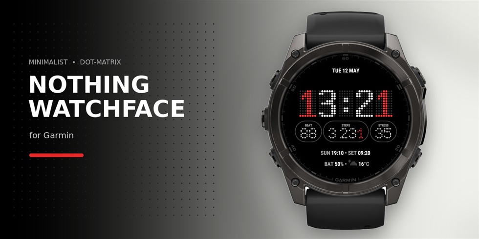
Nothing Style WatchFace — monochrome white-on-black with a single red accent, inspired by Nothing's dot-matrix design language. No themes, no color picker, no clutter.

Features:

  • Three customisable complications (HR, steps, body battery, stress, kcal, floors, distance, active minutes, SpO2, notifications)
  • Two accent modes — pulsing red colon at 1 Hz or red "1" digits
  • Weather indication with dot-matrix icons
  • AOD-safe with 4-min pixel shift to mitigate OLED burn-in
  • Sunrise / sunset, °F/°C and km/mi, 12h / 24h

AMOLED only: fēnix 8, epix Pro, FR965, Venu 3 / 3S / X1, vívoactive 5, tactix 7 / 8, quatix 7 Pro / 8, D2 Mach 1 Pro.

Free install + 7-day trial of full customisation. After trial the face keeps running forever in its default look — no nags. Lifetime unlock for customisation via https://tinyurl.com/nothing-wf, one key works across every Garmin on your Connect IQ account.

Store: https://apps.garmin.com/apps/d2feae7c-03a2-424f-aadb-ac71a5e5a8ea

Giving away 5 free unlock keys in this thread — drop honest and constructive feedback (what works, what's broken, what you'd add) and I'll DM you a key.

  • Hi,

    I like your design! But after trying it out I want to share two items that are immediately visible where I think you can improve this Watch Face.

    1. ambiguity about sunrise and sunset. I think the watch face means with ‘SUN’ the sunrise and with ‘SET’ sunset? To me this is not really clear from 1 glance and I need to think about what it says. I think you can improve this either by using the full words (sunset/sunrise) or by using clear iconography.

    2. The complications. I wear this Watch face on a fenix 8 47mm, but the complications can easily grow out of the screen. For instance when I select steps, calories and distance, I cannot read all the values because they fall off of the screen.

  • Hi Mies,

    Thanks so much for trying the face and for the thoughtful feedback —
    really appreciate you taking the time.

    On the SUN / SET labels: that one's an intentional design choice. The face leans more design-forward than info-dense, and the short three-letter labels are part of the Nothing-inspired typographic style (matching STP, CAL, HRM, etc. elsewhere on the face). I hear you that it takes a second to parse on first glance — fair point — but I'd like to keep the visual consistency for now.

    On the complications overflow on the Fenix 8 47mm: yeah, this is a known limitation. When three wide values (steps + calories + distance) land in the same row, longer numbers can clip at the edges. It's tricky to solve cleanly within the layout constraints without compromising the typography, but it's on my radar and I'll keep looking at it. In the meantime, picking one shorter complication in that slot (e.g. battery or HR instead of calories) usually keeps everything on screen.

    Thanks again for the kind words and for helping make the face better!

  • Looks great to me. Nice use of space, strong design, nice colours.