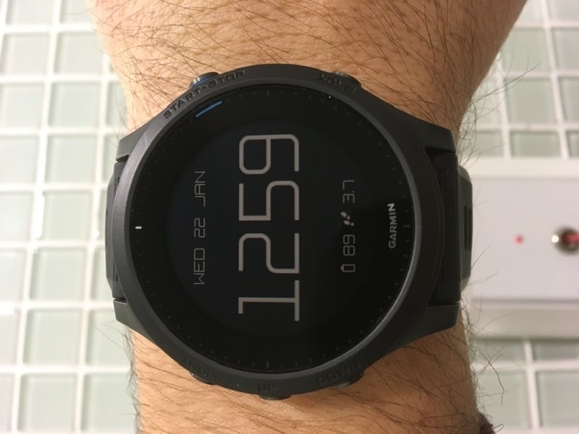
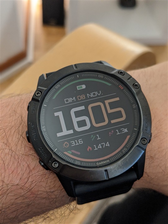
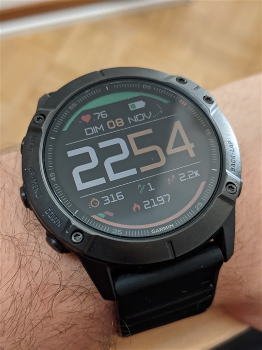
Watchface: M2

This is the support thread for the M2 watchface:

 has created a Facebook group for designs here: https://www.facebook.com/groups/423319952037948

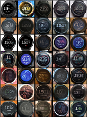
And this PDF files contains a quick visual index to the designs posted in this thread: >>>    ForumProfiles1.pdf    <<<
To create your own design or modify one, install & use the M2 Designer app on your watch. These are the steps you would go through:

  • Optionally paste a text code into the "Profile Text" setting of M2 Designer & save the settings, or load one of your previously saved designs (either via the settings or the in-app menu).
  • Run the M2 Designer app (found underneath your activities list) and create your design.
  • Once you've finished, open the Garmin settings for M2 Designer.
  • The text code in "Profile Text" will now represent whatever your design looks like, so copy the text code from "Profile Text" - and be careful to select the whole text.
  • Close the settings for M2 Designer.
  • Open the Garmin settings for M2 (watchface) instead.
  • Delete any text that was already in "Profile Text" - this step helps to avoid potential problems
  • Paste the text code into "Profile Text".
  • Save the settings.
  • Now when you view the M2 watchface it will show your changes.

A guide for accessing the Garmin settings is here: https://forums.garmin.com/developer/connect-iq/w/wiki/14/changing-your-app-settings-in-garmin-express-gcm-ciq-mobile-store.
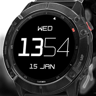
Profile text for the default display = 01Ys2525111WDPO1011WwWO020Vc121VZ11WwXw03X7C11WwVd035C13NC13XDC19010000

------------------

Notes on 12-hour and 24-hour display options - see 4 posts down (with Oldest first) ...

See the latest posts by clicking newest (if it is visible just below) or using the page navigation (if visible at the very bottom).

  • Thanks for your ideas, I update the to the k steps, that option wasn't there when I had done it. I hadn't used moving bars yet so here is my first shot. The design is done so you have to move if you want to see your battery level.

    First text:

    01ZW2525511WDPO102ZV0Vd0XGZ4YEVi8XRBVq7Vd0VoZPXGYx0BM113N11BO113N11BVV113N11BE117020XGYjYd61XGYN03X7153NJ1361Vf3NJ13XD157010XGYFYT11XGWh023Vc121VbVf7050XGWTYp18Y7DVbMVv028Y8CVbLVo028YGBVcLVe027020XGW1YtM1W2W304P0Ve3NF13Vo151XGW304N0Vo3VX111YTW304L0Vv3NF13

    Second text:

    Wp11BKF11XGVZ04Q0Vd3NF13Vm11Zl010XUZ447Zl010XGZ4RDZl3R5XGZ4N9

  • That's amazing! Thanks for that!

    Yeah, I believe a moving bar would be even cooler but hey, walking to get rid of the move bar and see the battery is a nice incentive anyway Wink

  • a really nice one! 
    I wouldn’t use so many colours, but maybe personal taste. 
    I had 14k steps on my watch today, screen showed only “k”

    instead of using 2 rects to “cut” the rings, you could use just one and make it “higher”. Then center it on y=105.

    my personal preferences on data are distance and steps. Floors is nonsence, though it looks nice. On the bottom I’d put HR. But these are all personal prefs.

    great face, again!

  • Yes, I really like to give color a meaning, it's usually either that or you end up with more complicated, unpleasant way of displaying data. For example, without giving 3 colors to the 3 main Garmin metrics I would have to explain what each mid circle means. 

    Looks like you like clean code, I am sorry, I have only been using the app for a few days and I didn't know much about the consumption behaviour, so I thought maybe the more you display (huge rectangle instead of two smalls), the more you use memory or battery while displaying. Really I don't know. But I agree it would be cleaner.

    For the K, it must be an app bug, I just tried displaying a 14k goal instead and it worked fine. I just made a new one because I prefer, like you do, to have HR while keeping the 3 Garmin main metrics, maybe you will like it better. The battery level turns red when it's low.

    First text:

    01ZW2525511WDPO102Zl0R0XGZRXGU8XRBVp8Vd0RZV0Vd0XGZMWSMZPXGZF0BM3VfBO3VfBVV3VfBE3Vf7020XGYZYxF1XGYK03X7153NJ1367Vf3NJ13XD157010XGYDYa11XGWg023Vc121VbVf7050XGWTYk18Y7DVbMVv028Y8CVbLVo028YGBVcLVe027020XGW1YtM1W2W304P0Ve3NF13Vo151XGW304N0Vo3VX111YQW304L0Vv3NF

    Second text:

    13Wp11BKF11XGVZ04Q0Vd3NF13Vm117010YDYt377010XxYtTF1WKYk04R0Vd1WZYl13Ve11YT3Vo5XxYtPBZF3Vd1XxYtPB

    Thanks for your feedback.

  • It's actually a moving ring + a message that tell you to move.

  • - I suspect the 14k steps showed up as "k" as I only added that option yesterday Slight smile If you update M2 to the latest version it should work ok! (If an older version of M2 doesn't recognise a new element type in the profile text then it just displays blank space instead.)

  •  - Thanks for this great apps! It is a great idea/work/achievement! Having the ability to share our design with lines of characters, it's ingenious.

    I see you introduced a feature based on feedbacks, so, if I may propose one which in my opinion would be a design game changer:

    • add circle (with same attributes as rect).

    I don't know if it is easy to do, but rect looks cheap in memory usage and adding circles could help make rectangles look a bit smoother (concatenating it to a rectangle) and would allow us to display data on a small area (circle with data and then on top a smaller circle with the backgrounds color -> small data ring we can move wherever we want.

    Thank again for your great work!

  • - that is a great idea for the circle option Slight smile Now that Garmin have added the option to draw shapes with anti-aliasing, circles should look as smooth as any of the other graphics - I'll try to add them this weekend as it shouldn't be too hard ...

    Also when you mention the rectangles with a smooth circle at the end (I think that is what you are describing) - there is actually a draw mode available for this, to draw "rounded rectangles", so I might test an option for that too. (I didn't try it before as it couldn't be anti-aliased ...)

    I also might try an option to rotate the rects/lines so they could be drawn at any angle. (Could be useful for circles maybe so they don't have to start at the top.)

    Wow so many options for ways to display data ...

  • - That would be really nice! Yes, I guess their could be so many options. Hopefully, you've been doing a great work at keeping everything well organized, so you can easily build on top of that. Thanks again!