Watchface: M2

This is the support thread for the M2 watchface:

 has created a Facebook group for designs here: https://www.facebook.com/groups/423319952037948

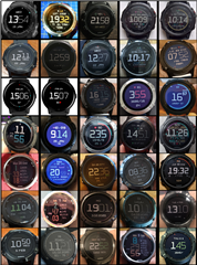
And this PDF files contains a quick visual index to the designs posted in this thread: >>>    ForumProfiles1.pdf    <<<

To create your own design or modify one, install & use the M2 Designer app on your watch. These are the steps you would go through:

  • Optionally paste a text code into the "Profile Text" setting of M2 Designer & save the settings, or load one of your previously saved designs (either via the settings or the in-app menu).
  • Run the M2 Designer app (found underneath your activities list) and create your design.
  • Once you've finished, open the Garmin settings for M2 Designer.
  • The text code in "Profile Text" will now represent whatever your design looks like, so copy the text code from "Profile Text" - and be careful to select the whole text.
  • Close the settings for M2 Designer.
  • Open the Garmin settings for M2 (watchface) instead.
  • Delete any text that was already in "Profile Text" - this step helps to avoid potential problems
  • Paste the text code into "Profile Text".
  • Save the settings.
  • Now when you view the M2 watchface it will show your changes.

A guide for accessing the Garmin settings is here: https://forums.garmin.com/developer/connect-iq/w/wiki/14/changing-your-app-settings-in-garmin-express-gcm-ciq-mobile-store.

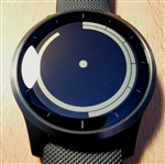
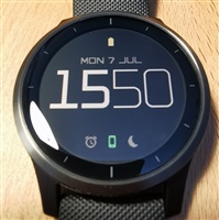
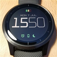
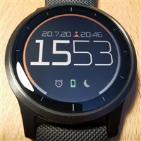
Profile text for the default display = 01Ys2525111WDPO1011WwWO020Vc121VZ11WwXw03X7C11WwVd035C13NC13XDC19010000

------------------

Notes on 12-hour and 24-hour display options - see 4 posts down (with Oldest first) ...

See the latest posts by clicking newest (if it is visible just below) or using the page navigation (if visible at the very bottom).

  • Thanks. I was gonna try to learn how to make my own face using... What is it, MonkeyC?... Downloaded the dev kit and everything... Buuut... I don't have time (or really experience) for that unfortunately. I'd almost resigned myself to just living with whatever was available in the stores... But stumbled across this and found it to be awesome! There was a big hurdle of 'can I be effed doing this on the watch... Eeerrgghh', but I read someone else's review who had experienced the same thing and was happy with the result,so that pushed me over the edge. I think it's be good if you had a few very different variations previewed in the store, it would give people an idea of what they can create. Emphasise that they can aim for 'efficient', 'pretty' or anywhere in between. You could even just use some popular faces and add them as presets?

    Just playing around I had a look at what deleting elements would do... I'm already working on a 'cheaper' version of this same face. Haha. With such little available memory (as I'm sure you know), it does count to have multiple fields rather than just 1 field with multiple elements. Do you think it's cheaper to have multiple spaces, or just draw a new field? I'm thinking i want to draw something on the left and right. Side of the face on the same line. 

    Also yeh, having bars with no limit would be awesome too. I REALLY like rings, but I could live with bars - are they significantly 'cheaper'? I'm just thinking of my next more 'efficient' design

    It would be really good to open up the memory for watches that can afford it - does my 5X plus have extra available? 

    The multiple profiles thing - maybe that was my problem, I tried to save multiple profiles in 1 session (had them copy pasted from separate window) - I will try again later. Perhaps in that save/load screen have a friendly prompt to close and reopen the settings after each use? 

    New question - do watchfaces support rotating fonts? Either free-form or just 90° - I'd guess no.

    New question #2 if another user loads my code, will they have the ability to 'theme' - ie is foreground colour in the code or basically just a user shortcut?

    Cheers :) 

  • - yep I really need to add some more screenshots to the app store - maybe my task for next weekend Slight smile

    On the memory side: there are actually 5 chunks of memory pre-allocated for different things:

    • Profile Text length (maximum is 510 characters)
    • Number of fields and elements (roughly)
    • Memory for text characters displayed on screen (max 150)
    • Number of "dynamic" resources loaded, like text fonts, icon fonts, ring fonts (max 30)
    • Memory used by "dynamic" resources (max 25kB)

    By default the Designer just displays one memory bar - it chooses whichever one of those 5 things is closest to becoming fully used.

    But in the Global Settings of the Designer there is a memory display option to show "all bars" which will then show all 5 individually Slight smile (I think in the order I listed top to bottom)

    Normally the last one (memory used up by loading all the fonts is what gets used up first) - e.g. each ring style, or each custom font will use up some memory. Note that system fonts are free - as they are built in to the watch.

    Creating a "field" is actually really cheap - it is basically just a position on screen, followed by a list of "elements". Each element is roughly the same - ones with more options (like movebar) are slightly more. But roughly each field and element is the same. It's mainly associated font resources that take up the memory.

    So I'd go for multiple fields (one on the left and one on the right of the display) rather than having one field and putting in a load of spaces in between. All those extra spaces would also cause some extra "drawing" cost too - even though they are blank.

  • For your other questions Slight smile :

    • Bars are a lot cheaper (both in memory and drawing cost) - as they are just simple rectangles, whereas every segment of a ring is a font character. But I like the look of the rings too!
    • I have a 5X Plus too - and nope it has no extra memory available
    • One problem with allowing different memory for different watches, is that some profiles would not work on some watches (whereas currently every profile works on every watch)
    • Unfortunately there is no automatic way of rotating any font - the developer has to create a copy of that font where every character is rotated by the required angle. So for fonts that curve around the edge of the display, you have to create multiple font copies that are individually rotated by different angles!
    • The foreground color (for theming) is stored as part of the profile - so if someone else loads it into the designer and changes the foreground color in the "global settings" then they will see all the elements change color just like you do Slight smile
  • Thanks... Now to think of a design with bars.. Hmmm ? I'm gonna try for the as much information with the most efficient use of memory. I'd like icons, but I might even forego those. Althooouughh... Would it be fair to say that drawing 1 icon is cheaper than drawing a (potentially large) number? 

    Speaking of... Sorry to keep adding pts, a way to do 'thousands' would be nice. Ie. For steps, 12,345 could be expressed as 12.3K... I know it only saves 1 character, but ya could even make the K optional. 

    As a solution for the higher memory ones, how about the memory bar goes red when you exceed the 'normal' memory... And then just a binary flag for faces that use that extra memory?... Unless there is a range of various high memory watches - that'd make it slightly more annoying. 

    The rotated font thing is annoying, but expected. Forget it - too much effort then. 

    Regarding the foreground colour, that's awesome. Well, I'd definitely appreciate a few extra settable colours then (is 5 too many? Haha I'll take 3 Wink) ... One of the most tedious things was scrolling through that colour menu... For that matter, having 1 or 2 global settings for fonts would also be a good idea! When I decided I wanted to change the fonts (or colours) it was positively painful going through each element in each field. 

  • Yep the cost of drawing one icon should be about the same cost as drawing one number digit. They will each also cause a font to be loaded (either icon or number font) - but these are shared by all items using the same font. Using up memory won't make it more expensive to draw - purely the number of items being drawn will make it more or less expensive.

    Noting down your other suggestions too Slight smile Particularly agree on the text font one - that would make it so much easier to change the font of multiple items!

  • Hello!

    Here’s my first try on this watchmaker with a minimalistic watchface. Just the essentials in the middle with two time rings around. Looking forward to build up some more, it was really fun Slight smile

    01ZC2525111WDPO1011X6WS04I013Va213N214L113VV213N214R113Ve211X6X603X7013N4135213N413XD411X6XQ031E13QC132C13QC13W1A18EG0VxVw0084F0VxVw00

    It would be interesting to see if it’s possible in the future to have more different sizes or a possibility to change the ring size manually.

    II would love to make a watchface similiar to the Ziiiro Saturn watch (I’ve tried) or include activity meters similar to the apple watch.

    But right now I couldn’t fit too many rings in there without overlapping designs.


    (This is the watch I’m talking about . I’m thinking if there is a possibility to use the seconds lines differently or move around the rings in another way, a mainly line based watch face like this could be possible and I think that would make a cool looking minimalistic watch face Slight smile)

    Update: I tried recreating something similar with the tools available. I think this could be great!

    (Dot in the middle is for AM/PM indication, only shows on PM)

  • So I had some time on my hand yesterday and made some more watchfaces. It’s a minimalistic setup with some key features and then two versions of it with more features. The bottom icons indicate (from left to right) if an alarm is set, your phone is connected and if DND is active.

    1.)

    So this is the basic watchface with just time, date, three status icons on the bottom that change color and a battery icon that’s based on the battery level (high=green full, middle=yellow full, low=red empty) at the top.

    01ZC2525111WDPO101WZWXP04C13WJWXP04C1RXbX6P04E13XLX6P04E1RW3XfP04VV13VnXfP04VV1R1X6WV023Vb121VZ11X6Xv03X7333N333A333N333XD331X6YY0YgI1RYwI1OZCH1Vd

    2.)

    The second face is an extension with focus on precise time telling by adding an second ring and second numbers on it. Currently they’re set to "always on" (because my watch has a bug where the gesture activates the backlight but doesn’t work for watchfaces, I don’t know how to resolve this yet) but you can switch the visibility to gesture mode.

    01ZC2525111WDPO101WZWXP04C13WJWXP04C1RXbX6P04E13XLX6P04E1RW3XfP04VV13VnXfP04VV1R1X6WC03W1331X6WV023Vb121VZ11X6Xm03X7333N333A333N333XD331X6YY0YgI1RYwI1OZCH1Vd9ZE12200

    3.)

    The third and last one of this series for now has a focus on sunrise and sunset times. Battery indicators are also included at the top, but only show up for High or Low battery charge!

    The sun indicators above the time switch according to witch event is next, as do the colored rings change too.

    Tbh I kinda struggled with the sunrise/sunset rings as I couldn’t quite figure out how the setting for the start/end work (e.g. the now=middle etc. settings). I would love to set the rings so the value indicator starts at sunrise left and then fills up over the day to sunset to the end, and then after sunset they switch and the same starts until sunrise again but with different colors (second ring). I hope you understand what I mean and maybe you can show me how this works and if I’m missing something Slight smile for now I set it to now=middle and put the start at the bottom left and end bottom right.

    01ZC2525111WDPO1011X650YgI0RYwI02ZCH0VdWZWXVZ04C13WJWXVZ04C1RXbX6VZ04E13XLX6VZ04E1RW3XfVZ04VV13VnXfVZ04VV1R1X6WV023Vb121VZ11X4Xu235633S633A633S633C631X8Xu1b0S1OazVf6ViazQ6ViazVg6VibGT1VebFVh6VjbFQ6VjbFVi6Vjb4TBVZOO0VibKTBVZOVe0Vj

  • - nice designs Slight smile You've been busy!

    I'm not even sure how you did the diagonal lines on the outer ring of the circular only design, or are they with the seconds indicator? Looks stylish though.

    Currently it's not possible to manually change the graphics for the rings - as they are made from pre-rendered font elements in order to make the edges appear smoother by using anti-aliasing. I went for the higher quality option, which has upsides and downsides!

    The bug with gesture not working for CIQ watches seems to come and go in different firmware versions. It was last reported 5 months ago for the VA4, but I'm not sure if it was supposed to be fixed or not yet: https://forums.garmin.com/developer/connect-iq/i/bug-reports/onexitsleep-not-being-called-on-va4

    That's a nice suggestion for a different way of showing sunrise/sunset on the rings - so I'll add it to my list (currently you can't display them in that particular way!) The existing options always display 24 hours on the ring, the filled color shows the period from sunrise to sunset, and they simply change the time at the start point of the ring:

    • Midnight is at the start
    • Noon is at the start
    • "Now" is at the start - this means the filled period will rotate as the days passes
    • "Now" is in the middle of the ring - probably the most useful for arcs like in yours, so you can see how far towards sunset/sunrise you are.

    Although with the midnight or noon at the start it may be possible to overlay a 24 hour time ring on top - which would indicate where you are in the day. (I haven't tried this though ...)

    I like the new way you suggested, so I'll try and add it as an option Slight smile

  • - just uploaded a new version (0.1.24) with the "no limit" ring feature working for partial arcs Slight smile If you see anything odd let me know!

  • Thank you!

    are they with the seconds indicator?

    Yes I used the second indicator for this, it looks cool but of course you have to be kinda lucky to see it at a glance Smiley

    Maybe not customizing the lines itself but more variety of choice (e.g. there are 4 simple rings but only 2 wide ones). If there would be a sub-menu that seperates different kind of rings, there could be enough options to more fill the watchface with them and possibly create a minimalistic "ring-only" watchface.

    reported 5 months ago for the VA4

    Thanks for the link, I also posted on the forum but so far I haven’t found a fix. I just the watch three days ago, so there will still be a lot to learn.

    The existing options always display 24 hours on the ring, the filled color shows the period from sunrise to sunset

    Oh okay, now I get it. I was a little confused especially because I chnaged the start and end points and didn’t make a full circle. So if I use this "now=middle" format and don’t set a full circle I should set a different limit?

    Great! I’m happy I could help. Looking forward for some more great features Slight smile