Simulator - Poor Image Quality

I've been playing with the Connect IQ SDK over the past couple of days and have some questions about the image quality of the simulator, and whether or not these issues extend to watches.

I downloaded a few emoji images from https://github.com/twitter/twemoji/ to see how they show up on the devices, and the results are not only disappointing, but very inconsistent. Here's what I see:

This is the square sim, and the results are acceptable:


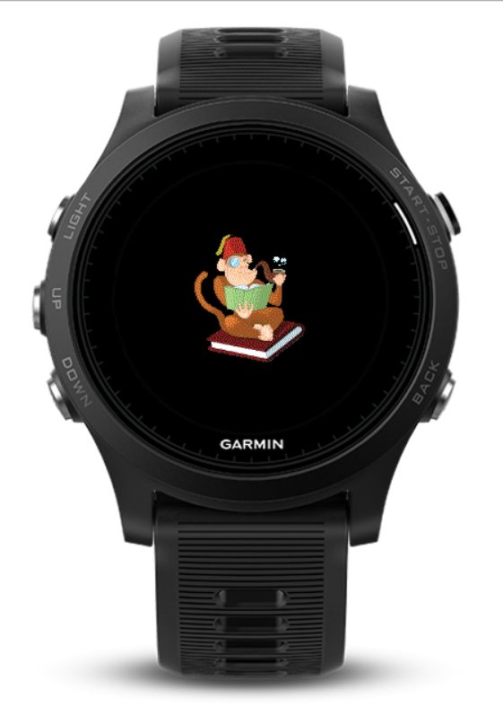
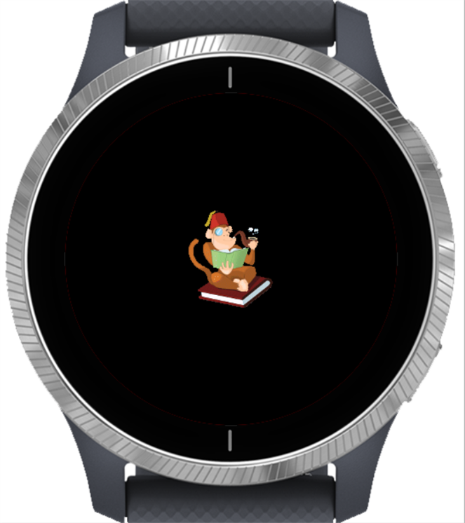
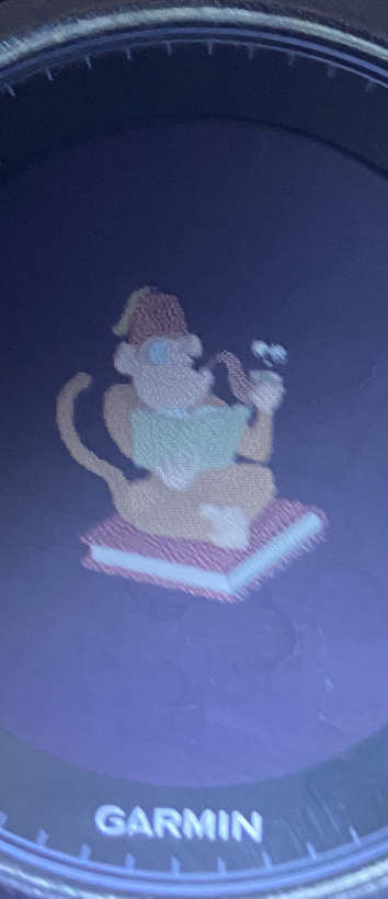
The following is an assortment of round watches and the results vary, even between different runs of the application. How many colors can these screens display? Is it just 16?


Additionally, I've played around a bit with the "palettes" attributes for bitmaps (described here http://developer.garmin.com/connect-iq/developer-tools/resource-compiler) which are also puzzling.

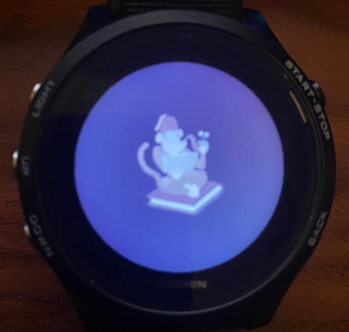
When setting only a single color in the palette, the images are converted to that color, but on the round watches the colors are inverted, which means that if I'd like one to show up in white (FFFFFF) then I need to set the palette to black (000000).

Has anyone else seen anything similar to this? I haven't tried loading the app onto my Fenix 3 because I'm still running the stock firmware.

FWIW I'm using the latest version of the SDK (1.1.0).

Thanks!
  • Well, I already suggested playing with the resource compiler image settings (like disabling dithering), but of course that could affect the final image that's displayed on the real device, too.

    Do you have an example of a store screenshot or listing image which has a "high quality publishable image" which could not have been generated by taking a screenshot of the device simulator?

    I have the exact opposite impression of the majority of store apps. Most people seem to have simply taken a screenshot of the device simulator and cropped it. In other cases, the screenshot appears to have come directly from the watch.

    In some cases, people have uploaded a non-square image which gets distorted (not cropped) by the store to make it square.

    I can't know for sure, but I am 99% certain there is no special command line option to "remove grainy effect from device simulator".

    I'm fairly sure the grainy effect comes from dithering, which happens when the palette of your image is larger than the palette of your device. 256 colors doesn't sound like a lot these days, but most devices only have 64:

    [https://developer.garmin.com/connect-iq/user-experience-guidelines/displays/]

    [https://developer.garmin.com/connect-iq/reference-guides/devices-reference/]

    For example, if I create a new widget using either Eclipse or the VS Code plugin, I get a sample app which displays a bitmap of a monkey.

    This is the source bitmap (32-bit png):

    This is what it looks like when I run the widget in the sim for the Forerunner 935 (64 colors):

    (Note the "grainy" effect due to dithering)

    This is what the sim looks like for Venu (65K colors):

    (significantly less grain than 935)

    Here's what a screenshot taken directly from my 935 looks like:

    (Note that it looks just as grainy as the simulated 935.)

    And finally here's a photo of the widget running on my 935:

    (I resized it for the forum, but there's def no visible grain. Sorry for the bad picture quality)

    So I would have to say if someone's screenshot looks like it could not have been generated via a screenshot of the device simulator or a screenshot from the device, then it must've been edited.

    I think that the overall point still stands, which is that due to the nature of the display, a screenshot won't look the same as an image displayed on the device itself, especially when it comes to colors.

    Since dithering is the process of simulating a higher range of colors on a lower-color palette, it makes sense that dithered images which look okay on a device may not look good off the device.

  • Try just doing a screen shot, trimming it, and sizing it for the store.  I use 400x400 for store images, but they won't display at that size in the store (they are smaller), and whatever graininess you see in the sim probably won't be seen in the store.  You can always update the store image if you don't like it.

    With ciq 4, you can also use svg files for bitmaps, which may help with what you see in the sim, at least for some devices, and they can be scaled, which should make it easier to support different sizes.

    See https://forums.garmin.com/developer/connect-iq/b/news-announcements/posts/welcome-to-connect-iq-4-0

  •   I use 400x400 for store images, but they won't display at that size in the store (they are smaller), and whatever graininess you see in the sim probably won't be seen in the store.  You can always update the store image if you don't like it.

    If a bitmap image appears "grainy" in the simulator due to dithering, and you take a screenshot of the sim and use that in the store, then I think you will most likely see the graininess in the store, too.

    1) I resized my screencap from the 935 sim posted above to 75% and I can still see the "grains". Admittedly, if I resize to 50%, I can't see the grains anymore. But then it's way too small.

    2) If you take a screenshot from most watches and only crop it (without resizing) so that the majority of the image is taken up by the watch face, then your image will be around 300x300 and it will display at 100% in the web store when you click on the app to view the full details. I guess if you leave more of the watchband in the pic, then the store may shrink your image slightly, but probably not enough to to obscure the dithering. (See 1)

    3) Here's an example of watchface in the store where the screenshot clearly exhibits "graininess", likely from dithering:

    https://apps.garmin.com/en-US/apps/ce1f646c-91d3-4119-b89e-e1c2ce3360b5

    So to directly address the original question of why other apps in the store don't seem to have the graininess problem in their screenshots, it's because most of the screenshots are of apps that don't display a dithered bitmap. That's my educated guess, anyway.

    For example, at first glance this meme watch face seems to display a detailed bitmap with lots of colors:

    https://apps.garmin.com/en-US/apps/f52d51f3-38a9-4be7-9f04-1c4dc95e212b

    But if you look closely, everything is a flat color with no shading. This version of the meme (not the original meme, which does have shading) probably has less than 64 distinct colors.

    It seems to me that if you want to avoid extreme dithering as seen in the examples I posted, you could run your app on a simulated Venu device and use that for your screenshots. As in my previous post, there's a huge difference between dithering for the 935 and Venu, since the former has 64 colors and the latter has 65536.

    The only downside is that the Venu is a 390 x 390 device, so if you weren't planning on supporting it before, it's a bit of additional work to do so (since it's a very different resolution than other devices.) You could also use a Venu Square, which is 240 x 240, but that's square device, and may not be representative of the form factor that most of your users will be used to.

    Then again, if you were already planning on supporting all devices, then taking your screenshots from the Venu would seem to be a no-brainer.

    Or you could try to edit original bitmap so that it doesn't have to be dithered. If it's a photo-realistic image as opposed to a cartoon, that may not be possible.

  • In the case of "this is fine", it could also be that there is a palette specified for the bit map with the 8 or so colors that are used.  So no dithering.

  • When it comes to making your app look a bit better, you can also do a hero image, which shows in the Connect IQ mobile App -

  • Hi Flow,

    I tried the dithering options a while back and they did impact the image displayed in the DS, but not for the better.  As expected, it greatly reduced the colors and the image looked even worse.  But, your above suggestion about using the Venu worked great!  The fact that it displays 65K colors seems to make the DS very happy and it displays the images perfectly.  I went to the ConnectIQ store and indeed it seems almost all screenshots with background images use the Venu (take a look at the Natural Beauty category for countless examples).  

    So to anyone else looking, the answer to the grainy image issue is to use a device with a high color count (such as the Venu) in the Device Simulator when capturing images you plan to publish in the Connect IQ Store.

    Thanks Flow.

  • In the case of "this is fine", it could also be that there is a palette specified for the bit map with the 8 or so colors that are used.  So no dithering.

    Yes, my entire point was that "This is Fine" does *not* use dithering.

    It was an example of app that seems to be colorful, but actually uses very few colors and avoids graininess by not having dithering.

    My further point was that the original meme (if you search for it), actually does have shading (as opposed to flat colors), so if the original image had been used, it probably would've been dithered.

    In this case, it seems the app author edited or recreated the image to use as few colors as possible.

  • No worries. Glad you have a good solution!

    To be clear, as pointed out above, taking a screenshot on the device itself produces an image with the exact same graininess (dithering) as the image displayed on the device simulator, in the case of a 935 (which has 64 colors).

    So this isn't a problem that's confined to the sim.

    BTW, the reflective displays of 64 color watches such as 935 which I tested above look best in direct light (like sunlight). Even with the backlight on, you don't really seem to see the same kind of detail. So my test with just taking a photo with the backlight on wasn't great.

    When I shine a flashlight on my 935, displaying the same app used for testing, I can clearly see graininess due to dithering.

    So I just want to highlight the fact that graininess actually exists both in the sim and the device. It's not really a matter of making the simulator happy, it's the fact that 64 colors is just not enough to display a dithered bitmap which originally had a lot more colors.

    And it seems that dithering isn't always noticeable on our 64-color watches unless we're looking closely, under the right conditions. But it's immediately obvious in the simulator, due to the larger pixels and the different display tech.

    TL;DR the sim and device are displaying the exact same image, it's just the differing display tech which produces a dramatic perceived difference.