FONT_SYSTEM_NUMBER_THAI_HOT wrong positioning on Fenix 5

The Gfx.FONT_SYSTEM_NUMBER_THAI_HOT is positioned different on Fenix 5 and 5X than on a lot of other watches.
All these entries in layout.xml I have to subtract around 20 pixel.
This does not hapen with all other Fonts (self imported ones) or FONT_LARGE or FONT_TINY or….

These means that I have do use several layouts.xml for the Fenix5 watches. (folder resources-fenix5)
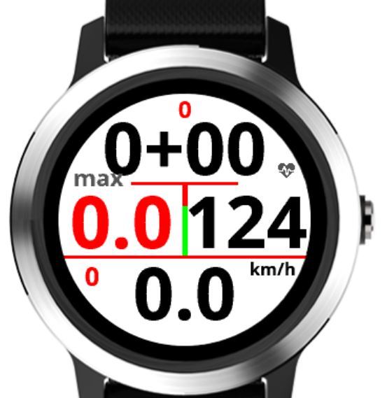
Also Forerunner 935 (see atched screenshot) does the problem.
Do you have any explanation or is it a bug? community.garmin.com/.../1365020.jpg community.garmin.com/.../1365021.jpg
  • Hey Seli17,

    If I'm reading this correctly it looks like you are having issues dealing with some of the different screen sizes and fonts utilized by our different devices. Generally you can make layouts based on device families or screen sizes. The 5, 5X, and the 935 share a common screen size and layout as well as fonts. The vivoactive 3 pictured in your post shares a screen size and some layouts but utilizes different fonts. Is this the difference you are seeing?

  • Yes, it is this what I am seeing.
    I hoped, that for all round watches with 240x240px I can use the same resource/layout-file.
    Using an own made font, it is placed correctly, but uses more memory, and my datafield on Fenix5 is already at the limit of it.

    Best would probably be, that Garmin creates a new big font, that is placed same place an all 240x240px.
    One could consider it as a bug, if a same named font is placed differently or looks differently on same kind of watch.(at least it makes no sense)
    Also the TINY font is different. it looks smaller on Fenix5.

    So with this strange behavior, I have to create a layout-file for each watch? Or is there a possibility to group it them?
  • There are some groupings available. I agree that as a Connect IQ developer a consistent font across devices of like screen shape and size makes sense. However, the devices are not simply Connect IQ machines. Each device has a unique native UI and layouts that need specific fonts and sizes to support the overall device experience. It doesn't make our job easy as developers, but that is part of what makes things like layout systems so powerful for us. There is a list with the font specs and device families that can be found in the UX Guide.

    https://developer.garmin.com/connect-iq/user-experience-guide/appendices/

    There are some of our newer devices missing still as it's need to be updated, but this will give you a general idea. Another place you can look for the specifics of each device is in the /bin directory of the SDK you have downloaded locally. There is a devices.xml file that has the device definitions in xml form. We're always trying to make these things easier to find, but this is where we are currently. Sorry for any confusion and happy coding!

    Thanks,
    - Coleman
  • Here's a breakdown for round devices
    • for 240x240 devices, the Approach S60, va3 and va3m use one set of fonts, the f5 ,f5x (and variations like the DC2 Charlie), the 935, the 645/645M and f5 plus devices uses another.
    • for 218x218 devices, the f5s and Chonos use one set of fonts, and the f3 family uses another