I feel ya man. I've felt the same way, just as a CIQ hobbyist. It's almost like we need another language which can be transpiled to IQPL, so we can have efficient constants, etc. My biggest pet peeve is…
The other thing which I've thought about is just creating the Companion app (or use a web-app) to parse the settings into a LONG string and then have users paste it into the app-settings page…
Another approach would be to use switchToView (instead of popView or pushView) to handle switching between nested menus. You do have to keep track of the "pushed" and "popped" menus with your own little…
Yeah there's a huge difference because the code in question positions all the elements of a 6 or 7 field "full-screen" data field.
So there's 6 or 7 labels and values, lines to separate each of the fields, header and footer, etc. There's also code to dynamically resize fonts to fit in a given area, based on the content (although to be fair both versions of the code need this)
The dynamic code isn't quite as simple as your first example. I started with an open-source example that had been shared on github, and tried to rewrite to be more memory-efficient, but nothing was more efficient than doing static precalculation. The dynamic example took up over half of the available RAM on a device with 16 KB for datafields, IIRC.
(Because the layout isn't truly "dynamic", it changes in fixed ways based on the device resolution, shape, and fonts.)
You could write logic to generate the precalculated layouts....
I wish I had done that from the start, actually. I still would need to adjust some things by hand due to font quirks across families. (Some fonts have a "height" that includes whitespace above the uppermost visible pixel, and others don't).
That's why I define my own font wrappers for each device (or actually for each font, some devices do use the same fonts) with custom ascent, descent and font height definitions so that I can use those values for pixel perfect positioning...
This sounds like an interesting approach, could you maybe describe a bit more your technique?
I also define fixed positions based on screen resolution, format, etc. not in a super granular way, but at least based on resolution and screen shape. I definitely don't take into account variations within non system fonts (I don't use system fonts because they vary too much for my use case). This can handle my simple layouts without looking too bad in any one of them, but its not perfect though. Now, for full screen messages, I still do it dynamically, as each line will have a different length based on the screen size, shape, font rendering size, as well as localisation. So I have to calculate each row dynamically. My logic is "heavily" inspired in:
For long messages, I have a fairly simple function for that, where in onLayout I calculate how many characters will fit on a line and then "chop" what's to displayed to that, then look for the last space, and chop again there. I don't take into account the rounding of the screen, but it's really simple. I don't use layouts, and did this before TextArea using just dc calls.

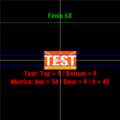
I did write a test app that simply draws something like following:

As you can see, on a Fenix 6X it seems like the FONT_LARGE does have an ascent value of 34, an descent of 9 (which sum up to 43 font height). And then I try to find out with trial and error how much the desired sign is "off", in my case I want to be able to place texts like "TEST" or "0123" in way that they touch each other, so I now know that I must draw the text 9px higher + the fonts "inner height" is on 43 - 9 * 2 = 25.
So my own font definitions simple looks like Font(Graphics.FONT_LARGE, 9 /* top space */, 9 /* bottom space*/ ). And by knowing this data you can place texts just the way you want it without device specific logic...
It's just a lot of tests that needs to be done for each device (until you find the correct top/bottom values) and for each font you want to use...
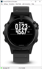
Here's the same native fonts on the f5

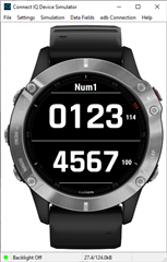
and f6

The little number of the right is the result of dc.getFontHeight(), and the lines that are drawn are also based on that. You can see on the f5, you white space above or below, but there is on the f6.
There's a slew of issues esp when you just start out early on and the wearables have like 16 or 32kb of memory. That means Optimisation to the wazoo.. No such thing as using the LONG version of GRAPHICS.FONT_SIZE_MEDIUM_MILD and what not and just use "1". It was optimise all the way.
Hard coded Layouts and each time a new device is out, there's another round of layout optimisations to account for differing screen sizes, differing internal fonts.
I too try to use the same fonts across diff devices but if its 16KB or 32kB, you Cant due to memory constraints. So it's back t pixel peeping and optimisation again and again.
I too used to use layouts but then found out the hard way that it eats up memory so had to refactor all of it.