Edge 1040/50 fonts

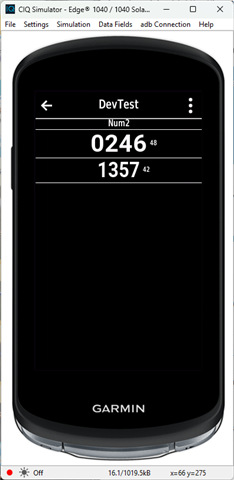
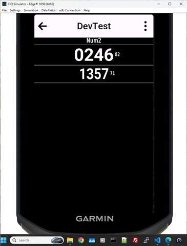
FONT_NUMBER_MEDIUM vs FONT_NUMBER_MILD....

is there any way to use the FONT_NUMBER_MEDIUM type with the FONT_NUMBER_MILD size? I prefer the typography of FONT_NUMBER_MEDIUM, but its size feels too large for some fields.

  • Not sure what you mean, they are just different sizes.  Here they are on the 1040 for example.

    The small number to the right is the height.

    Here's the code for this part

    			
    		//(in onUpdate)	
    			y=titleH;
    			dc.drawText(width/2,0,Gfx.FONT_TINY,"Num2",Gfx.TEXT_JUSTIFY_CENTER);
    			y=doFont(dc,width/2,y,Gfx.FONT_NUMBER_MEDIUM,"0246");
    			y=doFont(dc,width/2,y,Gfx.FONT_NUMBER_MILD,"1357");


        function doFont(dc,x,y,font,str) {
        	dc.drawLine(0,y,width,y);
        	dc.drawText(x,y,font,str,Gfx.TEXT_JUSTIFY_CENTER);
        	var x2=x+dc.getTextWidthInPixels(str,font)/2+5;
        	var fh=dc.getFontHeight(font);
        	dc.drawText(x2,y+fh/2,Gfx.FONT_XTINY,""+fh,Gfx.TEXT_JUSTIFY_LEFT|Gfx.TEXT_JUSTIFY_VCENTER);
        	y=y+fh;
        	dc.drawLine(0,y,width,y);
        	return y;    
        }

    There's the same thing on the 1050

  • Thanks for your answer. Yes, that's exactly how it looks. I'd like to use FONT_NUMBER_MEDIUM because I prefer its bold style, but I only have enough space for the MILD size.

    According to the documentation I've seen, here are the specs:

    • FONT_NUMBER_MILD: 71 font size (Garmin_Roboto_Bold)

    • FONT_NUMBER_MEDIUM: 82 font size (Garmin_Roboto_Bold)

    Ideally, I would need FONT_NUMBER_MEDIUM at a font size of 71 (instead of 82), but I'm not sure if that's possible at all.

  • As Jim already mentioned: FONT_NUMBER_MEDIUM at a font size of 71 would be exactly the same as FONT_NUMBER_MILD!

    Of course, the boldness of fonts decreases as their size decreases.

    If you want really bold fonts, you'll have to use custom fonts based on Roboto ExtraBold or Black TTF.

    forums.garmin.com/.../how-do-i-create-a-custom-font

  • thank you guys, appreciate the support

    I've been experimenting with the approach described here: forums.garmin.com/.../how-do-i-create-a-custom-font, but the results have been disappointing—the fonts end up looking pixelated and, ultimately, quite poor.

    I will look for the Roboto ExtraBold one and see if I get something better

  • I can't say that the custom fonts look bad. On the contrary—they look perfect.

    In the fonts.xml set antialias = true 

    Here is a line of one of my custom fonts definition:
    <font id="id_font_myMILD_N4" filename="mySofiaBlack39_116.fnt" antialias = "true" filter = ".: -1234567890CFWNSOE°kmi%"  />

    Here is a picture of a datafield using custom fonts:

  • they do look great.....will give that a try, thanks!

  • Are you looking at things in the sim or on a real device?  The sim can be a bit deceptive when it comes to things like the pixel size/pixelation  and color.  I'm guessing the device looks much bigger with the sim on your display than it is for real, and for colors, you really can't see the difference between MIP and other display types.

    Custom fonts do have additional overhead.  I really only use them with watch faces where I want a unique look.

  • try this: look at the fonts table or in the simulator.json of the device. You'll see the truetype font's name, and then you can use that as a truetype font in you app and scale it as you like.

  • I believe the edge 1040/1050 don't support scalable fonts, is that correct?

  • in the simulator.json it has lots of ttf fonts, so I think it does