onMenu behavior with Menu2/CustomMenu

Good morning,

Is there a way to implement onMenu behavior within a CustomMenu?

The Menu2InputDelegate doesn't appear to provide an onMenu method. I tried implementing it manually, but it doesn't seem to be triggered.

Is there a known workaround or recommended approach for this scenario?

Top Replies

All Replies

  • You want a press of the Menu key/shortcut to open *another* menu (or take some other kind of action) while you're already in a menu?

    Honestly this seems super unintuitive and it seems that Garmin agrees, since they haven't allowed you to implement this in CIQ.

    If you open a native menu on fr955 by holding UP, then holding UP again will simply close the menu. (This doesn't happen in CIQ apps though)

    Honestly I think it's bad enough there's like 3 different ways of opening menus in 5-button touchscreen watches (at least for the FR955/FR965 generations), the user doesn't need another layer of confusion.

    If you actually wanted onMenu to close the existing menu, then I apologize for jumping to conclusions.

    Yes I am aware that Garmin themselves violate this "rule" I made up (about not opening another menu while you're in a menu). Like if you open an activity on an FR955/FR965, short-pressing UP opens the activity menu (without system settings), but even while that menu is displayed, long-pressing UP takes you to the activity plus system settings menu.

    I kinda think Garmin made the right call with their design of Menu2InputDelegate tho.

  • My use case might differ from how these menus are typically used.

    My app launches directly into a CustomMenu that represents a hierarchical structure of home automation devices. You can see some screenshots here: https://apps.garmin.com/apps/93fd8044-1cf4-450c-b8aa-1c80a6730d1a

    I still need a way to open another menu or view - for example, to display system info or, in the future, to allow switching between servers. Logically, triggering this via an onMenu behavior would make sense to me, and I believe my users - who are fairly tech-savvy - would have no issue with that interaction model.

    Since that’s not currently supported, I think the best approach is to add a dedicated menu item to the root menu. This is a bit tricky in my case because the menu items are generated dynamically from a web response and updated on the fly. So I’ll need to implement some special handling for this particular menu entry.

  • If I understand correctly, then you already implemented custom menus to fit to your desired design, so why not taking that one more step and implement the whole menu system in your watch-app with your own delegates, not using the system menu?

  • I implemented CustomMenu primarily to support CustomMenuItem, with the goal of combining icons on the left of the label with status indicators on the right. I’d also like to support additional item types beyond just toggles and checkboxes.

    Overall, I’m quite happy with how CustomMenu turned out - as well as with Menu2, for that matter. Replicating its behavior manually, especially the animated scrolling, would be a significant effort.

    This is an example. Icons haven’t been added yet - they’re on my to-do list.

  • My use case might differ from how these menus are typically used.

    Yeah, I can't think of many Garmin apps (CIQ or built-in) which have a literal menu as the main view. (I'm not counting activities like ice skating or basketball which have a initial menu that asks the user to select Indoor or Outdoor, since that's not the main view for interacting with the activity.)

    The closest that comes to mind is the Connect IQ on-device store, except:

    - the root view isn't really a "menu" per se (as in something that looks like Menu2), it's a scrollable view where each item takes up a whole page

    - pressing the menu button/shortcut (e.g. hold UP) does nothing in the app

    I guess the notifications app is kinda another example (although has more functionality than a regular menu).

    On second thought it does seem like your use case is valid, although I do think knowing which context you're in becomes an issue. (And ofc I'll reiterate that many normie Garmin users have no idea that holding UP opens a menu, which goes back to my speculation about why Garmin actually got rid of the dedicated menu button/shortcut in Vivoactive 6.)

    Since that’s not currently supported, I think the best approach is to add a dedicated menu item to the root menu. This is a bit tricky in my case because the menu items are generated dynamically from a web response and updated on the fly. So I’ll need to implement some special handling for this particular menu entry.

    Or you could have a new root menu:

    - Devices / Groups -> old root menu

    - Settings -> settings menu

    I can understand why you wouldn't want to do this though. (You probably want the top level view to be the list of groups)

  • I can understand why you wouldn't want to do this though. (You probably want the top level view to be the list of groups)

    Yes, exactly, the settings will be rarely needed, so the app should take the quickest way into the devices/groups.

  • Maybe you should file a feature request.

    I noticed that the spotify app implements the Library view using something that "looks" like a menu (it's probably not a Menu2 though), and the user is able to hold UP for - gasp - another menu.

    So there's probably not much of a leg to stand on for my fake "rule" that a new menu shouldn't be opened while another menu is already open. (Ofc that's assuming we're talking about devices which have a menu button/shortcut in the first place. Again I will argue that Garmin purposely removed the menu button/shortcut for VA6 because they want to eliminate this kind of scenario completely by always making it obvious when a context-sensitive or universal menu can be opened, using the action menu indicator.)

  • Maybe you should file a feature request.

    In theory, if Garmin were to implement such a feature now, would it require a new API level, or could it be made compatible with older ones?

    I noticed that the spotify app implements the Library view using something that "looks" like a menu (it's probably not a Menu2 though), and the user is able to hold UP for - gasp - another menu.

    I found another UI pattern used by Garmin that I could implement. On the Epix 2 Pro, when opening the context menu from the Watch Face, a menu appears with items like Watch Face, Clocks, and History. At the bottom is a footer with a Settings icon and a small down arrow. Scrolling down from the last item opens another menu, suggesting this is built on the standard Menu2 with the onFooter callback.

    I could apply this in my root menu, and in any submenus continue to display the logo as before.

  • Scrolling down from the last item opens another menu, suggesting this is built on the standard Menu2 with the onFooter callback.

    That could work but you also need to handle onWrap(), so that when the user presses the DOWN button on the last item of the first menu, the other menu is opened. (onFooter() is only triggered when the user taps the footer.)

    See the "Wrap Out" menu in the SDK's menu2sample. In this menu, tapping the footer or pressing DOWN when the last item is selected opens a 2nd menu. And in the 2nd menu, tapping the header or pressing UP when the first item returns to the previous menu.

    Note that if you press BACK while in the 2nd menu, the sample pops *two* views - this mimics the behaviour of the native system settings menu (accessed by scrolling down  from another menu) where pressing BACK doesn't take you to the first menu, it takes out of both menus.

    I noticed there's a bug in the sim where wrapping doesn't occur when you press UP on the first item though - this is apparently problem with Menu2 in general.

    It does work on a real fr955.

    I found another UI pattern used by Garmin that I could implement. On the Epix 2 Pro, when opening the context menu from the Watch Face, a menu appears with items like Watch Face, Clocks, and History. At the bottom is a footer with a Settings icon and a small down arrow.

    Yeah Garmin also does this for the activity menu (at least in FR955, FR965 and Fenix 7.) Holding UP during an activity gives you an activity-specific menu, but if you scroll "past the bottom" you get the same system settings menu as above.

    I'm of two minds about this - I absolutely realize they made this change because in previous watches, (system) settings was just another submenu (and nobody likes navigating endless menus), but what they've done is effectively combined two menus into one. That's how it looks from the user's pov imo - there's very little to distinguish the "first menu" (whether it's watch face/clocks/history or the activity menu) from the system settings menu, at least on an fr955, except that the system settings menu has an icon for every item, while the first menu does not have icons.

    And one very real problem is that the activity menu has a Navigation item, and so does the system settings menu.

    So it is very hard to explain to the end user *which* Navigation item to select when they are in an activity, because from their POV, it's just one long menu with two Navigation items.

    Sure, for the 2nd (system settings) navigation item you could say something like:

    "Hold UP, select Settings > Navigation"

    But that's very awkward/unintuitive when "Settings" isn't really a menu item per se, it's just a 2nd menu that you access by scrolling past a certain point. (Again I kinda question whether any end user truly thinks of it as a 2nd menu).

    In fact, the Garmin manual for FR955 (and similar watches) never tells the user to select "Settings" because they know it doesn't make sense.

    How about the first (activity) navigation item?

    "Hold UP, select Navigation"

    That seems ok except there's no easy way to prevent users from scrolling too far, going into the system settings menu and selecting the wrong Navigation item.

    I'm pretty selecting the wrong Navigation item has happened more than once, based on forum discussions.

    So this is what the FR955 manual does say about selecting the Navigation item (in system settings):

    https://www8.garmin.com/manuals/webhelp/GUID-9D99A9D4-467A-4F1A-A0EA-023184FEA3DD/EN-US/GUID-A302AFEE-C535-4C80-9DDD-95B717620C5B.html

    Yeah unfortunately that will be confusing/misleading when the user is in an activity, because the activity menu itself also has a Navigation item.

    So basically Garmin created a UI model which they are unable to document unambiguously / clearly in all cases.

    On the surface it seems cleaner / easier to use, but in practice it's only caused confusion.

    Some ways they could've tried to avoid confusion:

    - never have items with the same name in separate menus which are "joined together" (like activity menu and system settings menu)

    - in the (system) Settings menu, display a persistent header with the label "Settings", so you know you're in the settings menu (even better, call it "Watch Settings" - see next comment). They would never do this tho bc it wastes precious space in the UI

  • I found another UI pattern used by Garmin that I could implement. On the Epix 2 Pro, when opening the context menu from the Watch Face, a menu appears with items like Watch Face, Clocks, and History. At the bottom is a footer with a Settings icon and a small down arrow. Scrolling down from the last item opens another menu

    I'm of two minds about this - I absolutely realize they made this change because in previous watches, (system) settings was just another submenu (and nobody likes navigating endless menus), but what they've done is effectively combined two menus into one. That's how it looks from the user's pov imo - there's very little to distinguish the "first menu" (whether it's watch face/clocks/history or the activity menu) from the system settings menu, at least on an fr955, except that the system settings menu has an icon for every item, while the first menu does not have icons.

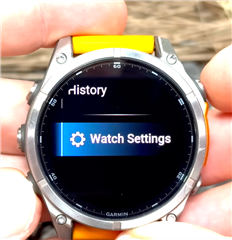
    To prove my point about how effectively combining the system settings menu with other menus in this way is awkward and confusing for the end user, Garmin has reversed this change in Fenix 8. "Watch Settings" is just another sub menu (once again) - not a fancy menu that opens by scrolling down from another menu.

    youtu.be/M8kR2A_3n0A

    You can also see this in the manual, where they'll say stuff like "hold UP, select Watch Settings, select ..."

    Also note the refinement of calling the menu "Watch Settings" (whereas in previous devices, it was just called "Settings".) This makes a lot of sense because how does the user know these aren't activity settings (for example), in the case that they're accessing the menu from an activity?