formatting logic of simpledatafield?

I'm using a simpledatafield to display different values/units, switching each second.

I recognized that in some cases values are rendered with a big and bold font, while others are shown in smaller size - while the width is the nearly identical.

Example:

"75%" or just "0" is rendered big and bold"

"0W" is rendered small

In all cases my compute function is returning the value as String.

Is there any information available on formatting/rendering logic of simpledatafield?

  • 75% is done with a numeric font, while 0W is done with a text font, thus the difference in size  In a simple DF, you can't specify the font. It's determined by what you want to display

  • that means, rendering depends on content only, not on format? since i always return String, not Number.

    Are there any hacks known, how to enforce a certain font size in a simpledatafield?

  • You may just want to have a complex DF where you control everything.

  • exactly. Because the NUMERIC fonts are bigger but only contain very few characters besides the 10 digits, so if your string contains any character that isn't included in the NUMERIC font the system automatically uses the biggest non numeric font

  • - numeric-only fonts (FONT_NUMBER_*) are big, alphanumeric fonts (FONT_*) are small. I assume this is a holdover from times when storage was very limited on Garmin devices. (Conservation of RAM may still be a consideration.)

    - there used to be references in the CIQ documentation for which characters were available in (large) numeric-only fonts for all devices, but it's gone now

    - if your simple data field returns a numeric type (Number / Long / Float / Double) or a Duration, it should be rendered in a large numeric font (but you lose control over formatting, like how many decimals are displayed for floating-point types)

    - if you return a string, in some cases, as you've seen, the watch will correctly determine when the string contains only characters supported by your device's numeric fonts, and use a numeric font accordingly

    - in other cases, if you return a string, the watch will always use a small font - e.g. even if you return "42" as a string, the device will render that in a small alphanumeric font, instead of a large numeric-only font. This might be considered a bug, and it's certainly caused issues with users complaining that certain CIQ simple data fields suddenly started displaying text that's too small

    - even worse, in some cases when a simple data field returns numeric data, it's still rendered in a small alphanumeric font. This is more unambiguously a bug than the one in the above point. This has caused bug reports that certain CIQ simple data fields display small text (even when they return numeric data)

    - Here's a list of characters I've found that were available in numeric fonts for most devices, in the past:

    #%+-./0123456789:°

    - funnily enough, " " (space) is available in numeric fonts for some devices, but not others. (the other funny part is that when the numeric characters were documented, space was in the docs when applicable but you couldn't see it because it was invisible - one way to see it was to view the page source.)

    TL;DR

    The way I think it should work (and the way it worked in the past), based on the return value of compute() in a simple data field:

    - numeric return value => large numeric fonts

    - string return value => large numeric fonts if content is numeric, small alphanumeric fonts otherwise

    The way it seems to work sometimes:

    - numeric return value => large numeric fonts

    - string return value => small alphanumeric fonts always

    The worst case scenario: small alphanumeric fonts always 

  • Thanks for these useful explanations.
    Is there a font table available, somewhere?

  • https://developer.garmin.com/connect-iq/reference-guides/devices-reference/#devicereference

    But there are things you don't see there, especially for number fonts, where the white space above and below the characters can vary by device.

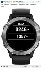
    You may want to put together a simple app that you can run in the sim to see how they look.  Like this for the f6 (notice the white space)

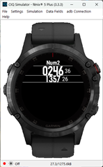
    And this for the f5+.  (No white space)

  • I try to get it from the fonts in the simulator. But of course we don't know if the fonts in the simulator and on the real device have the same characters...