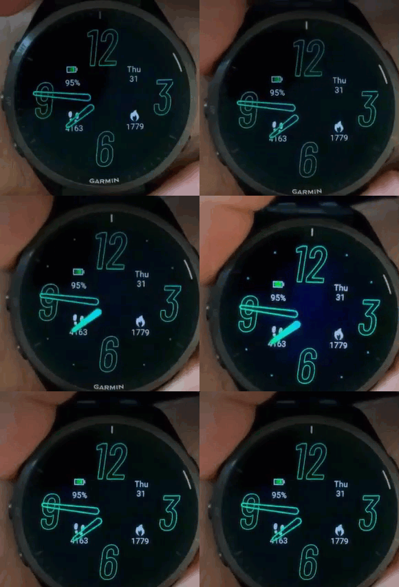
How does garmin prevent burn ins with their native watchfaces?

Does anyone know how garmin does do that? Or do they not care?

Check out following Fenix 8 AOD watchface (the outlined style is already the AOD style) and as you can see, there is no way that the battery bar on top is "moving" invisibly. I would even say, nothing is moving around here...
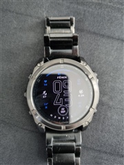
So from a technical point - how can this not lead to burn in over time?

  • Dumb question, but how can you tell Garmin isn't doing pixel shifting here? How can any of us tell by looking at that still image? (I'm genuinely asking, I don't have a Garmin AMOLED watch.)

    It's been demonstrated a couple of times that Garmin def implements pixel shifting for activity data screens. (CIQ devs have reported this, thinking it was a bug in the watch.) So why wouldn't they also implement pixel shifting for watch faces?

    Did a quick search and found this support article:

    https://support.garmin.com/en-CA/?faq=fFRdBLXkzf2fTICJ0oOMR9

    The Displayed Watch Face Shifted on My AMOLED Watch

    Watches that feature an AMOLED display may experience the watch face shifting by a few pixels after a period of inactivity. This is designed to mitigate possible burn-in images.

    (inb4 "what's this shaky gif supposed to prove" haha. you'd think that if Garmin wanted to demonstrate pixel shifting, they'd mount the watch somehow so it wouldn't move as they press the button. but the gif doesn't even really demonstrate what the text describes afaict.)

  • I am seeing many pixels shifting to all directions. It's a nice touch that they also shift the bezel though ;)

  • When you check the battery bar you can see that the parts are probably 4-5x as wide as the spaces - even if this would be moving around you could not reach the target of only lighting each pixel for 3 minutes at most...

    I will test this soon, but I think, that if I would draw a pixel and then skip one and then draw one and skip one and draw a bar like the one on my watch, you would see this. And with the target of only lightinh one pixel for 3 consecutive mins at most, you would need to draw one pixel and skip 2 to have enough room to move things around...

    Regarding your video, I just see the hour arm switching from filled to outlined... Not important though there probably may be some shift.

    Shifts with outlines seem reasonable and probably working but with solids I wonder if garmin is really following the same rules as we do and if, how you would define the logic for a solid number or solid bar. Or of they do not follow the same rules, how they protect the screen from burn ins from their watchfaces.

  • Regarding your video, I just see the hour arm switching from filled to outlined... Not important though there probably may be some shift.

    Yeah, I just included it bc it's in the support article. My main point was that Garmin says they do pixel shifting, despite the weird video they chose to try to "demonstrate" it.

    When you check the battery bar you can see that the parts are probably 4-5x as wide as the spaces - even if this would be moving around you could not reach the target of only lighting each pixel for 3 minutes at most...

    Yeah, now I see your point about how pixel shifting of a solid may not help, bc if the solid is thick enough, there may be parts that are always lit.

    For what it's worth, I don't think the 3 minute rule applies to CIQ watchfaces anymore (and I think it's bc Garmin implements automatic pixel shifting for all watch faces.) Whether Garmin's pixel shifting algorithm is a sensible replacement for the 3 minute rule is a question I can't answer.

  • Garmin implements automatic pixel shifting for all watch faces

    Really? Did not know that. Can you tell me how you design an AOD version of your watchface? Shifting around texts is probably not save and will lead to some cases where you break a rule like the 3mins pixel rule and then the watchface crashes... I currenlty have a moving text from upper to middle to lower third, this is 100% save but it looks quite bad...

    Implementing one of the common patterns of pixel shifting is not save as well as those do not guarantee that any pixel will not be on more than 3 minutes in a row...

  • I use a checkerboard overlay.  Always draw the time in the same place, and then overlay it with a checkerboard with the colors for that set for black and transparent, then shift it back and forth one pixel every minute, so no pixel is on more than 1 minute.  The result is the time is dimmer, as half the pixels are off at any given time.  I keep the option for moving the time around for people that want a brighter display in low power on an AMOLED display.

  • Garmin implements automatic pixel shifting for all watch faces

    Really? Did not know that.

    To be clear I was only speculating. The full quote was:

    For what it's worth, I don't think the 3 minute rule applies to CIQ watchfaces anymore (and I think it's bc Garmin implements automatic pixel shifting for all watch faces.)

    I’m just basing that on some documentation / announcements from Garmin and some posts in the forums, along with the fact that Garmin says they implement pixel shifting for watch faces, and the fact that they do implement pixel shifting for activity data screens. For example, others have posted that the 3 minute rule does not apply in the sim (for certain AMOLED devices.)

    (To be fair some of the documentation seems to be out of date and/or inconsistent, as well.)

    jim_m_58 has a lot of experience with watch faces, I would take his advice.

  • I use a checkerboard overlay.

    Do you combine that with dimmed colors (grey instead of white e.g.)? Or do you use full brightness for the pixels that are on?

    jim_m_58 has a lot of experience with watch faces, I would take his advice.

    If the simple checkboard solution is working good enough, I will use that one as well... I'm just thinking about combining it with dimmed colors but I must check how good the readability is then... But from a technical point fully lighted pixels half  of the time is still not perfect (but should be good enough if you do not use the AOD at night as well)...

  • In low power, I display the time using the same color as can be configured for high power.  But I do force the background color to be black in low power,

    Remember you can lose 1/2 or more of the battery life with AOD on, for both native and CIQ watch faces.  On a 965 for example, at a 100% charge, I see about 25 days with AOD off for both native and CIQ watch faces, and 7 days with AOD on for both.

  • Thanks.

    Personally I do not care about battery life in this scenario, it's a user choice and it costs what it costs. But I do care a lot about keeping my watch in good and healthy condition and I just fear burn ins over time.

    But I will implement the checkerboard + configurable alpha values for the foreground color as my new AOD screen.

    One last question:

    Your checkboard solution is just drawing black lines on top of the whole screen or at least on the region you know your watch is using or is there some alternative optimized solution you use?