Remove the spam watch faces from Connect IQ

I realize others have said this too. But it’s super annoying that there are so many low quality (and repetitive !) watch faces (examples include Ioface and Timeface faces) in IQ. If it’s not possible to take those out (ban them), we should at least be able to filter and remove them that way. 

Top Replies

All Replies

  • So, if you want to filter out things updated in Sept, you understand that would filter out apps that were updated to add support of the just announced new Fenix 8 devices?  I did the update for a number of apps for that in early Sept.

    Or, if you ONLY want to see things updated in Sept, that will probably include the apps you have issues with, again due to the Fenix8.

    What is your goal?  Did you just publish your first apps and want to see them categories?  If you look at other app types, even there you will be in line with 100's, maybe 1000's of other legitimate apps in the same category

    Maybe filter to only see apps with 10K+ downloads or 100k+ downloads?  Something like that? 

    Or less than 1000 downloads?  Again, you see many of the apps you have issues with.

  • removing it from the default subforum view

    The default view is fairly useless imo,

    inb4 "it's very easy to sort by date!!!1!!" - guy who has facile answer for everything
    It would be nice if the default order would be by date, but it's pretty easy to change it.  Only 2 clicks.

    Just as I predicted.

    The point flew over your head that I was responding to someone who said that the bug report has been removed from the default view, and my response was that the default view is fairly useless bc it's not sorted by date.

    Once you change the order, you're no longer in the default view. Anyone who is willing to change the order is probably also willing to change the filter which controls whether you see bugs with open status (the default behavior) or any status.

    The point is that most casual forum browsers will never change the default view. (Then again, anyone who really cares about bug reports will probably be motivated to change the default view for the bug reports forum. But it's annoying to have to do it.)

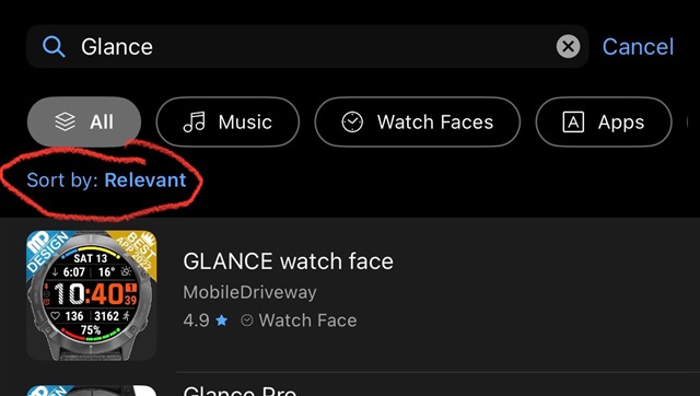
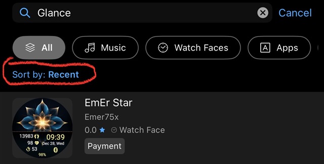
  • I just realized that I usually scroll through the watch faces on my phone, which has no way to filter anything (beyond the Search function, which works poorly). The online PC version of Garmin IQ on the other hand DOES have a little filter pull down where one can sort by recent-ness, star score, etc.

  • I just realized that I usually scroll through the watch faces on my phone, which has no way to filter anything (beyond the Search function, which works poorly). The online PC version of Garmin IQ on the other hand DOES have a little filter pull down where one can sort by recent-ness, star score, etc.

    I hate to "well actually" you but, well actually, it looks to me like the Connect IQ app (at least on iOS) and the Connect IQ website have the same sorting and filtering features.

    - On both the app and the website, if you select a category (like "Hot & Fresh Apps"), there's no way to further filter or sort that category

    - On both the app and the website, if you search by keyword, then you also have the ability to filter by app type ("All App Types", "Watch Face", "Device App", "Data Field", etc.), and you have the ability to sort ("Most Relevant", "Highest Rated", "Most Popular", "Most Recent".)

    It might be easy to miss the sort control in the app because it's just a little blue label under the search field.

    So as far as I know, the sorting and filtering options in the app and the website are basically identical, except that the app only shows results for the currently selected device, while the website shows results for all devices (although there is a "secret" way to filter by device)

    (beyond the Search function, which works poorly)

    Be that as it may, pretty sure the search function is equally bad in the app and on the website.

  • Two clicks is too hard for you?  How many years have you been complaining about this?  4? 5?  Shouldn't new users learn about how to do things?

  • Two clicks is too hard for you?  How many years have you been complaining about this?  4? 5?

    It's not too hard for me, I do it all the time.

    How many years have you been failing at reading comprehension (if you even bother to read in the first place)?

    Again: someone said that it's too bad their bug report was removed from the default view and I replied that the default view is useless in any case. Also, most users of any software/website/app will never change *any* settings from the default, which is why it's important to choose usable default settings.

    It shouldn't be hard to understand.

    It's also pretty ironic that you're the guy who always says that voting for bugs is a waste of time, yet you acknowledge it affects how the list is presented to us (and probably Garmin employees as well.) May as well go one step further and acknowledge that posting bug reports is mostly useless too.

  • It's not that me that didn't understand this thread as it progressed

  • It's not that me that didn't understand this thread as it progressed

    ?

    I understand the thread, let me recap it for you:

    - Serval (OP) complained about spam watchfaces

    - eau_de_vie mentioned that they posted a bug report but it's been marked as complete, removing it from the default view

    - I said it's basically irrelevant that it's removed from the default view bc the default view is not useful for seeing recent bugs anyway (the bug report was not in the first page of the default view, for example). I also predicted that *somebody* would reply "it's easy to change the bug reports view"

    - You replied that it's easy to change the bug reports view, as predicted

    - Serval pivoted by saying, right, you can't sort by date in the CIQ store (although we were actually talking about the bug reports subforum.) No big deal tho

    - You replied that sorting/filtering by date is useless for Serval's goal of avoiding spam

    - I replied to your comment about the bug reports view, confirming that it matched my earlier expectations 100%

    - Serval followed up by saying that the CIQ website actually has the filtering/sorting features they want, unlike the app

    - I replied to Serval, saying that actually the filtering and sorting capabilities of the CIQ website and app are actually identical as far as I can tell (except that the app also filters by the currently selected device)

    I challenge you to point out any instance of something I didn't understand here. On the contrary, I can remember several times that you comically failed to read or understand a post or bug report, to the point that when someone else replied to OP after actually trying to understand the post, OP was like "thanks for actually reading my post".

    What this forum really needs are threaded replies so that more than one convo can co-exist without causing confusion (to be clear, I'm not confused, but I think you're under the mistaken impression that I am). (Yeah, I know the forum used to have threaded replies and it didn't work.)

    What may have confused you is that I replied to your earlier comment, not your latest comment, although I took care to quote what I was replying to and the previous context.

    EDIT: I agree that it sucks that the bug report was closed. Not necessarily just bc it was removed from the default view, but also bc, as pointed out, it can't receive any more votes, and it's implied that it won't be considered or worked on in the future (yes I know Garmin said they would look at it, nevertheless).

    I also concede that when users change the bug report view settings, they’re probably more likely to just change the sort type to date (descending) as opposed to also changing the filter to show both open and closed bug reports. 

  • Why did this thread devolve? I too want to be able to reliably search and be presented with high quality faces. I want to be able to search selectively/exclusively for things like:

    My watch, a Fenix 8 only most importantly,

    Then:

    Most recent, most popular, specific artist, and/or genuine Garmin only, etc.

    I often presented 22K plus items of !?@$.

    I send money here. Hey Garmin! Respect that! And respect our time.

    BTW, NO Fenix 8 faces tickle my fancy primarily due to tiny typefaces and blended (smeared) colors. YES, I do know I can fiddle with thousands of colors.

  • There's a way to do that even without AI but yes automatically but i think they won't spend the money to develope it.