Just enough luminance?

Among the group, who has successfully used the new 10% "luminance" threshold instead of the 10% "lit pixels" threshold?

I'm exploring ways to try the luminance route, and I'm finding it hard to get the right luminance to uniformly "dim" the screen.  I'm trying to take the "easy way" out and just paint a semi-opaque black rectangle over the entire screen -- with just the right amount of "alpha" so that it hits the luminance threshold.

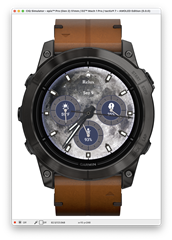
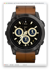
But I'm finding big differences between the amount of "dimming" I need to apply for various themes. For example, between these two themes on the same watch face app, I'd need to apply drastically different "dimming" layers.  The bright moon one would require a lot more darkening than the "deep sky" one with a black background and stars.

I see a few options:

- Configure different "dimming" parameters based on each theme (tuning it myself, with some themes needing to be darker than others)

- Get more complicated and "dim" specific parts of the screen (e.g. the background by itself)

Any tips or ideas?  What has worked well?
  • Sounds logical to me: using semi-opaque black rectangle means IMHO that you reduce the luminescence by a given percentage. Starting from a darker picture you get a darker result. Darker result means less luminance. What am I missing?

  • I was trying to see if anyone came up with a more clever way of "picking" the correct darkness given whatever is dynamically on the screen.

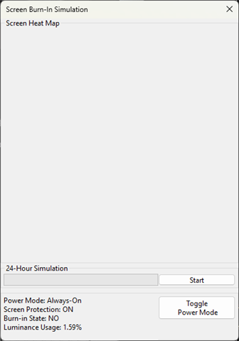
    Is there any kind of built-in "current luminance used" function I missed in the docs, which can be used?

    To hack it, I made a temporary Setting/Property I could tweak at runtime to control the "dimming.  Then I went theme-by-theme, finding the right % darkness for each theme to get it just under 9.5% luminance.  Very manual, and I'm not sure that's super reliable for testing all cases/devices.  But it's my current solution.

    It would be really swell if Garmin provided a simple "turn down the lights" function that turned it down, however much necessary, to just render the same thing but darker.  I appreciate the flexibility to do something more "custom" here, but I think most developers just want "the same thing but dark enough."

    Anyway, i shipped my updates as is, but I'm open to hearing other clever solutions to solving this.