Vertically Center Icon in IconMenuItem using Menu2

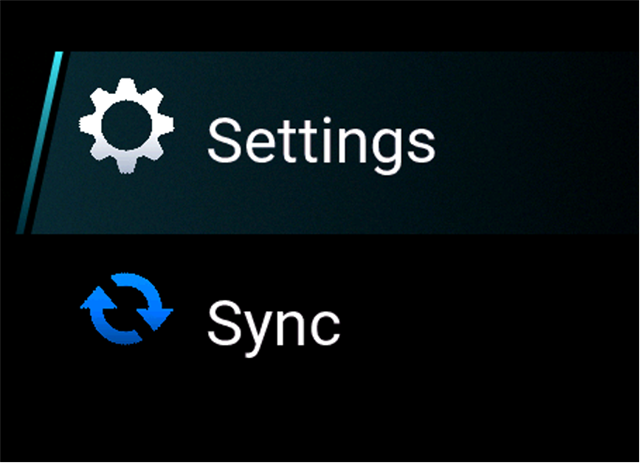
I am using IconMenuItem with a Menu2 class. I cannot get the icons to vertically center (and align to the text). Here is my code snippet:

***************************************************************************

rootMenuView = new WatchUi.Menu2({:title=>$.appName}); 

var myMenuIcon = new WatchUi.Bitmap({:rezId=>Rez.Drawables.menuSettings});

var mySyncIcon = new WatchUi.Bitmap({:rezId=>Rez.Drawables.menuSync});  

rootMenuView.addItem(new WatchUi.IconMenuItem("Settings","","settingsID", myMenuIcon, {:alignment=>WatchUi.MenuItem.MENU_ITEM_LABEL_ALIGN_LEFT}));

rootMenuView.addItem(new WatchUi.IconMenuItem("Sync","","syncID", mySyncIcon, {:alignment=> WatchUi.MenuItem.MENU_ITEM_LABEL_ALIGN_LEFT}));

*****************************************************************************

Icons are aligned to top of menu item while text is vertically centered. Testing on a Forerunner 965 (sim and device). Any help would be greatly appreciated. 


  • Can you show a screenshot? Are your icons bigger or smaller than the text height?

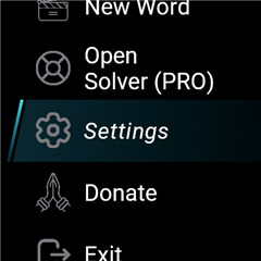
  • This is how it looks in my app:

    And this is the xml:

    <menu2 id="MainMenu2" title="@Strings.menu_title">
        <icon-menu-item id="resume_game" label="@Strings.menu_label_resume_game" icon="@Drawables.resume"/>
        <icon-menu-item id="reset_game" label="@Strings.menu_label_reset_game" icon="@Drawables.reset"/>
        <icon-menu-item id="new_game" label="@Strings.menu_label_new_game" icon="@Drawables.new_word"/>
        <icon-menu-item id="solver" label="@Strings.menu_label_solver" icon="@Drawables.help"/>
        <icon-menu-item id="settings" label="@Strings.menu_label_settings" icon="@Drawables.settings"/>
        <icon-menu-item id="donate" label="@Strings.menu_label_donate" icon="@Drawables.donate"/>
        <icon-menu-item id="exit_game" label="@Strings.menu_label_exit_game" icon="@Drawables.exit"/>
    </menu2>
    

    What happens when you remove the alignement?

  • The way your menu items are aligned is what I am trying to achieve. I do create my menu only through Monkey C code (no XML). I did set the alignment parameter to null. No change. I am using SDK 7.2.1. I do appreciate you taking the time to provide advice. Thanks, Tyson

  • I think (maybe more hope) there's a way to do the same from code. But there might be some bug that will prevent you achieving it. Is there a real reason why you do it from code and not xml? Is it dynamic or something like that?

  • Yes. It was so I can have a single icon set and dynamically resize based on watch type. I will try this evening to redo using XML to see if it corrects the issue. I have not used XML, so may take a moment for me to implement.

  • Ah, good that I asked. That's a very bad thing to do in the code IMHO, and there's no need to do it, because the compiler will do it for you this way:

    <drawables>
    <bitmap id="long_key_press" filename="arrow-down-up.svg" automaticPalette="true" dithering="none" scaleX="15%" scaleRelativeTo="screen" />
    </drawables>
    This way I have 1 set of icons, but they are resized in compile time to a size relative to the screen.
  • Good news and bad news. Switching to XML has centered the icons in the Simulator. On a 965 watch they are still skewed towards the top of the menu item. Again, thanks for getting me this far. Any further ideas are appreciated. I have verified that my graphics are vertically centered in the image files.

  • I mean clearly Connect IQ is just drawing the images with a vertical alignment of "top" rather than "center", and the only reason flocsy's example works for him on a real device (assuming it does) is because his images (including padding) are the perfect size so you can't tell the difference between top alignment vs. center alignment.

    In your case, if you scaled the bitmaps in the XML as flocsy suggested, then the fact that the icons are little bit bigger may have masked this problem (especially if there's padding around the visible pixels as you suggested.)

    My educated guess is the only way to make it look right is to use icons that are exactly the right size for the menu items (including padding), which ofc may be an issue if you want to test on other devices and you don't have the real devices handy.

  • At first I also thought it's the image size, but then I looked at mine, and they were more or less the same (or at least in both cases the icon size vs text height look similar)

    Secondly my icons don't have padding. They are as I downloaded them from a free website for SVG icons. 

    Thirdly, yes they look the same on the real fr965, fenix6:

    BTW you can see that the same icon size is correctly centered both in the line where the text is rendered in 1 and 2 lines