
Hi,
I'm trying to replicate the aesthetic of the default Garmin Edge 1040 Datafields. My goal is to change the background color according to HR / Power zones.
This is my current result:
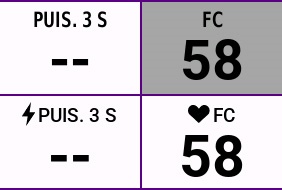
As you can see, I'm not that far from the original layout, but the smalls differences drives me nuts!
So I was wondering if there's a solution to slightly increase font size and if we can use the heart and power icon in labels?


