Is there a component for multiple number picker similar to wallet PIN input?

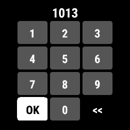
In the app I'm working on am looking to add an input for a PIN number. It will be used for simple one-time authentication. The standard picker component is too clunky. I really like the input method on the wallet app.


Are there component libraries that are open-sourced that developers could use from standard Garmin apps or other cool sources to get good-looking user input components?

Cheers!

  • There is nothing standard in CIQ.  Recall that things in the native FW like this aren't written in CIQ.

    Also note, even the pin entry for Garmin Pay look/act different on different devices.

  • I have a number picker barrel I'm working on; the code works but I just need to properly extract it from one of my projects and clean it up. Looks like this:

    Would that be of interest?

  • How that works on devices without touch screen?

  • How that works on devices without touch screen?

    Pretty much all the devices have touch screen now. But for those that don't I would think that users would use it the same way as the native PIN number picker and utilize the buttons.

  • Yeah but it isn’t optimal to use the same UI for buttons and touch. I know Garmin 5-button devices do it, but they suffer in some cases. Like Spotify whose UI is optimized for touch on devices like Venu which don’t have full functionality when touch is disabled, but whose UI is optimized for buttons on devices like Forerunner where touch is optional - the touch experience on the latter devices sucks.

    For example, the circular menu keyboard makes sense for buttons but the “T9” (without predictive text) keyboard makes sense for touch. It’s a bit awkward, but at least Garmin lets you choose between them now. There isn’t much else they could do since they can’t exactly read the users mind to determine whether they want to use touch or buttons when touch is enabled.

    In the case of the native PIN picker, I haven’t seen it in person, but I saw a picture of it on Fenix 7 where it looked to be a circular dial like the keyboard on 5-button watches (i.e. optimized for button input.)

    Having said that, your component looks nice and thanks in advance for sharing!

  • Yeah but it isn’t optimal to use the same UI for buttons and touch.

    My number picker barrel utilizes layouts (but could be setup for direct draw), so you could have a layout for touch (similar to the T9-ish layout in my image) and a layout for buttons (that could mimic the native picker layout).

    In the case of the native PIN picker, I haven’t seen it in person, but I saw a picture of it on Fenix 7 where it looked to be a circular dial like the keyboard on 5-button watches (i.e. optimized for button input.)

    You can see the native PIN picker above in the OP's post; it's the same for touch-only, button-only or both.

    My picker is used in a couple of apps, one of which sees about 2000 uses per week. It's not a big number of uses but I would contend it's enough to make a reasonable estimate on user acceptance -- so far, after seven months of use there hasn't been too much pushback. Wink

  • You can see the native PIN picker above in the OP's post; it's the same for touch-only, button-only or both.

    Yeah that's the one I was thinking of haha. That's what I get for replying to a post that I've seen before without scrolling back to double check the OP.

    My point was that it's clearly optimized for buttons while yours is optimized for touch. I like yours but I think users who choose to use buttons (or lack a touchscreen) would prefer the dial.

    My other point is even Garmin has trouble designing interfaces which work equally well with touch and buttons. (That's why the interfaces for the "mandatory touch" devices like Venu are different than the 5-button touchscreen interfaces, such as the Venu's controls menu not being a dial iirc, and the superior touch-based UI in Spotify for Venu.)

  • My point was that it's clearly optimized for buttons while yours is optimized for touch. I like yours but I think users who choose to use buttons (or lack a touchscreen) would prefer the dial.

    I would have thought so too but as I stated, there has only been a few complaints (from those wanting the old, NumberPicker class design) and no one has yet mentioned that they prefer the dial.

    That said, because my barrel uses layouts you could easily create a layout that mimics the dial. In fact, if I have time I may add that in.

  • That would be great, thanks!

    I think what would be really cool (but impractical) would be an interface that adapts depending on whether you choose to use buttons or touch. Like how the button hints in PC video games change depending on whether you use mouse/keyboard or controller.

    Ofc it's impractical bc changing a whole interface would be a bit more jarring than some button labels changing. And bc touching a screen isn't the same as moving a mouse / pressing a key, especially considering that accidental touches happen.

    However, it would be cool if you could opt in to a touch-friendly interface (via a little finger/touch icon), similar to how you can opt into the "T9" keyboard. Ofc that assumes that you'd be starting with a button friendly interface.

    Or if you started with a touch friendly interface, it could adaptively change to a button-friendly interface if the user presses a button. (But then you'd need a way to switch back to the touch friendly interface.)

    Yeah, I realize all of this stuff sounds complicated to implement and/or confusing to the end user, which is probably why Garmin hasn't implemented any of it, except for the ability to switch between keyboards.

  • Very much interested! I think for non-touch input it could even be a navigation around the numbers with up/down move to next column kind of thing?