how to make a confirmation, looks like style guide?

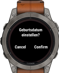
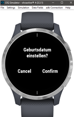
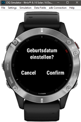
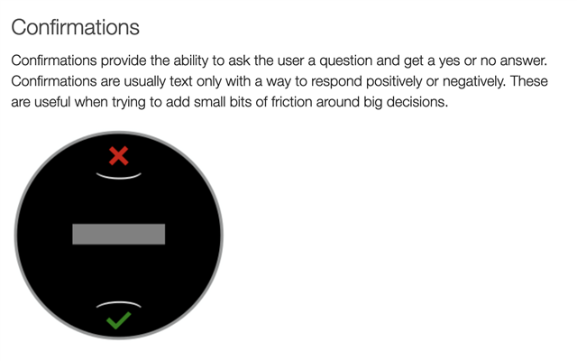
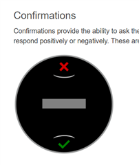
On the web page https://developer.garmin.com/connect-iq/ are several examples of a confirmation: 

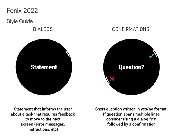
Can I use it like that?

When I use the WatchUi.Confirmation and ConfirmationDelegate it looks totally different and I cannot change the text of the confirm and cancel text.

  • The last picture is what IQ provides (you can't change it). Note that Garmin "reserves the right" to change how it looks (and it might look different on different devices).

    The other images are examples (which you'd have to program yourself).

    developer.garmin.com/.../

    Note the section is "User Experience Guidelines". It's not necessarily a "Style Guide".

  • This all depends on the specific device. thing are different on touch only devices and those with buttons

    Your last image is 5 buttons. the one with the x on top looks like a vivoactive or venu,  The one with the checkmark and X on the sides is a device with buttons, and it indicates which button to press and is a newer device.

    You'll also see things like menu2 will differ by device

    What you're looking at isn't so much a "style guide" as it shows how things look on different devices, IMHO.

  • What you're looking at isn't so much a "style guide" as it shows how things look on different devices, IMHO.

    Do other devices look like the other pictures?

  • To be honest, I've not really looked at that doc much.  I've seen enough real watches over time, and the doc might be for people that have never seen something like a venu. for example, as things look different than on a fenix or a forerunner.

  • There's no indication (on that page) that the other images are being used by Garmin (or anything).

    It's important to avoid reading too much into documentation. 

    It's kind of moot anyway because you can't pick the style (which is what the OP is asking about).

  • I cannot agree. it looks the same on 2 button device, such as vivaoactive 4 or 4s.

    I thought the styles from the style guide, which are also inside the Garmin Apps are usable by programmer. but seems not.

    But anyway. Thanks for your quick repsonse. For now I am just going to accept it :)

  • That's the sim.  Not the real device.  The sim shows a generic view of some things.

    If you look at the API doc and things like confirmation and menu, you see a note like:


    "The look and feel of a confirmation dialog is device-specific."

    Do you have a real device where you can see how things look there?

  • yes. I have a Fenix 7 pro and a vivoactive 4s. I will create a build and test. 

    Good Idea. I though the sim is able to do that.

    --> Works on the device. Thanks a lot for the hint

  • What you're looking at isn't so much a "style guide" as it shows how things look on different devices, IMHO.

    Except if you look at the page one of those pictures is from, it literally says "style guide". I actually agree with you, but it doesn't help that Garmin literally put the text "Style Guide" on those pages.

    https://developer.garmin.com/connect-iq/user-experience-guidelines/fenix-2022/

    On other hand, another of the images is from the (generic) confirmations page, which isn't a "style guide" (although it is part of the "User Experience Guidelines"):

    https://developer.garmin.com/connect-iq/user-experience-guidelines/confirmations/

    Do other devices look like the other pictures?

    Yes, they do. I have a 955, and the native confirmations look just like the screenshot from the "Fenix 2022" style guide.

    The confirmations page is clearly meant to show a generic example, but it looks very similar to the Venu 2021 and Vivoactive 2019 style guides:

    https://developer.garmin.com/connect-iq/user-experience-guidelines/venu-2021/

    https://developer.garmin.com/connect-iq/user-experience-guidelines/vivoactive-2019/

    My two cents is even though these pages say "style guide", they really show examples of the native UI components, as jim_m_58 said. Sure, you could recreate those if you had to, but is anyone going to do that?

    I've seen one attempt to recreate the Menu (not Menu2) component to allow items to be dynamically added and removed. While it was an admirable and much appreciated effort, it's years old, unmaintained, and had some non-trivial bugs at one point. It also didn't match the native UX in some ways, even at the time it was released.

    I haven't seen anything else that comes close, at least nothing publicly available. I feel like CIQ is too much of a niche for people to invest a ton of time reinventing the wheel in a pixel-perfect fashion. I've seen a feature-rich menu reimplementation that didn't match the native UI/UX though.

    The last picture is what IQ provides (you can't change it). Note that Garmin "reserves the right" to change how it looks (and it might look different on different devices).

    The other images are examples (which you'd have to program yourself).

    I tried the SDK ConfirmationDialog sample on my 955, without modification (except to add my device to the manifest). It uses WatchUi.Confirmation to display the confirmation prompt.

    I can confirm that, on a real 955, the confirmation dialog looks like the Fenix 2022 screenshot, as opposed to the basic confirmation prompt shown in the sim.

    Here's a device screenshot:

    I agree that it's not always the case that CIQ provides the same UI/UX as native code on the device. But at least in this specific case, the CIQ confirmation dialog is the same as the native confirmation dialog.