As per title - I don‘t understand the graphs of the CIQ statistics.
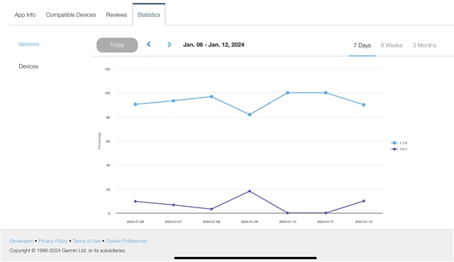
As an simple example: here are the 7 days figures for one of my datafields.
The dark blue line (bottom) is version 1.0.1 which is not available anymore since end of November 2023. Since December only version 1.1.0 (top line) is available for downloading.
How is it possible that this old version has a risen line of downloads in the last days?