How to set the theme of a custom menu?

Probably a very easy problem to solve, but: I am struggling to set the theme of a custom menu. I tried like this:

var mainMenu = new WatchUi.CustomMenu(75, Graphics.COLOR_WHITE, {

        :focusItemHeight=>75,

        :focus=>0,

        :title=>new $.MainMenuTitle(),

        :footerItemHeight=>80,

        :theme=>1 // This is theme                  

    });

But this always fails to compile. Could anyone please help?

Top Replies

All Replies

  • What device are you using?  The API Doc says this:

    Note:

    The :theme option is only used on ConnectIQ 4.1.8 devices with menu theme support. The background color will not be used if themes are supported and the theme is non-null.

  • Forerunner 965 with API 4.2.x.

    How do I set the background color?

    Compile error:

    Invalid '$.Toybox.Lang.Dictionary{:focusItemHeight as $.Toybox.Lang.Number, :title as $.MainMenuTitle, :theme as $.Toybox.Lang.Number, :focus as $.Toybox.Lang.Number, :footerItemHeight as $.Toybox.Lang.Number}' passed as parameter 3 of type 'PolyType<Null or $.Toybox.Lang.Dictionary{:icon as $.Toybox.Graphics.BitmapType or $.Toybox.Lang.Symbol or $.Toybox.WatchUi.Drawable, :focusItemHeight as Null or $.Toybox.Lang.Number, :titleItemHeight as Null or $.Toybox.Lang.Number, :title as $.Toybox.WatchUi.Drawable, :theme as Null or $.Toybox.WatchUi.MenuTheme, :focus as $.Toybox.Lang.Number, :foreground as $.Toybox.WatchUi.Drawable, :footerItemHeight as Null or $.Toybox.Lang.Number, :footer as $.Toybox.WatchUi.Drawable}>'.

  • where you have COLOR_WHITE in the code you posted, that's the background color.  Take out the line where you have :theme, and change it to COLOR_GREEN or something to see it.

    Have you experimented with the menu2sample in the SDK?

    You can also try using 

     :theme=>WatchUi.MENU_THEME_BLUE

    instead of "1" as the type checker is complaining about something and that might be it..

  • Thank you, that at least removes the compile error. But in the simulator, no visual change is shown.

  • I tried setting a custom menu theme in the SDK Menu2Sample, for a simulated 965.

    MenuSampleBasicCustom.mc:

    //! Create the Basic Drawables custom menu
    function pushBasicCustom() as Void {
        var customMenu = new WatchUi.CustomMenu(
            35,
            Graphics.COLOR_GREEN, // 👈 modified arg
            {
                :focusItemHeight=>45,
                :foreground=>new $.Rez.Drawables.MenuForeground(),
                :title=>new $.DrawableMenuTitle(),
                :footer=>new $.DrawableMenuFooter(),
                :theme=>WatchUi.MENU_THEME_ORANGE // 👈 new option
            }
        );

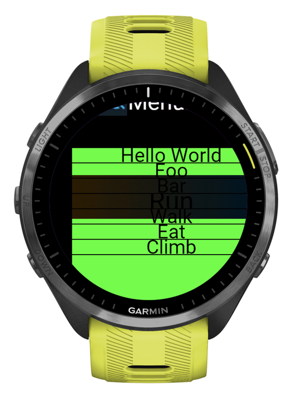
    Changing the theme actually seems to change the appearance of the UI element (*) which highlights the focused item, contrary to the implication in the docs (**). Also contrary to what the docs explicitly say, the background color (2nd arg) is still respected. At least that's what I see in the sim.

    (*) This element only seems to be present for touchscreen devices. As the docs point out, focusItemHeight is ignored for non-touchscreen devices, which suggests that the focused item is distinguished by its height on those devices.

    EDIT: Looks like the highlighter element is only present on newer watches, like Forerunner 265 and 965 (in order to match the new look of native menus).

    (**) [https://developer.garmin.com/connect-iq/api-docs/Toybox/WatchUi/CustomMenu.html#initialize-instance_function]

    The background color will not be used if themes are supported and the theme is non-null.

    ^ This is obviously not true.

    This is what MENU_THEME_ORANGE (with a green background) looks like.

    For contrast, MENU_THEME_BLUE:

  • I am experiencing similar flaws. Probably it makes sense to avoid custom menus and use Menu2 instead.

  • I am experiencing similar flaws. Probably it makes sense to avoid custom menus and use Menu2 instead.

    I feel like it's working (somewhat) as intended, but the documentation is incorrect.

    Ofc it looks kinda weird in the sim, but it's possible that the item highlighter will look good on a real watch (e.g. maybe it won't be oversized like the one in the screenshots.) Or, maybe the onus is on the developer to make the item height match the highlighter size. It makes sense that the highlighter item would be big, since it's meant for touchscreen usage. Looking at the Menu2Sample in the sim, the highlighter for Menu2 does seem to be a simliar size (if not appearance) to the custom menu highlighter.

    Probably best to try it out on a real watch (I don't have a touchscreen watch 965 tho).

    Based on everything above, I'd also say the sample needs some work.