What is the order of fonts by size?

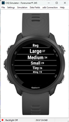
My datafield tries to use the biggest font that fits the text to be displayed to the place available. The text can include letters, so numeric-only fonts are not of interest.

Currently I only try the fonts available in CIQ 1.0.0, but users ask if I can make the fonts bigger. So I started to look into it, and would need to get the right "generic" (true for all devices) order of fonts.

I assume that both of these are true:

CIQ 1.0: FONT_XTINY <= FONT_TINY <= FONT_SMALL <= FONT_MEDIUM <= FONT_LARGE
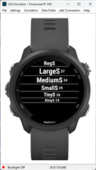
CIQ 1.3: FONT_SYSTEM_XTINY <= FONT_SYSTEM_TINY <= FONT_SYSTEM_SMALL <= FONT_SYSTEM_MEDIUM <= FONT_SYSTEM_LARGE

But is there a way to merge these 2 lists into 1?

In general what is the difference between FONT_FOO and FONT_SYSTEM_FOO?

  • There is no difference.  Early on, there was an idea to have two different font sets.  One that was what was fonts used on a specific device, one that was common across all devices ('fonts for CIQ").

    FONT_* was there all along, and FONT_SYSTEM_* was the new idea.  It never went much further than the new names, but the names remain for backwards compatibility.  I can't recall the last time I used a FONT_SYSTEM_* but I might find it in some really old code,

    I just changed one of my test apps to check, and here are the fonts on a fr245:

    The FONT_* ones

    The FONT_SYSTEM_* ones

    (the small numbers on the right are the results of dc.getFontHeight(), and the line space shows the white space above and below the characters.  That really varies across devices for FONT_NUMBER_* fonts)  

    If you want to use something bigger, the only way to do it is using custom fonts, but that will be a memory hit on older devices for sure,

  • In general, FONT_NUMBER_* are the largest.  Here's the fr245 again:

    But there you will have the white space issue between devices, and the limited characters allowed. Some have things like the degree symbol. sone don't, etc)

  • OK, I think I'll go this way (add the FONT_NUMBER_* as well) when the text to be displayed "isNumeric()". The question is if there's any way to know either at compile time or at runtime if a certain string can be displayed with a certain font?

    My non-representative survey (I checked on 1 random device in the simulator ;) shows that at least these characters can be displayed with the FONT_NUMBER_* : "0123456789. \n-+/#%" but from what you wrote this is not something I can be sure of that it will work on all devices and all numeric fonts? 

    Just a note from a European to the Americans at Garmin: strange that "." is in the numeric fonts but "," isn't considering the (for me strange) ways people group digits of 3 in the USA, i.e: 1234 => 1,234

  • It's also not consistent for different number fonts on the same device.  The string you posted should be pretty consistent for all number fonts on all device,  

  • The funny thing is that a space actually isn't supported by numeric fonts on Edge. (At least last time I checked, 4 years ago). Maybe it's just me, but I find it hilarious to see a square box font substitution for a space (although I guess memory constraints are memory constraints.)

    Even funnier, the appendix for devices in the docs used to have the supported numeric font characters for every device, except nothing was quoted or delineated, so a space was invisible unless you looked at the html source or inspected the DOM.

    Other than that, I have pretty much the same list as you except I also have ":" and "°". (I've never tried "\n" though. Does it actually work?)

    Roughly:

    var isNumeric = ((c == ' ' && !isEdge) ||
        (c >=
    '0' && c <= '9') ||
        c ==
    '#' || c == '%' ||
        c ==
    '+' || c == '-' ||
        c ==
    '.' || c == '/' ||
        c ==
    ':' || c == '°');

    Haven't tested this in 4 years though.

    (Pretty funny that I am allowed to post the above snippet in a code block an new comment, but if I try to edit an existing comment with that code, I get the dreaded "you have been blocked" forum error message.)

  • Just a note from a European to the Americans at Garmin: strange that "." is in the numeric fonts but "," isn't considering the (for me strange) ways people group digits of 3 in the USA, i.e: 1234 => 1,234

    Is it really that strange? Garmin is an American company and they obviously care about their American customers first. (Not saying I agree or disagree either way, but stating obvious facts.) Obviously they don't care about grouping digits of 3 (especially on a sports watch), they care about using "." as a decimal separator. And if that looks funny to most Europeans, they're obviously not too concerned about that.

    Canadians and Britons have been asking Garmin for 10+ years to allow mixed units for distance and weight in Connect (not just on the devices), to no avail.

  • \n seems to work (again, only tried in a few devices in simulator), and that's because it's not really a letter (as opposed to space, that does have a width) but a sign to cut the line and go down 1 line, where the "down" is defined by not the height of the \n. The reason I have \n in my list is more technical, because my app tries to display 2 parts of a string, and tries both str1 + ' ' + str2 and str1 + '\n' + str2 and compares which format can be displayed with a bigger font.

    Which also leads me to the space problem, because this of course means that in 50% of the cases there will be at least 1 space in the string (but usually more), so that will make all the "isEdge" devices only use the small fonts. Do you remember a particular edge device with this problem, and whether it is reproduced in the simulator? I guess I'll need to check each one of them and do some juNgling...

    Regarding the missing ",", i think you misunderstood me, because what I was trying to say is the exact opposite :)

    I don't use "," to display big numbers like 1,000 so I'm ok without it, but I thought that the average american does use it, and knowing that Garmin is american it's strange they missed it from the numeric fonts. I can imagine that someone who is used to separate every 3 digits would prefer to display the steps or altitude in feet that way.

  • Tested all edge devices in the simulator, and only edgeexplore2 and edge1040 have the space in the FONT_NUMBER_*

  • Regarding the missing ",", i think you misunderstood me, because what I was trying to say is the exact opposite :)

    I don't use "," to display big numbers like 1,000 so I'm ok without it, but I thought that the average american does use it, and knowing that Garmin is american it's strange they missed it from the numeric fonts. I can imagine that someone who is used to separate every 3 digits would prefer to display the steps or altitude in feet that way.

    I think I understood you completely but maybe my reply was a little glib. My point was that I think Garmin is more likely to display decimal fractions like 1.23 (e.g. for speed) as opposed to big numbers over 999 (and especially over 9999/99999), with the exception of steps. Maybe its because I don't do a lot of extreme hiking or mountain marathons, so all my metrics are 3 digits or less, except for steps.

    I guess steps are huge for some people, though.

    I guess I also assumed it was obvious that while most non-American countries don't use "," as a thousands separator, they do have their own conventions such as "1 234 567" (this is the official Canadian standard although I don't know a single person who writes like this *) and even "1.234.567". (* As with a lot of things, we tend to copy the American usage of ",", due to geographical and cultural proximity.)

    Given that many countries have their own thousands separator, to me it's kinda funny to (humorously) throw shade at the US for their weird practice of using the comma as a separator, when ofc they must think it's weird that others use space or ".". I realize that the next argument would be that the US is in the global minority as far as the specific separator goes.

    I could be wrong, but I doubt most people care about a thousands separator for numbers in the range of about 1000 to 9999 or maybe even 99999. It's only when you get to 6 (or maybe 5) digits that a comma (or space, or period) seems to help with readability.

    It may even be part of some style guides that numbers with only 4 digits don't use the separator (although maybe I just made that up.)

    Can anyone really argue that 12345678 is just as easy to read as 12 345 678? Javascript literally added a feature that lets you use an underscore separator within numerical constants, so you can write something like 12_345_678. It's just easier to read - you can immediately see that the number is in the 12 million ballpark

  • Is it also weird to have a separator for phone numbers? I've seen "-", " ", and "." in various places. I think people just deal better with small chunks of digits (like groups of 3 or 4).