Connect IQ fields on dashboard not showing properly

I've developed an app for garmin watch to track squash matches and save this information to connectIQ.

In the app the information shows perfectly fine but on the web dashboard it's completely messed up.

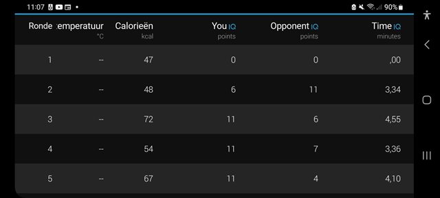
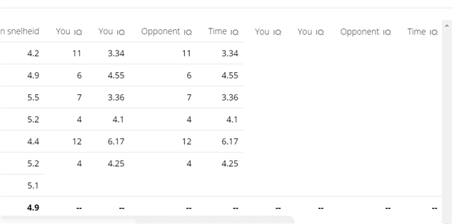
Hopefully somebody can help me out with this problem

  • Since it looks ok in the app it looks like another bug in the way the website displays CIQ recorded fit data. I opened many bug reports, only some of them were fixed.

    Add more info here (i.e, the fitcontributor.xml) and the link to the activity (if you don't mind putting it public) and then go to Garmin Customer Support website and report the bug by email (no chat or phone) by sending the link to this thread.

    I personally would like to ask you one more thing: can you also post the code of the fitcontributor? I'd like to learn how to create these nice tables.

  • I'd like to learn how to create these nice tables.

    Which part did you have a question about?

    - The "points" and "minutes" labels come from the "unitsLabel" property in the XML

    - "You", "Opponent" and "Time" are in the lap table because they are recorded as MESG_TYPE_LAP and displayInActivityLaps is true in the XML

    The only tricky part is that lap values have to be set *before* the onTimerLap() notification, which basically means you have to be calling FitContributor.Field.setData() continuously. (The MoxyField sample calls setData() continuously for all 3 types of FIT field message -- MESG_TYPE_RECORD, MESG_TYPE_SAMPLE and MESG_TYPE_SESSION -- although for the session message, you can get away with only calling setData() when the activity is paused, since it's impossible to end an activity without pausing it first (of course I'm assuming we're talking about a data field, and not a device app.)

  • This is my fit-contributions.xml Could it be that my sortorders are wrong. I had more fields in the past but I removed some of them since they didn't add any extra value. But I see I left the sortorders so now they don't really add up. If I need to fix these should they start from 0 or 1?

    It's a device app. It sets a new lap for each new squash game started.

    <resources>
      <fitContributions>
        <fitField
    			id="0"
    			displayInChart="false"
    			displayInActivityLaps="true"
    			displayInActivitySummary="false"
    			sortOrder="2"
    			precision="0"
    			dataLabel="@Strings.fit_game_score_player_1_label"
    			unitLabel="@Strings.fit_score_unit_label" />
        <fitField
    			id="1"
    			displayInChart="false"
    			displayInActivityLaps="true"
    			displayInActivitySummary="false"
    			sortOrder="3"
    			precision="0"
    			dataLabel="@Strings.fit_game_score_player_2_label"
    			unitLabel="@Strings.fit_score_unit_label" />
        <fitField
    			id="2"
    			displayInChart="false"
    			displayInActivityLaps="true"
    			displayInActivitySummary="false"
    			sortOrder="4"
    			precision="2"
    			dataLabel="@Strings.fit_game_game_time"
    			unitLabel="@Strings.fit_game_time_unit" />
        <fitField
    			id="3"
    			displayInChart="false"
    			displayInActivityLaps="false"
    			displayInActivitySummary="true"
    			sortOrder="1"
    			precision="0"
    			dataLabel="@Strings.fit_steps_taken_label"
    			unitLabel="@Strings.fit_steps_unit" />
        <fitField
          id="4"
          displayInChart="false"
          displayInActivityLaps="false"
          displayInActivitySummary="true"
          sortOrder="2"
          precision="0"
          dataLabel="@Strings.fit_match_score_player_1_label"
          unitLabel="@Strings.fit_score_unit_label" />
        <fitField
          id="5"
          displayInChart="false"
          displayInActivityLaps="false"
          displayInActivitySummary="true"
          sortOrder="3"
          precision="0"
          dataLabel="@Strings.fit_match_score_player_2_label"
          unitLabel="@Strings.fit_score_unit_label" />
      </fitContributions>
    </resources>

  • I don't think it has anything to do with the sortOrder properties (although I could be wrong). The bug you're seeing looks like other bug(s) which have been reported in the past, especially the fact that it only happens in one of the Connect app and the website.

  • Yes it is very weird that it shows fine in the phone app but not on the web dashboard.

  • OMG!

    I only ever saw Lap,Time,Distance,AvgPace in the GCM app's lap tab.

    Only now that I tried this when in landscape mode I realized that it is possible to more fields including my CIQ fields!

    Doesn't this sound like a bug in GCM? I mean shouldn't scrolling left-right in portrait mode also display the rest of the table?

    BTW I checked the same activity on the web and I see the same chaos. I should have have 3 IQ fields: min/avg/max ANT HR, and I have them twice: min,avg,max,min,avg,max but in my case the values are also there. So essentially all 3 columns are duplicated (header and values alike)

  • Doesn't this sound like a bug

    The answer is always "yes it's a bug" and "pls stop whining and complaining".

    I mean shouldn't scrolling left-right in portrait mode also display the rest of the table?

    But seriously this is a terrible design decision. You actually can't scroll left/right in portrait mode (on iOS at least), you *have* to use landscape mode to both see all the columns and scroll left/right. That's why there's a little icon below the lap table which quietly suggests that you rotate your phone.

    There's a longstanding bug related to this feature - if you have lots of laps, you'll also want to scroll up/down while you're in portrait mode. You'll find that if you daringly attempt to combine scrolling left/right with scrolling up/down, the columns will visually go out of alignment and it'll be tough to read the table. I've mentioned this several times over the years and probably filed bug reports, but you know what they say about whiners.

  • If anyone's ever used the Stryd app, it does almost everything better than Garmin Connect, as far as displaying your data goes.

    I will say that Stryd (like the Garmin Connect website) is pretty bad at displaying pace when you have any periods of walking slowly or stopping, because the choice of scale pretty much makes all your periods of running indistinguishable. Somehow Garmin Connect (the app only) and Strava are the only who get it sort of right (as well as runalyze, but it's very niche.)

  • Ahhh, there's an icon!? NOW that you told me I see it. It might even remind me next time, but for 2 years I haven't notice or understand it's meaning... BTW I'm in android, but everything you described is the same so it sounds like a design decision...

  • Yeah, so in the Stryd app (for example), there's a prominent button/link to view data as a table, at which point it forces your phone into landscape mode. A much better decision imo. (Normally data is just displayed in the form of a summary.)