Difference between simulator and real devices

Hi,

After several hours of trial and error to get the look and feel right, I was annoyed that on a different device with the same resolution everything was different in the simulator (in my case because of the differences in standard fonts of the Edge 1030 series and Edge 1040 series.

Ok, so I spended another hour to tune the same things for the other series in the simulator. All fine.

BUT, surprise surprise, after loading onto the device, there are some strange differences.

Anyone can tell me why ? I do not have access to all devices to test!

This is in the simulator (daytime simulation):

And this is a screenshot made on the actual device (1040):

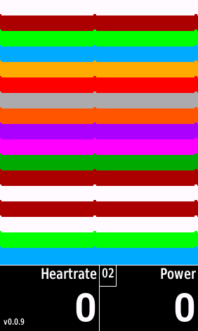
Apart from the difference in fonts and sharpness, on the real device on the places that an empty string is shown, there is a 'pixel' too high?

In the meantime I will continue testing.

  • Are you trying to draw text in each of the color bars?  How does it look of the real device if you comment that out?  That could be related to the bumps.

    How are you drawing the color bars?  dc.fillRectangele()?

  • Yes the bumps are caused by text in the column bars. If I put actual text than you can see that the text is placed too high up on the real device.

    Bars are drawn with drawline, after setting a certain penWidth. This way I can change the number of rows (increase/decrease) and match that with a certain fontsize (in future will be a user setting to choose more rows smaller font or fewer rows larger font).

    After drawing the lines, the text is put in with drawText.

    If I lower the text position by 3 pixels vertically, on the real device everything is ok on the real device (for the 1040), however on the simulator the text is partly hidden by the next line.

    Today I will test with a real 1030 device.

  • Just tested on a 1030, there all OK (same on real device as in simulator)

  • I don't have a solution that works for all devices, but maybe the way I used to debug these kind of layout issues can be helpful: I use constants for colors, and I can have different constant for (:release) and (:debug). This way I can set both the foreground and the background color to something that is different from everything around. When I write the text this way I see a box (with the background color I choose) that gives me a very good indication about the actual text box. Note that the margin between the edge of the box and the letters can be different depending on the letters. for example x vs f: f is higher, so it's closer to the top of the box. I also noticed that some fonts have "too much" margin so in some cases I intentionally overlap some graphic elements with the line of text below it to make them closer. Even though the text box overlaps, the actual font (in my case at least) doesn't.