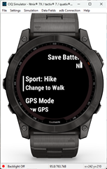
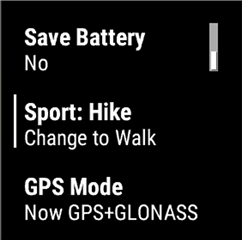
Menu2 looks terrible on new devices and the alignment options make no sense. Or does it only look bad in the simulator?
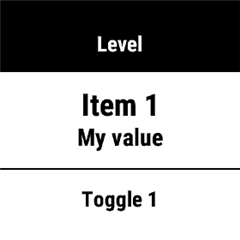
Here's a simple Menu2, adapted from the example in the api documentation. No alignment options specified.
function onMenu() {
    var menu = new WatchUi.Menu2({:title=>"My Menu2"});
    var delegate;
    menu.addItem(new WatchUi.MenuItem(
        "Item 1",
        "My value",
        :item1,
        {}));
    menu.addItem(new WatchUi.ToggleMenuItem(
        "Toggle 1",
        {:enabled=>"enabled", :disabled=>"disabled"},
        :toggle1,
        false,
        {}));
    menu.addItem(new WatchUi.ToggleMenuItem(
        "Toggle 2",
        {:enabled=>"enabled", :disabled=>"disabled"},
        :toggle2,
        true,
        {}));
    delegate = new MainMenuDelegate();
    WatchUi.pushView(menu, delegate, WatchUi.SLIDE_IMMEDIATE);
    return true;
}
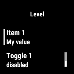
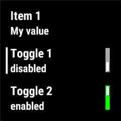
This looks fine on a fenix6x or older device. Here's what it looks like on a fenix6x, showing the 1st and 2nd item selected:
1st item:
2nd item:
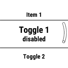
Here's what it looks like a fenix7x:
1st item:
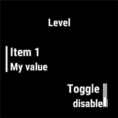
2nd item:
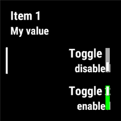
Why is the alignment inconsistent on the fenix7x? Why are the labels on the toggle items cut off? And it looks even worse in the simulator; due to the round screen, even more is cut off from the previous/next items on the menu than what's shown in the screen capture.
I figured I'd try out some of the alignment options. Here's the modified code with right alignment on every item:
function onMenu() {
    var menu = new WatchUi.Menu2({:title=>"My Menu2"});
    var delegate;
    menu.addItem(new WatchUi.MenuItem(
        "Item 1",
        "My value",
        :item1,
        {:alignment=>WatchUi.MenuItem.MENU_ITEM_LABEL_ALIGN_RIGHT}));
    menu.addItem(new WatchUi.ToggleMenuItem(
        "Toggle 1",
        {:enabled=>"enabled", :disabled=>"disabled"},
        :toggle1,
        false,
        {:alignment=>WatchUi.MenuItem.MENU_ITEM_LABEL_ALIGN_RIGHT}));
    menu.addItem(new WatchUi.ToggleMenuItem(
        "Toggle 2",
        {:enabled=>"enabled", :disabled=>"disabled"},
        :toggle2,
        true,
        {:alignment=>WatchUi.MenuItem.MENU_ITEM_LABEL_ALIGN_RIGHT}));
    delegate = new MainMenuDelegate();
    WatchUi.pushView(menu, delegate, WatchUi.SLIDE_IMMEDIATE);
    return true;
}
Now here's the 1st item selected on the fenix7x:
2nd item:
Why is all the text left aligned when I specifically set right alignment? This at least looks better than no alignment specified. Although it still has the problem with the previous/next item labels being cut off (the cut off is only visible in the simulator). This is the best Menu2 option I could come up with on newer devices. Is there something better or do people usually just do custom menus?