Menu2 a lot of questions.

Hello!

I'm a beginner in garmin developing APP.. I have a Fenix 5x plus and I want to make a Windsurf APP.

the ideia is have an app with all my information about windsurf equipment.

when going windsurf, I will run the app, choose what sail I will use, what board and what fin, then it will only track me and record how many jibes, jumps and shows live time and speed.

I already search on this forum about my doubts but I still have ones.

To create a Menu 2, what I'm doing wrong?

what is the best way to create a menu like:

the menu is pre defined by me, will be like.

Sails
- 11 m2
- 9.4 m2
- 7.8 m2
- 7.1 m2
- 6 m2 
etc...

Boards
- Formula 161l
- Isonic 127l
- Simmer 116l
etc...

Fins
- 70 boss
- 70 Zfins
- 44 Vmax
-39 SMAX
etc...

I know it will be very hard to make this kind of app, but lets give a try... 

maybe 10 years a go on my free times I used to be "web developer", using javascript, php, Ajax, ASP, mySQL, HTML :D

Thanks!!!

menu.xml

<menu id="mainMenu_Windsurf">
    <menu-item id="item_sail" label="@Strings.menu_sail" />
    <menu-item id="item_board" label="@Strings.menu_board" />
</menu>

strings.xml

<strings>
    <string id="AppName">teste4</string>
    <string id="prompt">Windsurf APP</string>
    <string id="menu_sail">Sail</string>
    <string id="menu_board">Board</string>
</strings>

teste4App.mc

import Toybox.Application;
import Toybox.Lang;
import Toybox.WatchUi;

class teste4App extends Application.AppBase {

    function initialize() {
        AppBase.initialize();
    }

    // onStart() is called on application start up
    function onStart(state as Dictionary?) as Void {
    }

    // onStop() is called when your application is exiting
    function onStop(state as Dictionary?) as Void {
    }

    // Return the initial view of your application here
    function getInitialView() as Array<Views or InputDelegates>? {
        return [ new teste4View(), new teste4Delegate() ] as Array<Views or InputDelegates>;
    }

}

function getApp() as teste4App {
    return Application.getApp() as teste4App;
}

teste4Delegate.mc

import Toybox.Lang;
import Toybox.WatchUi;

class teste4Delegate extends WatchUi.BehaviorDelegate {

    function initialize() {
        BehaviorDelegate.initialize();
    }


    function onMenu() as Boolean {

        var menu = new WatchUi.Menu2({:title=>"Wind Surf"});

            menu.addItem(new WatchUi.MenuItem("Sails",null,"item_sail",{}));
            menu.addItem(new WatchUi.MenuItem("Boards", null,"item_board", null));

            WatchUi.pushView(menu, new teste4MenuDelegate(), WatchUi.SLIDE_IMMEDIATE);

        return true;
    }
    

}

teste4MenuDelegate.mc

import Toybox.Lang;
import Toybox.System;
import Toybox.WatchUi;

class teste4MenuDelegate extends WatchUi.MenuInputDelegate {

    function initialize() {
        MenuInputDelegate.initialize();
    }


    function onMenuItem(item as Symbol) as Void {

        // quando carrega no bortao "vermelho"
        if (item == :item_sail) {

            System.println("VELAS");

            //CREATE SUB MENU
            var menu_sub = new WatchUi.Menu2({:title=>"Sails Size"});

            menu_sub.addItem(new WatchUi.MenuItem("7.8",null,"sail1",null));
            menu_sub.addItem(new WatchUi.MenuItem("7.1", null,"sail2", null));
            menu_sub.addItem(new WatchUi.MenuItem("6", null,"sail3", null));

            WatchUi.pushView(menu_sub, new teste4MenuDelegate(), WatchUi.SLIDE_IMMEDIATE);

        } 
        else if (item == :sail1) { System.println("you chose sail 7.8"); }
        else if (item == :sail2) { System.println("you chose sail 7.1"); }
        else if (item == :item_board) { System.println("PRANCHAS"); }
    }

}

teste4View.mc

import Toybox.Graphics;
import Toybox.WatchUi;

class teste4View extends WatchUi.View {

    function initialize() {
        View.initialize();
    }

    // Load your resources here
    function onLayout(dc as Dc) as Void {
        setLayout(Rez.Layouts.MainLayout(dc));
    }

    // Called when this View is brought to the foreground. Restore
    // the state of this View and prepare it to be shown. This includes
    // loading resources into memory.
    function onShow() as Void {
    }

    // Update the view
    function onUpdate(dc as Dc) as Void {
        // Call the parent onUpdate function to redraw the layout
        View.onUpdate(dc);
    }

    // Called when this View is removed from the screen. Save the
    // state of this View here. This includes freeing resources from
    // memory.
    function onHide() as Void {
    }

}

so... the only error is when I push the select button on "Sails", instead of open a new menu with new options (sail sizes), it doesn't do nothing...

Error: Symbol Not Found Error
Details: Failed invoking <symbol>
Stack: 

Encountered app crash.

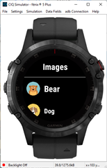
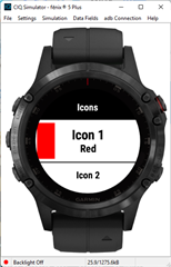
  • He means that if you open the SDK samples folder, there is a Menu2Sample project which has examples of IconMenuItem (and other fancy menu items) in code.

    In VS Code: CTRL/CMD-SHIFT-P > Monkey C: Open Samples Folder

    In Eclipse: (Menu) Connect IQ > Samples

  • I think a bunch of new folks don't know about/look at the samples.  There are a whole bunch of apps that demonstrate various things.  The menu2sample for instance. allows you to run and mess around with functioning code.

    Here's the custom/images screen in the sample along with the icon screen.

  • I think a bunch of new folks don't know about/look at the samples.

    If that's the case, then if I were in Garmin's shoes, I would ask why that's the case and what can be done to improve the situation.

    Same with recurring issues like:

    - People creating a new forum threads instead of responding to existing support threads. (Garmin already tried to fix that by removing the New button as suggested, but the fix wasn't complete)

    - Users sending developer feedback with no email

    - Garmin software being slow and unintuitive

    I don't think overly relying on free labor in the form of helpful forum posters is the right solution.

  • When a question comes up, I try to point folks to a SDK sample.  They tend to be small. specific, and easy to understand, vs what people find on github.

    I learned CIQ/Monkey C with the samples.  And still have some in my workspace to "experiment" with.  They were a bit hidden in VS Code, but 7 years back my very first app was based on importing a sample with Eclipse.

    The vast majority of Contact developer messages I get these days have an email address.  I added something in my app description like "If you want to hear back, you must include an email address."  (near the top where I mention "contact Developer"

    - Garmin software being slow and unintuitive

    Huh?  Give examples!

  • When a question comes up, I try to point folks to a SDK sample.  They tend to be small. specific, and easy to understand, vs what people find on github.

    Great. My point was that new devs shouldn't have to rely on help from people in the forums.

    The vast majority of Contact developer messages I get these days have an email address.  I added something in my app description like "If you want to hear back, you must include an email address."  (near the top where I mention "contact Developer"

    Great. Instead of Garmin designing a system where it's almost impossible for users to accidentally omit their email address when asking for help, the onus should be on devs to remind users to include their email address. Especially because we all know that users always read the webpage/documentation.

    - Garmin software being slow and unintuitive

    Huh?  Give examples!

    Sorry, I forgot to mention "buggy", as well.

    I've given lots of examples over the years, and so have others, in the Garmin forums and places like reddit, but it's all fallen on deaf ears. The main complaint I hear about Garmin software is that it's unintuitive and has outdated UI/UX, although it does provide the information that people want to see for the most part.

    Anecdotally, most runners I know (ranging from casual runners to sub-elite) may use Garmins, but they almost never open Garmin Connect but usually just sync to strava and look at their runs in the strava app.

    Personally, I also avoid opening Garmin Connect unless there's specific data I want to see.

    Examples:

    - The forums themselves are buggy, slow and unintuitive (not to mention useless on mobile). Garmin didn't develop the forum software, but the fact that they chose this platform is completely on-brand, especially considering the existence of modern alternatives like NodeBB and Discourse. Examples of egregious bugs: you can't quote emojis without having your comment blocked; trying to post certain code will also get your comment blocked.

    - CIQ itself is buggy and uninituitive. Just look at all the problems with Monkey Types and misunderstandings about certain app aspects (like FIT setData() and the fact that you can't set lap data in onTimerLap()) which come up over and over again. If new devs assume X almost every time, but the reality is actually Y, maybe that points to something being unintuitive, as opposed to the devs being wrong.

    - Monkey Types itself is broken in the sense that you can't cast something to a nested container type (like Array<Array<...>>) without a workaround even though one of the Monkey C api calls requires it. Given that Garmin has completely control over their own language, that's pretty sad.

    - In the other thread about app lists in the store, it was said that the CIQ app was slow to display apps, so a quick fix was made to limit the number of results

    - In the same thread, I noted that you have to wait for device app types to be populated before clicking on an app type, in the Connect IQ app. This is a step backwards from the Garmin Connect app, where you could click on the app type immediately. Even if the total amount of wait time is the same, perceived latency counts for a lot

    - DC Rainmaker noted that the new "data field settings in mobile app" feature is slow - you spend a lot of time staring at the "running man" animation.

    - There used to be a bug in Garmin Connect (mobile) where if you had app settings open and a sync happened in the background, you'd get kicked out of settings and lose any changes

    - There have been various bugs over the years where you can't enter certain characters in app settings strings, because they'd either be silently ignored or cause errors

    - Various threads in the Garmin Connect (web) forum and device-specific forums complain about buggy, slow and unintuitive Garmin software. (Perhaps slowness is more of an issue for the phone apps; maybe the watch UI isn't expected to be super fast. Then again I hated how slow the UI was on my older Garmin watches.)

    - I filed a couple of dozen bug reports on the 945 LTE watch, even though it's been out for over a year. Go ahead and check out the 945 LTE beta bug reports forum if you want. Lots of other bug reports there too

    - Garmin Connect (mobile) still has a bug relating to looking at laps in landscape mode (which is the only way to see additional lap information). If you scroll horizontally, then scroll vertically, your horizontal scroll position is constantly reset, which is *extremely* annoying. It's like nobody even tests this stuff or eats their own dogfood.

    - Just browse r/garmin, search these forums, or search the web. e.g.

    [https://www.google.com/search?&q=garmin+slow+bad+ui]

    [https://www.reddit.com/r/Garmin/comments/d1dv6z/garmin_interface_is_pretty_slow_and_clunky/]

    Am I crazy for hating Garmin Connect so much? - Reddit

    https://www.reddit.com/r/Garmin/comments/ilbs2s/why_im_returning_my_garmin_forerunner_945/

    Scrolling through menus, notifications and using maps is painfully slow and unintuitive.

    You know what I never hear? That Garmin software is modern, fun, and easy to use. Personally I use Garmin because of the features, data, and physical buttons; I always have to ignore the terrible UX.

    If you want examples of apps which are better than Garmin Connect in terms of usability and presentation, there's Strava and Stryd, just to name a couple. They're by no means perfect, but they try a lot harder than Garmin does.

    The best Garmin apologists can do is say "it's good enough for my purposes" and "your complaints are invalid". I noticed that nobody can actually muster up the enthusiasm to say stuff like "Garmin software has the best UI/UX I've seen in my life!" because that would clearly be untrue.

    I realize it's the nature of the internet (and human nature in general) that people usually only speak up when they have complaints, but I think it's hard to argue that Garmin's software isn't below average. Even if "slow and unintuitive" is debatable, "buggy" is not. Every time I buy a new high end Garmin, I'm guaranteed to become an unpaid beta tester.

  • "Great. My point was that new devs shouldn't have to rely on help from people in the forums.

    So people shouldn't help each other but complain about Garmin instead?

    You do like to complain!

    Links to what can be found on reddit about CIQ prove nothing.  People without a clue in many cases!

  • You do like to complain!

    Guilty as charged. Others like to constantly apologize for Garmin, as if we aren't customers who pay Garmin for expensive consumer products.

    I just have a bad taste in my mouth when I spend $X for a 935 or 945 LTE and I'm hit with countless bugs. I end up spending my free time recreating and documenting these bugs for Garmin as if I'm an unpaid beta tester.

    So people shouldn't help each other but complain about Garmin instead?

    People should help each other but Garmin shouldn't rely on people to help each other free when there's things they could do on their end. You realize that's what user-to-user support forums are, right? Unpaid labor for companies like Garmin and Apple?

    For example, if there's something that's missing or incorrect in Garmin documentation, the onus should be on Garmin to fix the documentation rather than expect people to just find out on their own or post a question in the forums.

    In practice, we all know that Garmin CIQ documentation is unreliable, in the same way that DC Rainmaker often points out that Garmin product specs on their official website are often incomplete/incorrect.

    Links to what can be found on reddit about CIQ prove nothing.  People without a clue in many cases!

    I mean, when people say that "Garmin is unintuitive", it's technically an opinion that can't be falsified. No different than "I like Garmin and everyone who complains about Garmin is clueless."

    It's just my anecdotal experience that many users dislike Garmin software. Either that or they're completely indifferent, because they don't even use Garmin Connect.

    EDIT: The discussions I'm referring to are about user-facing Garmin software (e.g. Garmin Connect app/website, Connect IQ app, and the UI of the software that runs on the watch.) Notice that there's almost 0 discussion of Connect IQ development outside of these forums. That should tell you something.

    EDIT2: What little discussion I've seen of Connect IQ development on reddit amounts to people being disappointed that Monkey C wasn't modern enough in their eyes (e.g. no functional programming support). Take that for what you will.

  • Personally I have looked at the sample but they are riddled with incomprehensible logic. The keyboard view for example. They add stuff to the example that isnt needed to convey the concept.

    Added annoyance, I can't even show you because the examples are not on a gitforge of any kind.

    But what would be even better is correct examples in the documentation. Including what it would look like in a UI.

  • Personally I have looked at the sample but they are riddled with incomprehensible logic. The keyboard view for example. They add stuff to the example that isnt needed to convey the concept.

    Noooooooooooo you can't just criticize Garmin without providing 572 different citations!!!!1! (But if you provide examples, I'll call you a complainer.)

    Added annoyance, I can't even show you because the examples are not on a gitforge of any kind.

    But what would be even better is correct examples in the documentation. Including what it would look like in a UI.

    Wow expecting Garmin to do things to attract developers (and users). What a complainer.

  • Garmin had the samples on github.  No one was using them and I think they are gone now.

    Consider trying to help people instead of complaining! Slight smile